Color interpolation, loosely speaking, is the process of determining the colors between two color points. It allows us to create unique colors, beautiful palettes, better gradients, and smooth transitions.
I recently wrote a Guide to CSS Color Functions but didn’t have the chance to explain color interpolation in any great depth — which is a shame, since it allows us to create cool demos like this one:
Did you notice how oklch(80% 0.3 340) interpolates to oklch(80% 0.3 60), then to oklch(80% 0.3 180), then to oklch(80% 0.3 270) and back to oklch(80% 0.3 340) using CSS animation? Well, I did! And that’s just a powerful use of interpolation.
Where can we use color interpolation?
Again, color interpolation is all over CSS. These properties and functions support color interpolation either through direct mixing, gradients, or transitions:
- All color gradients, like
linear-gradient(),conic-gradient(), etc.) color-mix()animationtransitionfilter- All functions in the relative color syntax
In gradients and the color-mix() function, we even have a formal syntax for color interpolation:
<color-interpolation-method> = in [ <rectangular-color-space> | <polar-color-space> <hue-interpolation-method>? ]

<color-space> = <rectangular-color-space> | <polar-color-space>
  <rectangular-color-space> = srgb | srgb-linear | display-p3 | a98-rgb | prophoto-rgb | rec2020 | lab | oklab | xyz | xyz-d50 | xyz-d65
  <polar-color-space> = hsl | hwb | lch | oklch
  <hue-interpolation-method> = [ shorter | longer | increasing | decreasing ] hue
Yes, that’s a convoluted definition, but if we go ahead and inspect how this syntax works in color-mix(), for example, we would have something like this:
.element{
  color: color-mix(in lch longer hue, red, blue);
}
The CSS color-mix() function provides a way for us to mix different colors in any color space, which is all what color interpolation is about: going from color to another.
Our key focus is the in lab longer hue part, which specifies how color-mix() does the interpolation. This is basically saying, “Hey CSS, interpolate the next colors in the CIELCH color space using a longer hue arc.” Yes, the in lab part means the interpolation is done in CIELCH, one of the many CSS color spaces, but we’ll get to what longer hue exactly means later.
Just remember:
- The
inkeyword always precedes the color interpolation method. - The second value is the color space used for mixing.
- The third value is an optional hue interpolation method ending with the
huekeyword.
This same syntax appears in all gradient functions, where colors are interpolated gradually to get a smooth gradient. Look at how tweaking the gradient with the color interpolation syntax can give us a completely new gradient:
.element {
  background: linear-gradient(in oklch longer hue 90deg, magenta, cyan);
}Let’s backtrack a little, though. Interpolation can occur in two major color spaces: rectangular and polar.
Rectangular color spaces
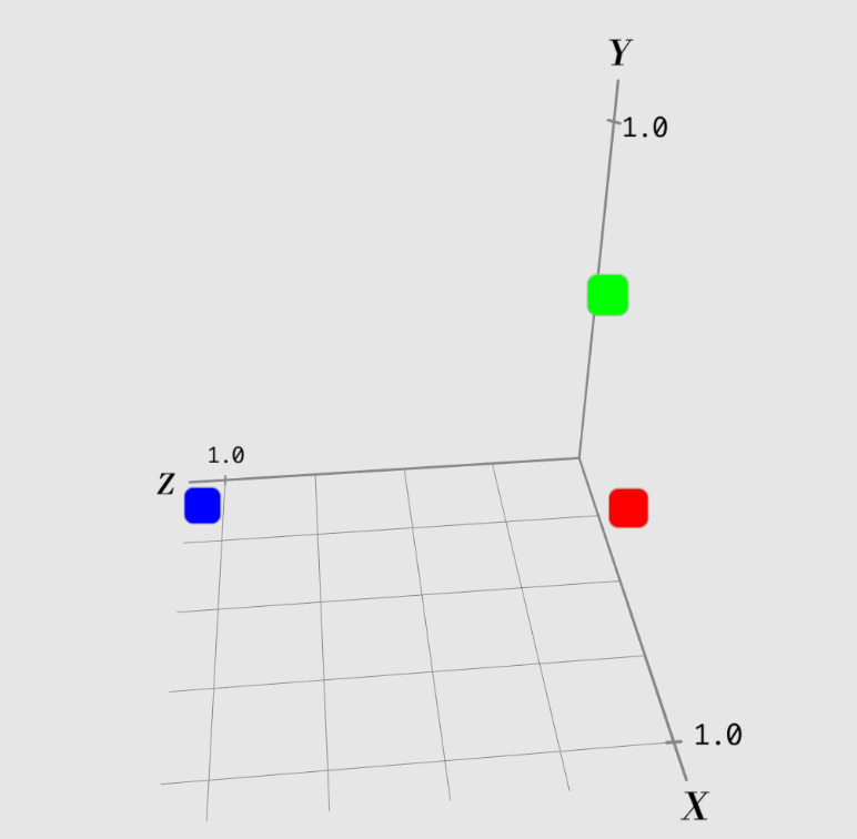
Rectangular color spaces represent colors using Cartesian coordinates on a three-dimensional plane, which you might already know as the X (horizontal), Y (vertical), and Z (depth) axes on a graph.
Rectangular color spaces are like the same sort of graph, but is a map of color points instead. For example, the sRGB color space has three axes, responsible for the amount of a color’s redness, blueness, and greenness.

Polar color spaces
Polar color spaces also represent colors in a three-dimensional plane, just like rectangular color spaces, but it is shaped like a cylinder instead of a rectangular. A color point is represented by three values:
- The height from the point to the center, usually assigned to lightness or brightness.
- The radial distance from the center, usually assigned to chroma or saturation.
- The angle around the center, assigned to the hue.

What makes polar color spaces unique is the hue angle. Since it’s an angle, and they are cyclic (like a continuous circle), we have more options for how it can be interpolated.
Hue interpolation
Think of hue interpolation like finding the distance between the two times on a clock.

Let’s assume the clock can go clockwise (forwards) or counterclockwise (backwards) in time.

The minute hand is at 10 minutes (2). If we want to take the shortest distance between 50 minutes (10), then we would make a counterclockwise turn, like going back in time since that is shorter than moving forward in a clockwise direction.

That’s because if you take the longer route, you’ll have to pass through 3, 4, 5, etc. all the way to 10. Taking the shorter counterclockwise) route , you would reach 10 in less time (15 minutes).
Hue interpolation works similarly. It is a CSS algorithm that determines how you want hue colors in polar color spaces to be mixed, and the direction you want to take between two hue points.
There are four types of hue interpolation in CSS. Let’s go over those next.
shorter and longer
The shorter (default value) hue interpolation method simply takes the shorter route, while the longer hue interpolation method takes the longer route when mixing colors between two hue points.
Imagine blending two hue values red (0deg) and blue (240deg). There are two ways to do this:
- Go the longer route (distance of
240deg). - Go the shorter route (distance of
120deg).
If shorter is used, the browser takes the shorter route (120deg). Otherwise, if longer is used, the browser takes the longer route (240deg).
This offers up a nice and unique blend of colors depending on your preferences. Hue interpolation is useful in creating smooth color transitions and gradients, giving plenty of life to the websites using color.
The shorter or longer hue interpolation, depending on the shortest or longest distances between two hue value points, can either go clockwise or counterclockwise. We can also set this automatically without actually using one of these keywords, which we will look at next.
increasing and decreasing
Sticking with our clock analogy, the increasing hue interpolation method is like moving the minutes hand from 2 to 10, always in a clockwise direction. Even if the final value is 1, it would still go in a clockwise direction, doing almost a full turn.
If, however, the hue interpolation method is set to decreasing, the minutes hand will always go in a counterclockwise direction. As the specification says, “[d]epending on the difference between the two angles, this will either look the same as shorter or as longer.”
If the angle goes from 20deg to 50deg using the increasing hue interpolation value, the value will move clockwise from 20deg to 50deg, displaying the colors in between. However, if the hue interpolation method is set to decreasing, then the algorithm takes the value from 20deg to 50deg in a counterclockwise direction.
Since increasing means the clock’s minute hand is constantly moving forward, this means the value can reach up to 360deg, a full circle. If the angle reaches 360deg, it resets back to 0deg until it reaches the next point. But if decreasing reaches 0deg, then it resets to 360deg, keeping the hue change consistent.
How is this useful?
Yes, all this theory is great: we can use interpolation to get the intermediary color(s) between two colors and make new kinds of colors, but how can we actually use it to create better color experiences in CSS?
Creating gradients
Color interpolation happens frequently in all CSS gradient functions. Take, for example, the conic-gradient() function, which makes it easy to create a smooth transition of colors that rotate around a center point:
background: conic-gradient(
  from 0deg,
  oklch(70% 0.3 0deg),
  oklch(70% 0.3 120deg),
  oklch(70% 0.3 240deg),
  oklch(70% 0.3 360deg)
);Notice how the hue blends smoothly between each color stop point? It’s beautiful.
Color mixing
Reading about <a href="https://css-tricks.com/almanac/functions/c/color-mix/">color-mix()</a> in the CSS-Tricks Almanac will give you a basic idea of how this is done, but if you’re like me and want the raw code, here it is:
/* First Box */
background-color: color-mix(in oklch, rgb(255 0 0) 50%, lch(60% 40% 220deg) 50%);

/* Second Box */
background-color: color-mix(in oklch longer hue, rgb(255 0 0) 50%, lch(60% 40% 220deg) 50%);A great advantage of color-mix() is that you gain the ability to mix colors in different color spaces within another color space, thereby producing a unique color. Again, it’s moving from one color into another and the direction we take for mixing colors matters.
Animation
We can animate the transition between colors! So, instead of mixing two specific points, we can watch the color transition between all of the colors in between the two points!
@keyframes bg-shift {
  from {
    background-color: oklch(30% 0.3 20deg); /* dark pink */
  }
  to {
    background-color: oklch(70% 0.3 200deg); /* Cool bluish */
  }
}References
- Okay, Color Spaces by Eric Portis
- ColorAide Color Interpolation Documentation
- CSS Color Module Level 4
- Interpolating Colors by Chris Brunell
What You Need to Know About CSS Color Interpolation originally published on CSS-Tricks, which is part of the DigitalOcean family. You should get the newsletter.
Source: Read MoreÂ

