Like ’em or loath ’em, whether you’re showing an alert, a message, or a newsletter signup, dialogue boxes draw attention to a particular piece of content without sending someone to a different page. In the past, dialogues relied on a mix of divisions, ARIA, and JavaScript. But the HTML dialog element has made them more accessible and style-able in countless ways.
So, how can you take dialogue box design beyond the generic look of frameworks and templates? How can you style them to reflect a brand’s visual identity and help to tell its stories? Here’s how I do it in CSS using ::backdrop, backdrop-filter, and animations.

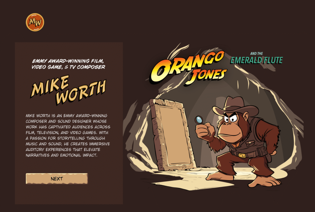
I mentioned before that Emmy-award-winning game composer Mike Worth hired me to create a highly graphical design. Mike loves ’90s animation, and he challenged me to find ways to incorporate its retro style without making a pastiche. However, I also needed to achieve that retro feel while maintaining accessibility, performance, responsiveness, and semantics.
A brief overview of dialog and ::backdrop
Let’s run through a quick refresher.
Note: While I mostly refer to “dialogue boxes” throughout, the HTML element is spelt dialog.
dialog is an HTML element designed for implementing modal and non-modal dialogue boxes in products and website interfaces. It comes with built-in functionality, including closing a box using the keyboard Esc key, focus trapping to keep it inside the box, show and hide methods, and a ::backdrop pseudo-element for styling a box’s overlay.
The HTML markup is just what you might expect:
<dialog>
  <h2>Keep me informed</h2>
  <!-- ... -->
  <button>Close</button>
</dialog>
This type of dialogue box is hidden by default, but adding the open attribute makes it visible when the page loads:
<dialog open>
  <h2>Keep me informed</h2>
  <!-- ... -->
  <button>Close</button>
</dialog>
I can’t imagine too many applications for non-modals which are open by default, so ordinarily I need a button which opens a dialogue box:
<dialog>
  <!-- ... -->
</dialog>
<button>Keep me informed</button>
Plus a little bit of JavaScript, which opens the modal:
const dialog = document.querySelector("dialog");
const showButton = document.querySelector("dialog + button");
showButton.addEventListener("click", () => {
  dialog.showModal();
});
Closing a dialogue box also requires JavaScript:
const closeButton = document.querySelector("dialog button");
closeButton.addEventListener("click", () => {
  dialog.close();
});
Unless the box contains a form using method="dialog", which allows it to close automatically on submit without JavaScript:
<dialog>
  <form method="dialog">
    <button>Submit</button>
  </form>
</dialog>
The dialog element was developed to be accessible out of the box. It traps focus, supports the Esc key, and behaves like a proper modal. But to help screen readers announce dialogue boxes properly, you’ll want to add an aria-labelledby attribute. This tells assistive technology where to find the dialogue box’s title so it can be read aloud when the modal opens.
<dialog aria-labelledby="dialog-title">
  <h2 id="dialog-title">Keep me informed</h2>
  <!-- ... -->
</dialog>
Most tutorials I’ve seen include very little styling for dialog and ::backdrop, which might explain why so many dialogue boxes have little more than border radii and a box-shadow applied.

I believe that every element in a design — no matter how small or infrequently seen — is an opportunity to present a brand and tell a story about its products or services. I know there are moments during someone’s journey through a design where paying special attention to design can make their experience more memorable.
Dialogue boxes are just one of those moments, and Mike Worth’s design offers plenty of opportunities to reflect his brand or connect directly to someone’s place in Mike’s story. That might be by styling a newsletter sign-up dialogue to match the scrolls in his news section.

Or making the form modal on his error pages look like a comic-book speech balloon.

dialog in action
Mike’s drop-down navigation menu looks like an ancient stone tablet.

I wanted to extend this look to his dialogue boxes with a three-dimensional tablet and a jungle leaf-filled backdrop.

This dialog contains a newsletter sign-up form with an email input and a submit button:
<dialog>
  <h2>Keep me informed</h2>
  <form>
    <label for="email" data-visibility="hidden">Email address</label>
    <input type="email" id="email" required>
    <button>Submit</button>
  </form>
  <button>x</button>
</dialog>
I started by applying dimensions to the dialog and adding the SVG stone tablet background image:
dialog {
  width: 420px;
  height: 480px;
  background-color: transparent;
  background-image: url("dialog.svg");
  background-repeat: no-repeat;
  background-size: contain;
}
Then, I added the leafy green background image to the dialogue box’s generated backdrop using the ::backdrop pseudo element selector:
dialog::backdrop {
  background-image: url("backdrop.svg");
  background-size: cover;
}
I needed to make it clear to anyone filling in Mike’s form that their email address is in a valid format. So I combined :has and :valid CSS pseudo-class selectors to change the color of the submit button from grey to green:
dialog:has(input:valid) button {
  background-color: #7e8943;
  color: #fff;
}
I also wanted this interaction to reflect Mike’s fun personality. So, I also changed the dialog background image and applied a rubberband animation to the box when someone inputs a valid email address:
dialog:has(input:valid) {
  background-image: url("dialog-valid.svg");
  animation: rubberBand 0.82s cubic-bezier(0.36, 0.07, 0.19, 0.97) both;
}

@keyframes rubberBand {
  from { transform: scale3d(1, 1, 1); }
  30% { transform: scale3d(1.25, 0.75, 1); }
  40% { transform: scale3d(0.75, 1.25, 1); }
  50% { transform: scale3d(1.15, 0.85, 1); }
  65% { transform: scale3d(0.95, 1.05, 1); }
  75% { transform: scale3d(1.05, 0.95, 1); }
  to { transform: scale3d(1, 1, 1); }
}Tip: Daniel Eden’s Animate.css library is a fabulous source of “Just-add-water CSS animations” like the rubberband I used for this dialogue box.
Changing how an element looks when it contains a valid input is a fabulous way to add interactions that are, at the same time, fun and valuable for the user.

That combination of :has and :valid selectors can even be extended to the ::backdrop pseudo-class, to change the backdrop’s background image:
dialog:has(input:valid)::backdrop {
  background-image: url("backdrop-valid.svg");
}
Try it for yourself:
Conclusion
We often think of dialogue boxes as functional elements, as necessary interruptions, but nothing more. But when you treat them as opportunities for expression, even the smallest parts of a design can help shape a product or website’s personality.
The HTML dialog element, with its built-in behaviours and styling potential, opens up opportunities for branding and creative storytelling. There’s no reason a dialogue box can’t be as distinctive as the rest of your design.
Andy Clarke
Often referred to as one of the pioneers of web design, Andy Clarke has been instrumental in pushing the boundaries of web design and is known for his creative and visually stunning designs. His work has inspired countless designers to explore the full potential of product and website design.
Andy’s written several industry-leading books, including ‘Transcending CSS,’ ‘Hardboiled Web Design,’ and ‘Art Direction for the Web.’ He’s also worked with businesses of all sizes and industries to achieve their goals through design.
Visit Andy’s studio, Stuff & Nonsense, and check out his Contract Killer, the popular web design contract template trusted by thousands of web designers and developers.
Getting Creative With HTML Dialog originally published on CSS-Tricks, which is part of the DigitalOcean family. You should get the newsletter.
Source: Read MoreÂ

