We’ve been able to get the length of the viewport in CSS since… checks notes… 2013! Surprisingly, that was more than a decade ago. Getting the viewport width is as easy these days as easy as writing 100vw, but what does that translate to, say, in pixels? What about the other properties, like those that take a percentage, an angle, or an integer?
Think about changing an element’s opacity, rotating it, or setting an animation progress based on the screen size. We would first need the viewport as an integer — which isn’t currently possible in CSS, right?
What I am about to say isn’t a groundbreaking discovery, it was first described amazingly by Jane Ori in 2023. In short, we can use a weird hack (or feature) involving the tan() and atan2() trigonometric functions to typecast a length (such as the viewport) to an integer. This opens many new layout possibilities, but my first experience was while writing an Almanac entry in which I just wanted to make an image’s opacity responsive.
Resize the CodePen and the image will get more transparent as the screen size gets smaller, of course with some boundaries, so it doesn’t become invisible:
This is the simplest we can do, but there is a lot more. Take, for example, this demo I did trying to combine many viewport-related effects. Resize the demo and the page feels alive: objects move, the background changes and the text smoothly wraps in place.
I think it’s really cool, but I am no designer, so that’s the best my brain could come up with. Still, it may be too much for an introduction to this typecasting hack, so as a middle-ground, I’ll focus only on the title transition to showcase how all of it works:
Setting things up
The idea behind this is to convert 100vw to radians (a way to write angles) using atan2(), and then back to its original value using tan(), with the perk of coming out as an integer. It should be achieved like this:
:root {
  --int-width: tan(atan2(100vw, 1px));
}
But! Browsers aren’t too keep on this method, so a lot more wrapping is needed to make it work across all browsers. The following may seem like magic (or nonsense), so I recommend reading Jane’s post to better understand it, but this way it will work in all browsers:
@property --100vw {
  syntax: "<length>";
  initial-value: 0px;
  inherits: false;
}

:root {
  --100vw: 100vw;
  --int-width: calc(10000 * tan(atan2(var(--100vw), 10000px)));
}
Don’t worry too much about it. What’s important is our precious --int-width variable, which holds the viewport size as an integer!
Wideness: One number to rule them all
Right now we have the viewport as an integer, but that’s just the first step. That integer isn’t super useful by itself. We oughta convert it to something else next since:
- different properties have different units, and
- we want each property to go from a start value to an end value.
Think about an image’s opacity going from 0 to 1, an object rotating from 0deg to 360deg, or an element’s offset-distance going from 0% to 100%. We want to interpolate between these values as --int-width gets bigger, but right now it’s just an integer that usually ranges between 0 to 1600, which is inflexible and can’t be easily converted to any of the end values.
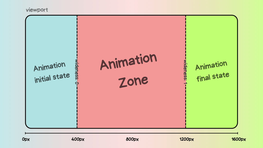
The best solution is to turn --int-width into a number that goes from 0 to 1. So, as the screen gets bigger, we can multiply it by the desired end value. Lacking a better name, I call this “0-to-1” value --wideness. If we have --wideness, all the last examples become possible:
/* If `--wideness is 0.5 */

.element {
  opacity: var(--wideness); /* is 0.5 */
  translate: rotate(calc(wideness(400px, 1200px) * 360deg)); /* is 180deg */
  offset-distance: calc(var(--wideness) * 100%); /* is 50% */
}
So --wideness is a value between 0 to 1 that represents how wide the screen is: 0 represents when the screen is narrow, and 1 represents when it’s wide. But we still have to set what those values mean in the viewport. For example, we may want 0 to be 400px and 1 to be 1200px, our viewport transitions will run between these values. Anything below and above is clamped to 0 and 1, respectively.

In CSS, we can write that as follows:
:root {
  /* Both bounds are unitless */
  --lower-bound: 400;
  --upper-bound: 1200;

  --wideness: calc(
    (clamp(var(--lower-bound), var(--int-width), var(--upper-bound)) - var(--lower-bound)) / (var(--upper-bound) - var(--lower-bound))
  );
}
Besides easy conversions, the --wideness variable lets us define the lower and upper limits in which the transition should run. And what’s even better, we can set the transition zone at a middle spot so that the user can see it in its full glory. Otherwise, the screen would need to be 0px so that --wideness reaches 0 and who knows how wide to reach 1.
We got the --wideness. What’s next?
For starters, the title’s markup is divided into spans since there is no CSS-way to select specific words in a sentence:
<h1><span>Resize</span> and <span>enjoy!</span></h1>And since we will be doing the line wrapping ourselves, it’s important to unset some defaults:
h1 {
  position: absolute; /* Keeps the text at the center */
  white-space: nowrap; /* Disables line wrapping */
}
The transition should work without the base styling, but it’s just too plain-looking. They are below if you want to copy them onto your stylesheet:
And just as a recap, our current hack looks like this:
@property --100vw {
  syntax: "<length>";
  initial-value: 0px;
  inherits: false;
}

:root {
  --100vw: 100vw;
  --int-width: calc(10000 * tan(atan2(var(--100vw), 10000px)));
  --lower-bound: 400;
  --upper-bound: 1200;

  --wideness: calc(
    (clamp(var(--lower-bound), var(--int-width), var(--upper-bound)) - var(--lower-bound)) / (var(--upper-bound) - var(--lower-bound))
  );
}
OK, enough with the set-up. It’s time to use our new values and make the viewport transition. We first gotta identify how the title should be rearranged for smaller screens: as you saw in the initial demo, the first span goes up and right, while the second span does the opposite and goes down and left. So, the end position for both spans translates to the following values:
h1 {
  span:nth-child(1) {
    display: inline-block; /* So transformations work */
    position: relative;
    bottom: 1.2lh;
    left: 50%;
    transform: translate(-50%);
  }

  span:nth-child(2) {
    display: inline-block; /* So transformations work */
    position: relative;
    bottom: -1.2lh;
    left: -50%;
    transform: translate(50%);
  }
}
Before going forward, both formulas are basically the same, but with different signs. We can rewrite them at once bringing one new variable: --direction. It will be either 1 or -1 and define which direction to run the transition:
h1 {
  span {
    display: inline-block;
    position: relative;
    bottom: calc(1.2lh * var(--direction));
    left: calc(50% * var(--direction));
    transform: translate(calc(-50% * var(--direction)));
    }

  span:nth-child(1) {
    --direction: 1;
  }

  span:nth-child(2) {
    --direction: -1;
  }
}
The next step would be bringing --wideness into the formula so that the values change as the screen resizes. However, we can’t just multiply everything by --wideness. Why? Let’s see what happens if we do:
span {
  display: inline-block;
  position: relative;
  bottom: calc(var(--wideness) * 1.2lh * var(--direction));
  left: calc(var(--wideness) * 50% * var(--direction));
  transform: translate(calc(var(--wideness) * -50% * var(--direction)));
}
As you’ll see, everything is backwards! The words wrap when the screen is too wide, and unwrap when the screen is too narrow:
Unlike our first examples, in which the transition ends as --wideness increases from 0 to 1, we want to complete the transition as --wideness decreases from 1 to 0, i.e. while the screen gets smaller the properties need to reach their end value. This isn’t a big deal, as we can rewrite our formula as a subtraction, in which the subtracting number gets bigger as --wideness increases:
span {
  display: inline-block;
  position: relative;
  bottom: calc((1.2lh - var(--wideness) * 1.2lh) * var(--direction));
  left: calc((50% - var(--wideness) * 50%) * var(--direction));
  transform: translate(calc((-50% - var(--wideness) * -50%) * var(--direction)));
}
And now everything moves in the right direction while resizing the screen!
However, you will notice how words move in a straight line and some words overlap while resizing. We can’t allow this since a user with a specific screen size may get stuck at that point in the transition. Viewport transitions are cool, but not at the expense of ruining the experience for certain screen sizes.
Instead of moving in a straight line, words should move in a curve such that they pass around the central word. Don’t worry, making a curve here is easier than it looks: just move the spans twice as fast in the x-axis as they do in the y-axis. This can be achieved by multiplying --wideness by 2, although we have to cap it at 1 so it doesn’t overshoot past the final value.
span {
 display: inline-block;
 position: relative;
 bottom: calc((1.2lh - var(--wideness) * 1.2lh) * var(--direction));
 left: calc((50% - min(var(--wideness) * 2, 1) * 50%) * var(--direction));
 transform: translate(calc((-50% - min(var(--wideness) * 2, 1) * -50%) * var(--direction)));
}
Look at that beautiful curve, just avoiding the central text:
This is just the beginning!
It’s surprising how powerful having the viewport as an integer can be, and what’s even crazier, the last example is one of the most basic transitions you could make with this typecasting hack. Once you do the initial setup, I can imagine a lot more possible transitions, and --widenesss is so useful, it’s like having a new CSS feature right now.
I expect to see more about “Viewport Transitions” in the future because they do make websites feel more “alive” than adaptive.
Typecasting and Viewport Transitions in CSS With tan(atan2()) originally published on CSS-Tricks, which is part of the DigitalOcean family. You should get the newsletter.
Source: Read MoreÂ


