")
Media queries are essential for modern websites. They enable responsive design by allowing your site or UI to adapt seamlessly across different device sizes. In this blog, we’ll explore how to implement media queries in Optimizely Spire and how to update or customize breakpoints to suit your design needs.
Let’s get started!
Setting Up Breakpoints
First, we’ll define breakpoints based on our style guide. Breakpoints help your website adjust its layout depending on the screen size, such as mobile, tablet, or desktop.
In Optimizely Spire, breakpoints are defined within the theme configuration file. To update these breakpoints in the base code, you need to create a Start.tsx file—if it hasn’t been made already.
Path: modules/blueprints/CustomBlueprint/src/Start.tsx
Where to Place Breakpoint Configuration
Place the breakpoint configuration within either the setPreStyleGuideTheme or setPostStyleGuideTheme functions. These functions allow you to customize the theme before or after the default style guide is applied.
This setup ensures that your custom breakpoints are recognized and used consistently throughout your application.
Below is the configuration structure for setting custom breakpoints in Optimizely Spire:
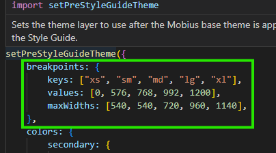
Understanding the Breakpoint Configuration
To make your site responsive, you define breakpoints—specific screen widths where your layout should adapt. Here’s what each part of the configuration means:
-
Keys – Represent screen size labels such as:
These are shorthand names for different device sizes:
-
- xs – Extra small (e.g., small phones)
- sm – Small (e.g., larger phones)
- md – Medium (e.g., tablets)
- lg – Large (e.g., small laptops)
- xl – Extra large (e.g., large desktops)
-
Values – Minimum Widths
These define when each screen size category starts:
-
- xs starts at 0px
- sm starts at 576px
- md starts at 768px
- lg starts at 992px
- xl starts at 1200px
-
Max Widths – Content Limits
These define the maximum width the content area can grow to at each breakpoint. Even if the screen is wider, the content won’t stretch beyond these limits (example: 1140px for xl).
Think of it like this:
- On a phone → small screen → use xs styles
- On a tablet → medium screen → use md styles
- On a laptop or desktop → big screen → use lg or xl styles
Creating Media Queries in a Standardized Way
To create media queries in Optimizely Spire, we rely on the breakpoint configuration defined earlier. This ensures consistency across the application and simplifies responsive design.
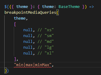
How It Works
Behind the scenes, Spire uses a utility called breakpointMediaQueries to convert standardized media query definitions into browser-readable CSS.
Utility Location: modulesmobiussrcutilitiesbreakpointMediaQueries.ts
This utility helps generate clean and consistent media queries based on your defined breakpoints.
Available Media Query Types:
Here are three types of media query options available:
- min – Applies styles when the screen is at or above a certain width.
- max – Applies styles when the screen is at or below a certain width.
- minMax – Applies styles between two specific widths.
Default Media Query Structure
Here’s what a typical media query definition looks like using this utility:
Now let’s see how this media query utility works with min, max, and minMax.
- min
The min-width media query structure will be as follows:

Example: To apply styles for min-width: 576px, insert your CSS code in the appropriate section. 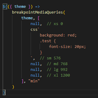
Similarly, if you want to apply CSS for min-width: 768px, just replace the respective null with your CSS code.
- max
The max-width media query structure will be as follows:

Example: To apply styles for max-width: 575px, insert your CSS code in the appropriate section.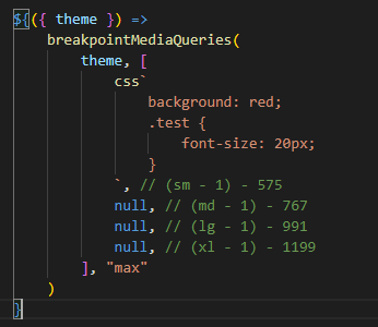
Similarly, if you want to apply CSS for max-width: 767px, just replace the respective null with your CSS code.
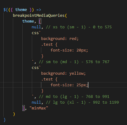
- minMax
The minMax media query structure will be as follows:
Example: To apply styles between min-width: 576px and max-width: 767px, insert your CSS code in the appropriate section.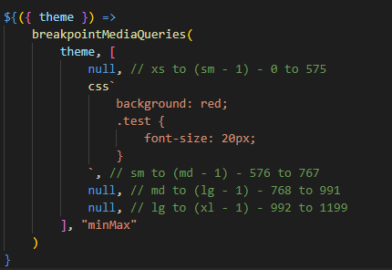
Similarly, if you want to create media queries for other screen sizes, follow the same approach as described above.
You can also define multiple CSS rules as shown in the examples below.
Conclusion
Creating responsive layouts doesn’t have to be complicated or repetitive. A utility like breakpointMediaQueries helps you apply consistent styling logic throughout your application. Whether you use a mobile-first (min), desktop-first (max), or range-based (minMax) approach, this system lets you apply styles exactly where they’re needed.
By simplifying the media query logic, your code becomes easier to read and maintain, so you can focus more on design and less on repetitive code. Choose the approach that best fits your project, and let your breakpoints handle the rest.
Source: Read MoreÂ
")
