


Ensuring clear focus visibility is key for accessibility; sometimes, visually impaired users and keyboard navigators have trouble interacting with web content. This blog explores practical ways to fix focus visibility issues and improve user experience.
ADA Compliance Overview
ADA compliance ensures websites are accessible to people with disabilities, promoting inclusivity and fairness. By following the WCAG 2.0 guidelines and the POUR principles (Perceivable, Operable, Understandable, Robust), websites can be made accessible. This helps businesses avoid legal issues enhances user experience, increases engagement, and drives actions like purchases. Additionally, ADA-compliant websites improve SEO, making them crucial for building successful, user-friendly websites.
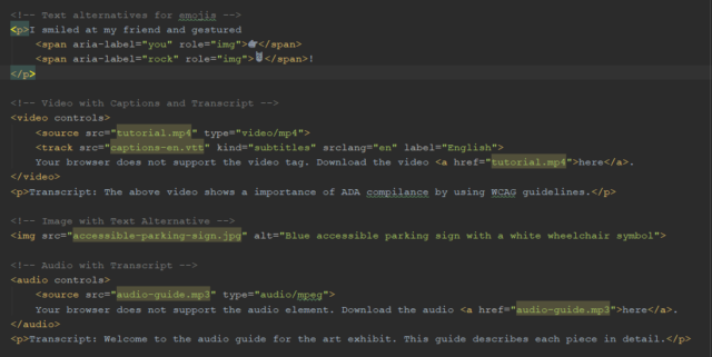
1. Perceivable
Make content accessible to all senses (text, images, videos) with alternatives like captions, transcripts, or descriptions for those who can’t see or hear. Use attributes like aria-label, alt, and track.
Example
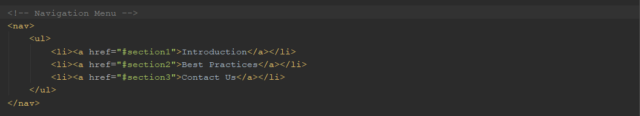
2. Operable
Ensure easy navigation and interaction with content via keyboard, timing controls, focus management, and a clear structure (titles, headings, labels).
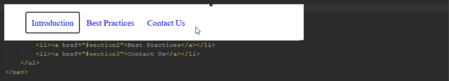
Example
The shared navigable nav code in the above HTML focuses on nav list items when the Tab key is pressed.
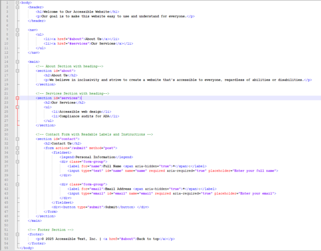
3. Understandable
For better usability, use clear language, label links to form fields, and maintain consistent navigation with semantic HTML, headings, and lists. Provide a code screenshot for clarity.
Example
4. Robust
Ensure your site works well with assistive technologies so all users get the same content, whether they read it or use a screen reader (NVDA).
Keyboard Focus-Related Issues & solutions
Why Keyboard Focus Matters
ADA compliance ensures that websites are accessible to all users, including those who rely on keyboard navigation or screen readers. One common issue that affects accessibility is the visibility of focus indicators (outlines or borders) when users navigate through interactive elements like links, buttons, dropdowns, and range controls.
The Problem
CSS styles that obscure focus rings can make it difficult for keyboard-only users to identify the focused element. This issue often arises in browsers like Chrome, Firefox, and Internet Explorer, leading to confusion and navigation difficulties.
The Goal
Ensure the focus indicator on interactive elements (e.g., links, buttons, and dropdowns) is clear and visible and meets accessibility guidelines for contrast and size.
Why It’s Crucial
A visible focus indicator is necessary for users who cannot use a mouse, helping them navigate a website efficiently. Sufficient contrast also makes the focus ring visible for users with visual impairments, ensuring inclusivity for all.
Solutions to Overcome Outline Issues
Browsers automatically provide focus indicators for interactive elements, but many developers remove them using the :focus { outline: none; } CSS rule. This is not recommended unless you replace it with a custom focus style. The default focus indicators can clash with the color scheme and become hard to see. To improve accessibility, focus indicators should meet three criteria: color contrast, surface area (size), and visibility.
Focus Indicators are visual markers that show which element is focused, which is especially useful for keyboard navigation. The :focus-visible pseudo-class can apply focus styles only when the keyboard is used.
Ensure the focus ring has:
- At least 2px thickness around the element.
- A contrast ratio of 3:1 between focused and unfocused states.
Use tools like the Color Contrast Checker to verify color contrast.
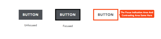
Solution 1
Add a thicker outline around the button on the keyboard focus, changing the color from white to black. This is called the focus indication area, where the focus indicator and the contrasting area are the same. The contrast ratio here is 21:1, which exceeds the required 3:1, meeting the standard criteria for focus visibility.
*:focus-visible {
    outline: 2px solid #000;
}
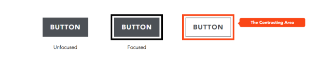
Solution 2
When the button receives keyboard focus, add a black outline separated from it. This creates a contrasting area, making the focus indicator stand out more. Use the outline-offset property to add space around the element.
*:focus-visible {
   outline: 2px solid #000;
   outline-offset: 2px;
}
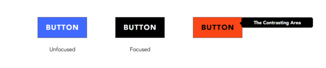
Solution 3
If the button changes its background color from blue to black when it is focused, the entire background area becomes a contrasting area. The color contrast ratio between the focused and unfocused states is 4.68.
You can choose any of these solutions based on your project’s focus indication requirements. Either test it with a screen reader or a recommended accessibility tool.
Note: The outline thickness can be adjusted beyond 2px as long as it meets the focus indication criteria.
Recommended Tools for Accessibility Testing
- Automated Tools: Lighthouse (Chrome DevTools), WAVE, Axe.
- Screen Readers: NVDA, JAWS, or VoiceOver.
- Color Contrast Checkers: WebAIM Contrast Checker.
- Keyboard Testing: Navigate your site using only the keyboard
- For more details, check Keyboard Accessibility Testing
Many developers use tools like Lighthouse (Chrome DevTools), WAVE, and Axe for accessibility testing. A new tool on the market for accessibility testing is the PowerMapper Tool.
You can learn more about PowerMapper below:
PowerMapper Accessibility Tool
PowerMapper is an accessibility testing tool that checks for broken links, spelling errors, browser compatibility, SEO issues, web standards, and WCAG compliance. Accessibility and usability issues significantly impact user experience, while SEO problems can harm a business’s customer base and make it appear unprofessional.
PowerMapper is a paid tool, and some organizations use it to comply with the Americans with Disabilities Act (ADA). The ADA is a civil law that ensures inclusivity for all individuals, particularly those with disabilities, in public life.
The tool offers a 30-day free trial, a downloadable version, and a web-based option for scanning websites and pages for accessibility testing.
How to Scan a Page Using the PowerMapper Trial
- Enter the following link in your browser’s address bar: https://www.powermapper.com/products/sortsite/try/
- A window will open, similar to the one shown below
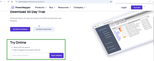
- In the “Try Online” input box, enter the URL of the page you want to scan, then click the ‘Scan Website’ button
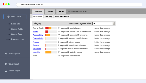
- After a few seconds of scanning, a report of issues will be displayed, similar to the screenshot below
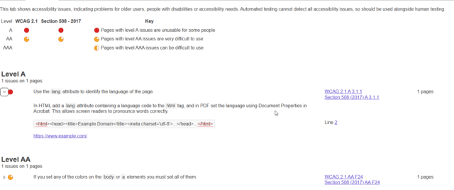
- After clicking on a specific issue, it highlights the relevant HTML code and provides a reference link to resolve the issue
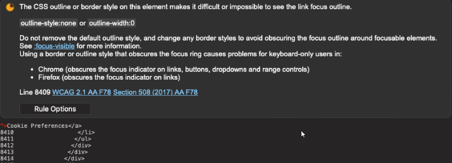
- The screenshot below shows a focus visibility issue.
- This way, you can check for focus visibility issues on your website. If any are found, fix them using the above focus visibility solutions and rescan the site.
Conclusion
By improving focus visibility, maintaining a logical focus order, and testing with assistive tools, developers create a more inclusive and user-friendly experience. Accessibility benefits everyone, making the web a better place for all users.
What steps have you taken to improve focus visibility accessibility on your websites? Share your thoughts in the comments below!
Source: Read MoreÂ