

Today we are excited to release React Native 0.77!
This release ships several features: new styling capabilities such as support for display: contents, boxSizing, mixBlendMode, and outline-related properties to provide a more powerful layout options; Android 16KB page support to be compatible with the newer Android devices. We are also modernizing the community template by migrating it to Swift, while continuing to support and maintain compatibility with Objective-C for developers who prefer it.
Highlights
- New CSS Features for better layouts, sizing and blending
- Android version 15 support & 16KB page support
- Community CLI and Template Updates
Breaking Changes
Highlights
New CSS Features for better layouts, sizing and blending
React Native 0.77 furthers our goal of aligning React Native with the web. We’ve added support for new CSS properties to give you more control over your app’s layout, sizing, and blending. These changes can help simplify complex layouts, add texture, and make your app more accessible.
All these new features are available only for the New Architecture.
Simpler layouts with display: contents
The display: contents prop allows an element to disappear from the layout structure while its children are still rendered as if they were direct children of the parent element. It can be useful for styling purposes where you want to apply styles to child elements without affecting the layout, when building wrapper components which must handle events, or if you need to interact with the ShadowTree.
Technically speaking, display: contents renders an element without generating a layout box, but it preserves the layout boxes of the element’s children. The element with display: contents is effectively flattened out of the view hierarchy.
Let’s have a look at this example where we want to display an alert when a widget is pressed. We have a red Widget inside of a container view:
function Container() {
  return (
    <View style={styles.container}>
      <Widget />
    </View>
  );
}
Now, let’s build a new Alerting wrapper component, with the goal of alerting the user when a component beneath it is pressed, using experimental pointer events. For clarity, the background of this component is made blue. That might look something like the component below:
function Alerting({children}) {
  return (
    <View
      style={{backgroundColor: 'blue'}}
      onPointerDown={() => alert('Hello World!')}>
      {children}
    </View>
}

function Container() {
  return (
    <View style={styles.container}>
      <Alerting>
        <Widget />
      </Alerting>
    </View>
  );
}
This doesn’t do quite what we want it to. Alerting adds a new layout box, with its own bounds, separate from the child Widget. Depending on the styling of the element it is wrapping, this may result in significant visual and functional changes. In this example, the blue background responds to taps with an alert when we want for only the red “Hello World” box to alert when tapped.
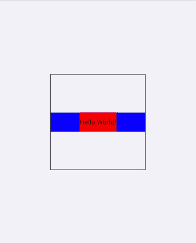
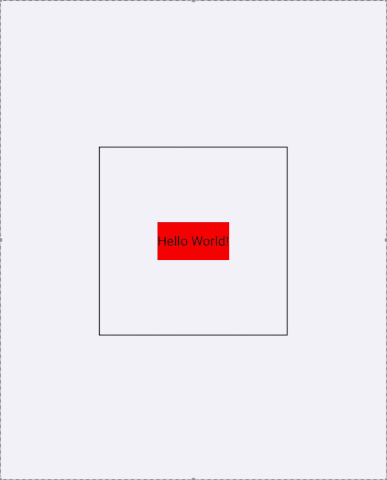
If we try this again, while setting display: contents on the View wrapper of Alerting, we only see alerts when the user presses within the original bounds of the Widget. This is because Alerting no longer adds its own box, but can still observe the pointer events bubbled from Widget.
function Alerting({children}) {
  return (
    <View
      style={{display: 'contents'}}
      onPointerDown={() => alert('Hello World!')}>
      {children}
    </View>
  );
}

// ... function Container ...
Box sizing
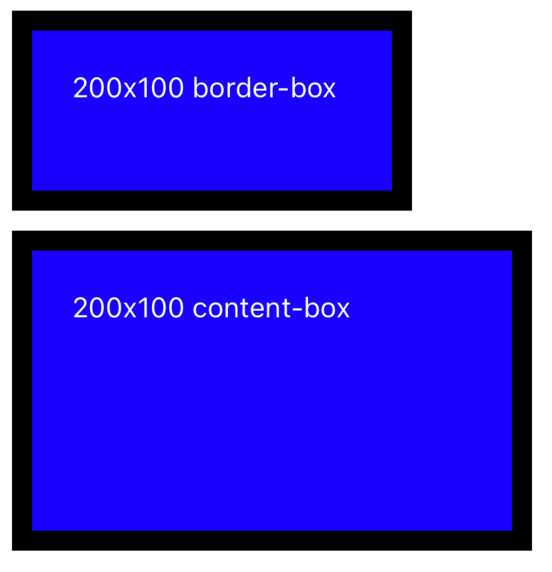
The boxSizing prop defines how the element’s various sizing props (width, height, minWidth, minHeight, etc.) are computed. If boxSizing is border-box, these sizes apply to the border box of the element. If it is content-box they apply to the content box of the element. The default value is border-box, this is different from the default value on the web. The web documentation is a good source of information if you wish to learn more about how this prop works.
border-box has been the default forever at this point, and has been the only boxSizing value up until we added content-box. Changing the default would have been a breaking change that would suddenly break several layouts. We decided to keep border-box as default value to ensure backward compatibility.
To understand the difference between border-box and content-box, have a look at these example, where both Views have padding: 20 and borderWidth: 10. When using border-box, we consider border and padding for the sizing; when using content-box, we consider only the content for the sizing.
CSS mixBlendMode
The mixBlendMode prop lets you control how an element blends its colors with the other elements in its stacking context. Check out the MDN documentation for a full overview of each blending function.
To help have more granular control about what is blending together, we also added the isolation property. Setting isolation: isolate on a View will force it to form a stacking context. So, you can set this on some ancestor View to ensure that some descendent View with mixBlendMode does not blend beyond the isolated View.
mixBlendMode Values
normal: The element is drawn on top of its background without blending.multiply: The source color is multiplied by the destination color and replaces the destination.screen: Multiplies the complements of the backdrop and source color values, then complements the result.overlay: Multiplies or screens the colors, depending on the backdrop color value.darken: Selects the darker of the backdrop and source colors.lighten: Selects the lighter of the backdrop and source colors.
color-dodge: Brightens the backdrop color to reflect the source color. Painting with black produces no changes.
color-burn: Darkens the backdrop color to reflect the source color. Painting with white produces no change.hard-light: Multiplies or screens the colors, depending on the source color value. The effect is similar to shining a harsh spotlight on the backdrop.soft-light: Darkens or lightens the colors, depending on the source color value. The effect is similar to shining a diffused spotlight on the backdrop.difference: Subtracts the darker of the two constituent colors from the lighter color.exclusion: Produces an effect similar to that of the Difference mode but lower in contrast.hue: Creates a color with the hue of the source color and the saturation and luminosity of the backdrop color.saturation: Creates a color with the saturation of the source color and the hue and luminosity of the backdrop color.color: Creates a color with the hue and saturation of the source color and the luminosity of the backdrop color. This preserves the gray levels of the backdrop and is useful for coloring monochrome images or tinting color images.luminosity: Creates a color with the luminosity of the source color and the hue and saturation of the backdrop color. This produces an inverse effect to that of the Color mode.

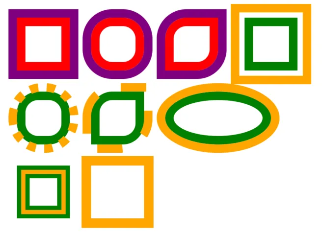
Outline props
We’ve also introduced outlineWidth, outlineStyle, outlineSpread and outlineColor. These outline props work very similar to the respective border props, but it is rendered around the border box as opposed to around the padding box. These props allow to highlight elements by drawing their outline without affecting their layout.
Check out the MDN documentation for more details.
Android version 15 support & 16KB page support
Forced edge-to-edge on Android 15
We’ve already done some work to support Android 15 on the prior release. One of the noticeable changes in Android 15 is forced edge-to-edge display when you build apps with targetSdk 35.
If you have not looked into this yet, please refer to our prior recommendation on how this should be handled as ignoring this can potentially break your UI in the app.
If you are using the react-native-safe-area-context in your app, the library is already handling the forced edge-to-edge for you.
16 KB page size support for Android
Android 15 introduces support for 16KB memory page size enabling performance improvements for apps and more, but making previous 4KB-based apps potentially incompatible on future devices; it’s currently an opt-in feature for developers to test on select devices to prepare for 16 KB page size being the OS default.
With the 0.77 release, React Native is ready to fully support 16 KB page size and developers will be able to test and ship apps for 16 KB devices using it.
Please refer to the official Android Developers site for further information on 16 KB support.
Community CLI and Template Updates
Community CLI: react-native init deprecation
This version fully completes the deprecation of the react-native init command that was introduced in React Native 0.75.
As a reminder, you won’t be able to use the react-native init command anymore, but you’ll have to either:
- Use a framework such as Expo, with its own dedicated command to create a new project:
npx create-expo-app - Invoke the Community CLI directly with
npx @react-native-community/cli init
Community CLI: Removal of “run on iOS/Android” key handlers from Metro
In this version, we removed the ‘a’ and ‘i’ keyboard shortcuts from Metro. Those shortcuts were used to invoke the run-android & run-ios community CLI commands.
Those keyboard shortcuts provided worse developer experience and were rarely used. Moreover, we believe that frameworks are better suited to orchestrate the terminal outputs.
You can read more about this change in this dedicated post.
Community Template: Swift as programming language for iOS apps
Projects using Expo should not be affected by this change.
This change let us slim down the community template by replacing three files (main.m, AppDelegate.h and AppDelegate.mm) with a single, new AppDelegate.swift.
This is technically a breaking change: you’ll see the change from Objective-C to Swift in the upgrade helper like this:
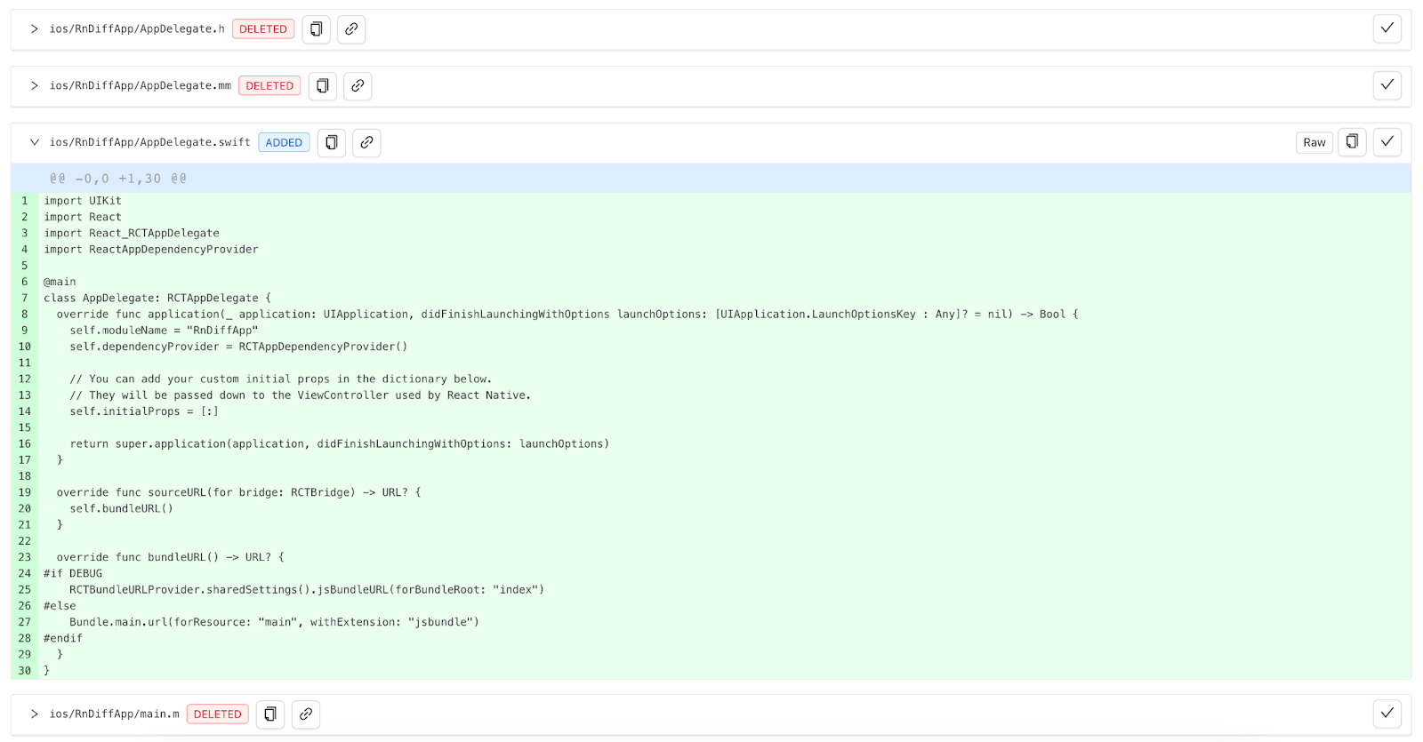
You don’t have to migrate to Swift: the Objective-C++ variant of the iOS community template is still supported (note that you still need to integrate the RCTAppDependencyProvider). New projects will be generated by using Swift as the iOS app language, although you can always migrate back to Objective-C if you need to.
Limitations
If your app has some local modules that are written in C++, you would not be able to register them in Swift as shown in this guide.
If your app falls in this category, please skip the migration of the AppDelegate to Swift, and keep using Objective-C++ for your app.
React Native core is mostly developed using C++ to encourage code sharing between iOS and Android and other platforms. The interoperability between Swift and C++ is not mature nor stable, yet. We are looking into ways to fill this gap and let you migrate to Swift too.
RCTAppDependencyProvider
React Native 0.77 slightly changes how the app loads third party dependencies. This is a new line in the community template that, if missed, can cause some runtime issues. Make sure to add it to your app.
The equivalent Objective-C lines are the following:
#import "AppDelegate.h"

#import <React/RCTBundleURLProvider.h>
#import <ReactAppDependencyProvider/RCTAppDependencyProvider.h>


@implementation AppDelegate

- (BOOL)application:(UIApplication *)application didFinishLaunchingWithOptions:(NSDictionary *)launchOptions
{
  self.moduleName = @"<Your app Name>";
  self.dependencyProvider = [RCTAppDependencyProvider new];
  // You can add your custom initial props in the dictionary below.
  // They will be passed down to the ViewController used by React Native.
  self.initialProps = @{};

  return [super application:application didFinishLaunchingWithOptions:launchOptions];
}

// remaining of the AppDelegate
Breaking Changes
Removal of console.log() streaming in Metro
We want every aspect of React Native debugging to behave reliably and to match the functionality of modern browser tooling. To meet this quality bar, log forwarding via Metro, originally deprecated in 0.76, is removed in 0.77.
This integration relied on a custom approach to communicate with the debugging target on device. With this change, we are moving exclusively to the Chrome DevTools Protocol (CDP).
- To view JS logs, please use React Native DevTools and its fully featured Console panel — supporting log filtering, rich object inspection, Live Expressions, and more.
- You can also connect VS Code as a CDP debugger, via third party extensions such as Expo Tools and Radon IDE.
- Please note that these integrations are not directly supported by the React team. However, we are working on first party VS Code support in 2025.
- Expo continues to offer log streaming in Expo CLI.
For more info, see Why are JavaScript logs leaving Metro?
Other Breaking Changes
General
- Animation
- Native looping animation do not send a React state update every time the loop ends.
- Layout
positionof sticky headers onScrollViewwill now be taken into account.- Absolute positioning is now behaving in a more compliant way
- JS Modules:
- Remove
ReactFabricInternalsmodule- This is not going to be accessible anymore
- Remove
- Native Modules
NativeModulesobject can now be used to load turbomodules in JS .- This improves compatibility between Native Modules and Turbo Native Modules
- Packages
- dev-middleware: Frameworks should specify
serverBaseUrlrelative to the middleware host
- dev-middleware: Frameworks should specify
- API Changes:
- Removed type for
useConcurrentRootfromAppRegistry, as it was already ignored - Removed
refsproperty fromNativeMethodsTypeScript definition.
- Removed type for
- UX Changes:
- Remove “run on iOS” and “run on Android” from the dev server key commands
Android
- Kotlin
- This is the first version of React Native that builds against Kotlin 2.0.21. You can read more about the changes coming with Kotlin 2.0 on the language release notes.
- API Changes:
- Nullability:
- Non-primitive getters in
ReadableArrayare now correctly typed as optional - Make
ReactHost.createSurface()method non nullable
- Non-primitive getters in
- Renamed:
DevSupportManagerBase.getCurrentContext()toDevSupportManagerBase.getCurrentReactContext()
- Nullability:
Additionally, several APIs have been removed or restricted in visibility, so they can’t be accessed anymore. Those APIs were internal and not needed to React Native developers directly. You can find the full list below:
List of Removed Android APIs:
The following packages are now internal and can’t be accessed anymore:
com.facebook.react.views.progressbarcom.facebook.react.views.safeareaviewcom.facebook.react.modules.accessibilityinfocom.facebook.react.modules.appstatecom.facebook.react.modules.clipboardcom.facebook.react.modules.devmodulecom.facebook.react.modules.reactdevtoolssettingscom.facebook.react.views.unimplementedview
The following classes are now either internal or have been removed, so can’t be accessed anymore:
BackHandler.removeEventListenerBaseViewManagerInterfaceBindingImplCompositeReactPackageDebugOverlayTags- Method
create()fromDefaultDevSupportManagerFactory DevToolsReactPerfLoggerFabricComponentsImageStoreManagerInteropModuleRegistryNativeModulePerfLoggerNoopPrinterNotThreadSafeViewHierarchyUpdateDebugListenerOkHttpCallUtilPrinterHolderPrinterReactDebugOverlayTagsReactNativeFlipperReactViewBackgroundManagerReactViewGroup.getBackgroundColor()ReactVirtualTextShadowNodeReactVirtualTextViewManagerSimpleSettableFutureSwipeRefreshLayoutManagerTaskCompletionSource- Parameter
jsBundleLoaderfrom DefaultReactHost.getDefaultReactHost()
iOS
- API Changes
- Removed
RCTConstants.RCTGetMemoryPressureUnloadLevelpartialBatchDidFlushRCTRuntimeExecutorUseNativeViewConfigsInBridgelessMode- Replaced by a proper feature flag
UseTurboModuleInteropForAllTurboModules- Interop layer is always on for TMs
- Changed
- Replace uses of
CGColorRefwithUIColor
- Replace uses of
- Removed
RCTAppDelegatenow requires to use theRCTDependencyProviderto load third party dependencies- CocoaPods sets C++ version for all the 3rd party dependencies to avoid compilation issues.
React 19?
React 19 was released the 6th of December 2024.
At the time, we already cut the branch for React Native 0.77 and we already released three RCs for React Native 0.77.
It was too late in the release of React Native 0.77 to introduce React 19 in this release.
React 19 will be shipped in React Native 0.78, and we already cut the branch for this version. You can try it by creating a new app with the command:
npx @react-native-community/cli init YourReact19App --version 0.78.0-rc.0
Acknowledgements
React Native 0.77 contains over 1061 commits from 161 contributors. Thanks for all your hard work!
Thanks to all the additional authors that worked on documenting features in this release post:
- Jakub Piasecki for contributing to the
display: contentsfeature - Nick Gerleman, Joe Vilches and Jorge Cabiedes Acosta for releasing the new styling features
- Alan Lee for the Android 16Kb page support content
- Riccardo Cipolleschi for supporting the migration of the template to Swift
- Nicola Corti for the
react-native initdeprecation cycle content - Alex Hunt for the content on the removal of
console.logfrom metro
Upgrade to 0.77
Please use the React Native Upgrade Helper to view code changes between React Native versions for existing projects, in addition to the Upgrading docs.
To create a new project:
npx @react-native-community/cli@latest init MyProject --version latest
If you use Expo, React Native 0.77 will be supported in Expo SDK 52 (instructions on how to update React Native inside your Expo project to 0.77.0 will be available in a separate Expo blog post in the near future).
0.77 is now the latest stable version of React Native and 0.74.x moves to unsupported. For more information see React Native’s support policy. We aim to publish a final end-of-life update of 0.74 in the near future.
Source: Read More
