Ensuring accessibility is not just a compliance requirement but a responsibility. According to the World Health Organization (WHO), over 1 in 6 people globally live with some form of disability. These users often rely on assistive technologies like screen readers, keyboard navigation, and transcripts to access digital content. Unfortunately, many websites and applications fall short due to basic accessibility oversights. Accessibility testing plays a crucial role in identifying and addressing these issues early. Addressing common accessibility issues not only helps you meet standards like WCAG, ADA, and Section 508, but also improves overall user experience and SEO. A more inclusive web means broader reach, higher engagement, and ultimately, greater impact. Through this article, we explore common accessibility issues found in real-world projects. These are not theoretical examples; they’re based on actual bugs discovered during rigorous testing. Let’s dive into the practical breakdown of accessibility concerns grouped by content type.
1. Heading Structure Issues
Proper heading structures help users using screen readers understand the content hierarchy and navigate pages efficiently.
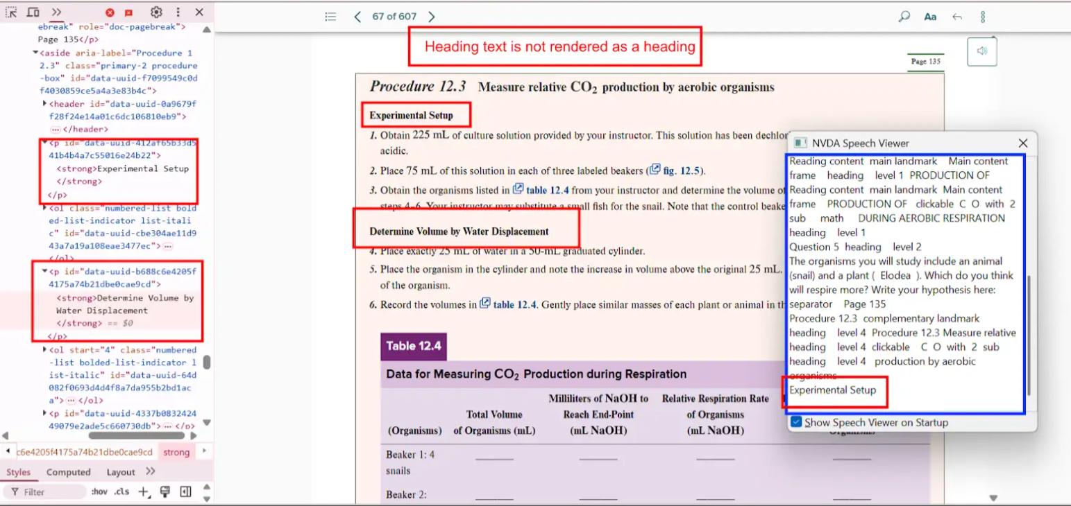
Bug 1: Heading Not Marked as a Heading

- Actual: The heading “Project Scope Statement” is rendered as plain text without any heading tag.
- Expected: Apply appropriate semantic HTML like
<h1>,<h2>, etc., to define heading levels. - Impact: Users relying on screen readers may miss the section altogether or fail to grasp its significance.
- Tip: Always structure headings in a logical hierarchy, starting with
<h1>.
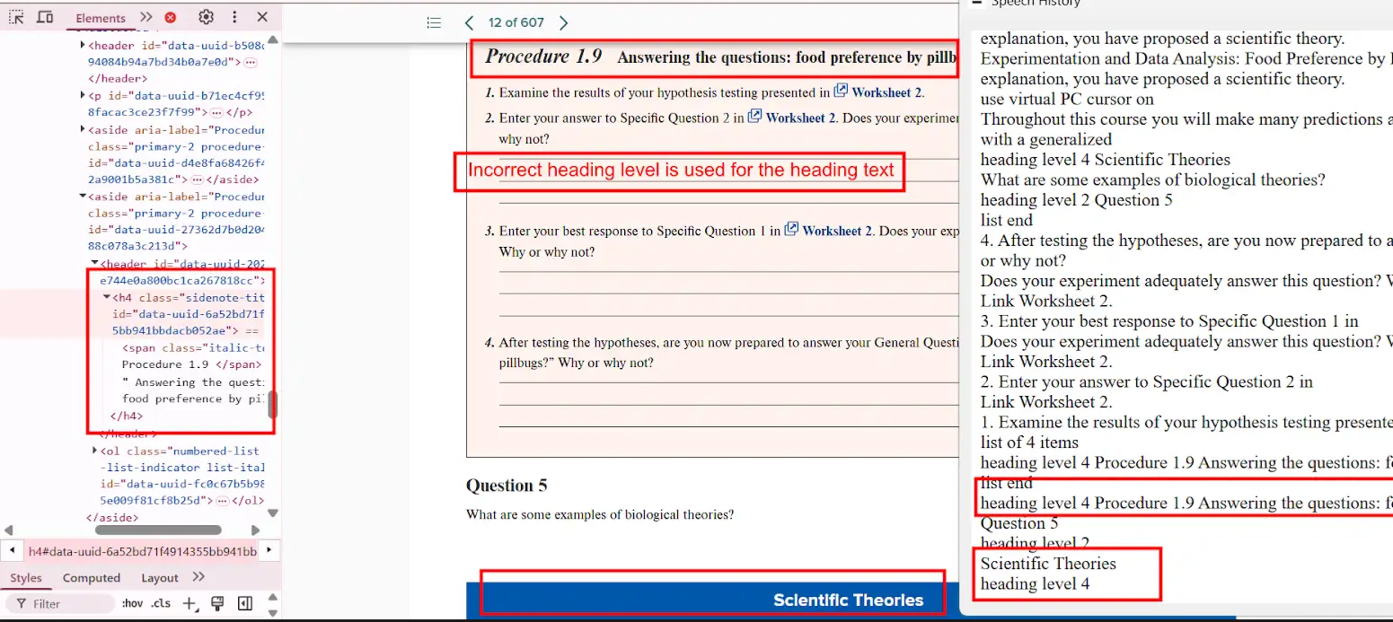
Bug 2: Incorrect Heading Level Used

- Actual: “Scientific Theories” is read as
<h4>, although it should be a sub-section of an<h4>heading. - Expected: Adjust the tag to
<h5>or correct parent heading level. - Impact: Breaks logical flow for assistive technologies, causing confusion.
- Tip: Use accessibility tools like the WAVE tool to audit heading levels.
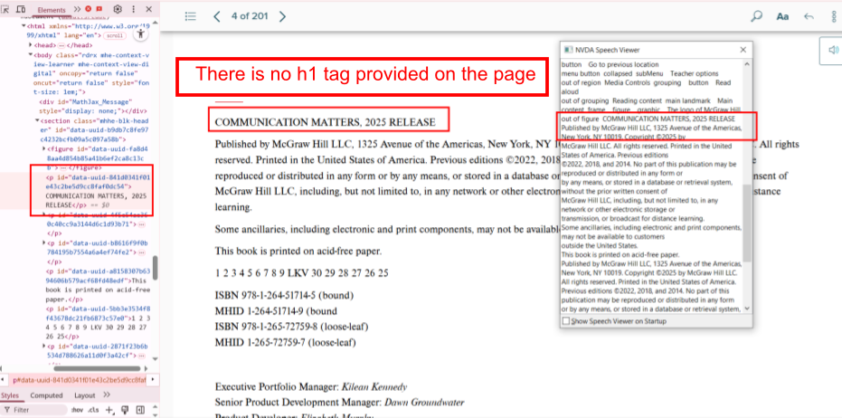
Bug 3: Missing <h1> Tag

- Actual: The page lacks an
<h1>tag, which defines the main topic. - Expected: Include an
<h1>tag at the top of every page. - Impact: Reduces both accessibility and SEO.
- Tip:
<h1>should be unique per page and describe the page content.
2. Image Accessibility Issues
Images need to be accessible for users who cannot see them, especially when images convey important information.
Bug 4: Missing Alt Text for Informative Image
- Actual: Alt attribute is missing for an image containing instructional content.
- Expected: Provide a short, meaningful alt text.
- Impact: Screen reader users miss essential information.
- Tip: Avoid using “image of” or “picture of” in alt text; go straight to the point.
Bug 5: Missing Long Description for Complex Image
- Actual: A complex diagram has no detailed description.
- Expected: Include a
longdescor use ARIA attributes for complex visuals. - Impact: Users miss relationships, patterns, or data described.
- Tip: Consider linking to a textual version nearby
3. List Markup Issues
List semantics are crucial for conveying grouped or ordered content meaningfully.
Bug 7: Missing List Tags
- Actual: A series of points is rendered as plain text.
- Expected: Use
<ul>or<ol>with<li>for each item. - Impact: Screen readers treat it as one long paragraph.
- Tip: Use semantic HTML, not CSS-based visual formatting alone.
Bug 8: Incorrect List Type
- Actual: An ordered list is coded as
<ul>. - Expected: Replace
<ul>with<ol>where sequence matters. - Impact: Users can’t tell that order is significant.
- Tip: Use
<ol>for steps, sequences, or rankings.
Bug 9: Single-Item List
- Actual: A list with only one
<li>. - Expected: Remove the list tag or combine with other content.
- Impact: Adds unnecessary navigation complexity.
- Tip: Avoid lists unless grouping multiple elements.
Bug 10: Fragmented List Structure
- Actual: Related list items split across separate lists.
- Expected: Combine all relevant items into a single list.
- Impact: Misrepresents logical groupings.
- Tip: Use list nesting if needed to maintain hierarchy.
4. Table Accessibility Issues
Tables must be well-structured to be meaningful when read aloud by screen readers.
Bug 11: Missing Table Headers
- Actual: Data cells lack
<th>elements. - Expected: Use
<th>for headers, with appropriatescopeattributes. - Impact: Users can’t understand what the data represents.
- Tip: Define row and column headers clearly.
Bug 12: Misleading Table Structure
- Actual: Table structure inaccurately reflects 2 rows instead of 16.
- Expected: Ensure correct markup for rows and columns.
- Impact: Critical data may be skipped.
- Tip: Validate with screen readers or accessibility checkers.
Bug 13: Inadequate Table Summary
- Actual: Blank cells aren’t explained.
- Expected: Describe cell usage and purpose.
- Impact: Leaves users guessing.
- Tip: Use ARIA attributes or visible descriptions.
Bug 14: List Data Formatted as Table
- Actual: Single-category list shown in table format.
- Expected: Reformat into semantic list.
- Impact: Adds unnecessary table complexity.
- Tip: Choose the simplest semantic structure.
Bug 15: Layout Table Misuse
- Actual: Used tables for page layout.
- Expected: Use
<div>,<p>, or CSS for layout. - Impact: Screen readers misinterpret structure.
- Tip: Reserve
<table>strictly for data.
Bug 16: Missing Table Summary
- Actual: No summary for complex data.
- Expected: Add a concise summary using
summaryoraria-describedby. - Impact: Users cannot grasp table context.
- Tip: Keep summaries short and descriptive.
Bug 17: Table Caption Missing
- Actual: Title outside of
<table>tags. - Expected: Use
<caption>within<table>. - Impact: Screen readers do not associate title with table.
- Tip: Use
<figure>and<figcaption>for more descriptive context.
5. Link Issues
Properly labeled and functional links are vital for intuitive navigation.
Bug 18: Inactive URL
- Actual: URL presented as plain text.
- Expected: Use anchor tag
<a href="">. - Impact: Users can’t access the link.
- Tip: Always validate links manually during testing.
Bug 19: Broken or Misleading Links
- Actual: Links go to 404 or wrong destination.
- Expected: Link to accurate, live pages.
- Impact: Users lose trust and face navigation issues.
- Tip: Set up automated link checkers.
6. Video Accessibility Issues
Accessible videos ensure inclusion for users with hearing or visual impairments.
Bug 20: Missing Transcript
- Actual: No transcript provided for the video.
- Expected: Include transcript button or inline text.
- Impact: Hearing-impaired users miss information.
- Tip: Provide transcripts alongside or beneath video.
Bug 21: No Audio Description
- Actual: Important visuals not described.
- Expected: Include described audio track or written version.
- Impact: Visually impaired users lose context.
- Tip: Use tools like YouDescribe for enhanced narration.
7. Color Contrast Issues (CCA)
Contrast ensures readability for users with low vision or color blindness.
Bug 22: Poor Contrast for Text
- Actual: Ratio is 1.9:1 instead of the required 4.5:1.
- Expected: Maintain minimum contrast for normal text.
- Impact: Text becomes unreadable.
- Tip: Use tools like Contrast Checker to verify.
Bug 23: Low Contrast in Charts
- Actual: Graph fails the 3:1 non-text contrast rule.
- Expected: Ensure clarity in visuals using patterns or textures.
- Impact: Data becomes inaccessible.
- Tip: Avoid using color alone to differentiate data points.
Bug 24: Color Alone Used to Convey Info
- Actual: No labels, only color cues.
- Expected: Add text labels or icons.
- Impact: Colorblind users are excluded.
- Tip: Pair color with shape or label.
8. Scroll Bar Issues
Horizontal scroll bars can break the user experience, especially on mobile.
Bug 25: Horizontal Scroll at 100% Zoom
- Actual: Page scrolls sideways unnecessarily.
- Expected: Content should be fully viewable without horizontal scroll.
- Impact: Frustrating on small screens or for users with mobility impairments.
- Tip: Use responsive design techniques and test at various zoom levels.
Conclusion
Accessibility is not a one-time fix but a continuous journey. By proactively identifying and resolving these common accessibility issues, you can enhance the usability and inclusiveness of your digital products. Remember, designing for accessibility not only benefits users with disabilities but also improves the experience for everyone. Incorporating accessibility into your development and testing workflow ensures legal compliance, better SEO, and greater user satisfaction. Start today by auditing your website or application and addressing the bugs outlined above.
Frequently Asked Questions
-
What are common accessibility issues in websites?
They include missing alt texts, improper heading levels, broken links, insufficient color contrast, and missing video transcripts.
-
Why is accessibility important in web development?
It ensures inclusivity for users with disabilities, improves SEO, and helps meet legal standards like WCAG and ADA.
-
How do I test for accessibility issues?
You can use tools like axe, WAVE, Lighthouse, and screen readers along with manual QA testing.
-
What is color contrast ratio?
It measures the difference in luminance between foreground text and its background. A higher ratio improves readability.
-
Are accessibility fixes expensive?
Not fixing them is more expensive. Early-stage remediation is cost-effective and avoids legal complications.
The post Common Accessibility Issues: Real Bugs from Real Testing appeared first on Codoid.
Source: Read More


