
If you have experience in traditional software development, low-code tools may feel a bit sparse at first. But to many people’s surprise, traditional techniques often translate quite well to low-code development. Not always one-for-one – but usually close enough.
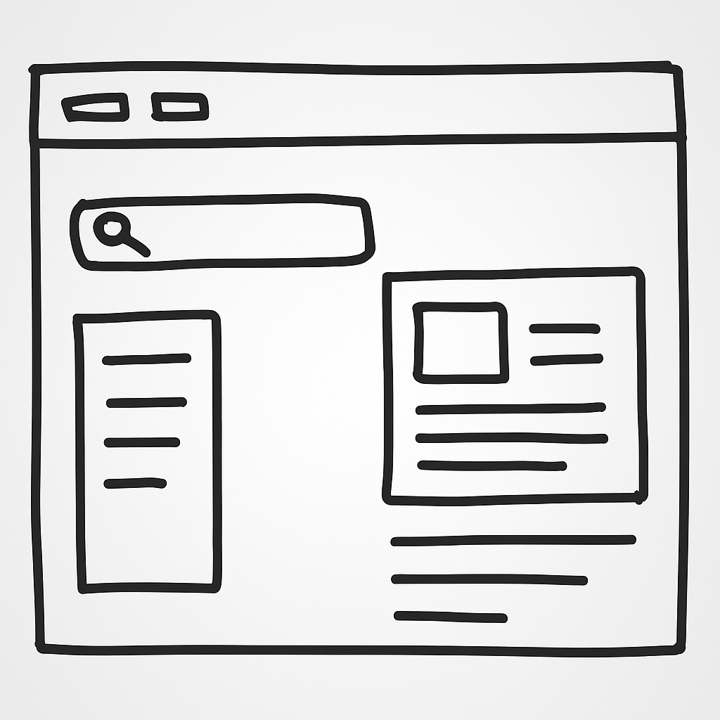
One of the most fundamental tasks when building an application is breaking it down into its core parts, or components. Websites are constructed from smaller building blocks. Just how small? Well, that’s up to you, the developer.
In the example below, we can spot some obvious elements: a header, a search box, perhaps a sidebar for navigation, and a main content area. Applications emerge from many smaller parts coming together.
Components allow us to isolate responsibility and manage complexity for specific parts of an application. In both traditional and low-code development, they play a vital role in creating maintainable, reusable, and testable products.
In this article, you’ll learn what a component is. Then we’ll build a custom text field component inside a Canvas app.
Prerequisites
This tutorial assumes a basic understanding of Microsoft Power Apps. While not required to understand the article, to actively follow along, you’ll need access to a Power Platform environment with the App Maker security role.
Table of Contents
The Concept of a Component
The idea of components isn’t new – and it’s not exclusive to software.
Let’s think about a car for a moment. A car is made up of many smaller parts: wheels, an engine, seats, a steering wheel, and so on. But it’s the concept of the car – and specifically its ability to transport us – that provides value. That concept emerges from the way the individual parts work together.
Now imagine you get a flat tire. Not a good day. But thanks to how cars are designed, you don’t need a whole new car – maybe not even a new tire. You fix the issue and you’re back on the road within a few hours. Breaking things into smaller parts helps make the whole system more resilient. Applying this same principle to application development is a smart, future-proof approach.
Two Broad Types of Components
Within an application, components can vary in complexity and responsibility. Some are simple, like a text label. Others are more complex, like a pop-up dialog. Regardless of their complexity (again, your design choice), components typically fall into one of two categories:
-
Presentational (“Dumb”) Components
-
Container (“Smart”) Components
The difference comes down to purpose. A container component may interact with external sources and usually mutates state. A presentational component, on the other hand, is generally only responsible for how things look and light communication with the application.
Container components are often more complex and harder to test. Presentational components are typically simpler and more predictable.
This isn’t to say you should avoid container components. That’s not realistic. At some point, your app will need to talk to the outside world.
Aside: Pure Functions
The concept of pure functions is useful here.
A function is considered pure if it always returns the same output for the same input and doesn’t interact with any external state.
<span class="hljs-comment">// Example 1 (pure)</span>
<span class="hljs-function"><span class="hljs-keyword">function</span> <span class="hljs-title">add</span>(<span class="hljs-params">x, y</span>) </span>{
  <span class="hljs-keyword">return</span> x + y;
}

<span class="hljs-built_in">console</span>.log(add(<span class="hljs-number">2</span>, <span class="hljs-number">3</span>)); <span class="hljs-comment">// Always 5</span>

<span class="hljs-comment">// Example 2 (not pure)</span>
<span class="hljs-function"><span class="hljs-keyword">function</span> <span class="hljs-title">subtract</span>(<span class="hljs-params">x</span>) </span>{
  <span class="hljs-keyword">const</span> y = <span class="hljs-built_in">Math</span>.floor(<span class="hljs-built_in">Math</span>.random() * <span class="hljs-number">100</span>) + <span class="hljs-number">1</span>; <span class="hljs-comment">// Random number between 1 - 100</span>
  <span class="hljs-built_in">console</span>.log(y);
  <span class="hljs-keyword">return</span> x + y;
}

<span class="hljs-built_in">console</span>.log(subtract(<span class="hljs-number">5</span>)); <span class="hljs-comment">// Unpredictable</span>
Just like add() is pure and subtract() is not, a presentational component behaves like a pure function: same input, same output. The output might be how the UI appears or an event with associated data.
More About Inputs and Outputs
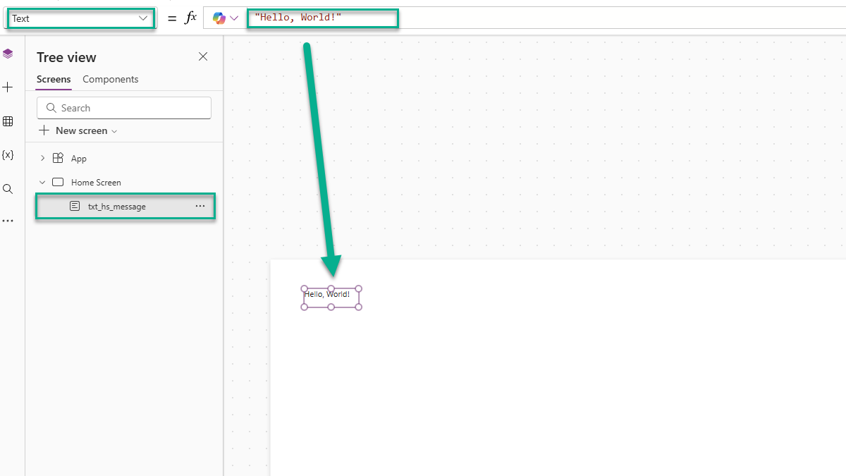
If you’ve built a Canvas App before, you’ve already used components – even if you didn’t realize it. Most controls in a Canvas App are presentational components.
Take the Label control. It receives an input (Text) and renders output (the text on screen).
Events are another kind of output. For example, the Button control emits an event when clicked – handled through the OnSelect property. That property allows the app to respond to the click and perform some logic.
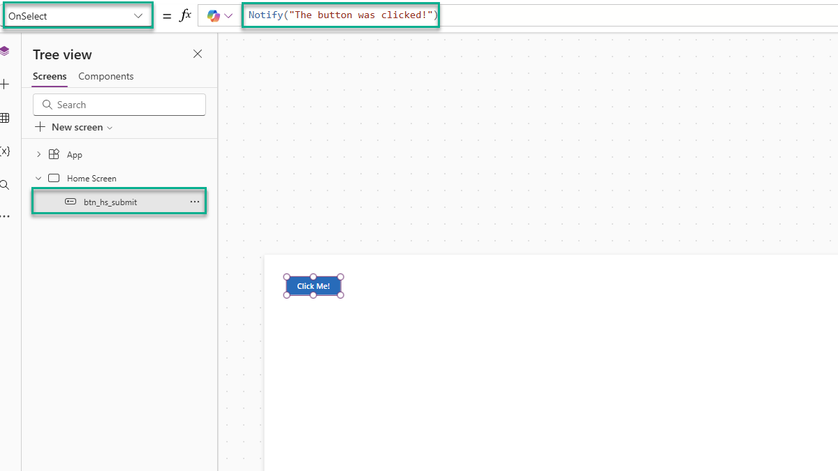
💡 When a component sends a message back to the application the component is said to have emitted an event.
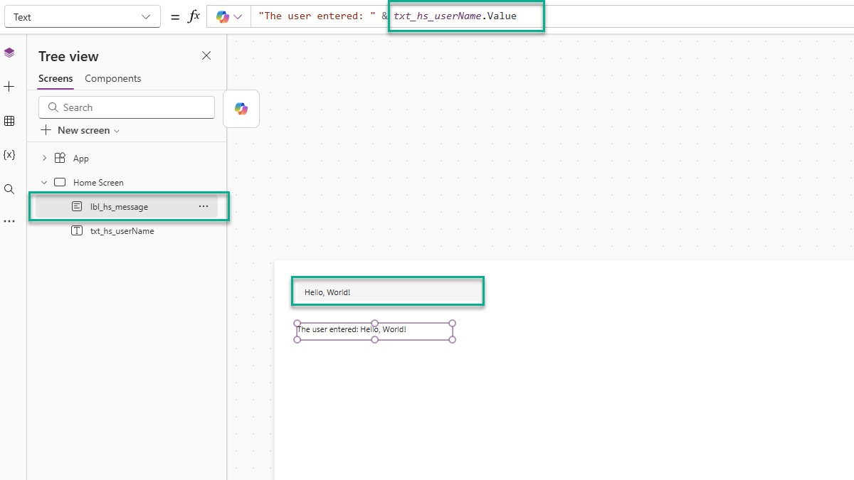
Now let’s look at the Text Input control.
Like the others, it has inputs (like Placeholder). But it also emits a Change event via OnChange. Even better, it passes data back to the application through its Value property. As the user types, the value updates. That value is how we access what they typed.
How to Build Your Own Component
Let’s build a simple, customized input component. It will include:
-
A label above the input
-
Optional “required” validation
-
Change detection and data output
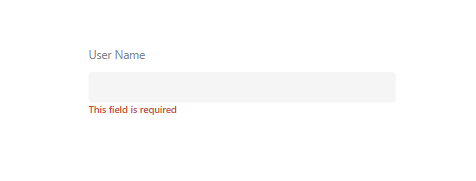
Here is what it will look like:
Part 1: Create the Component
-
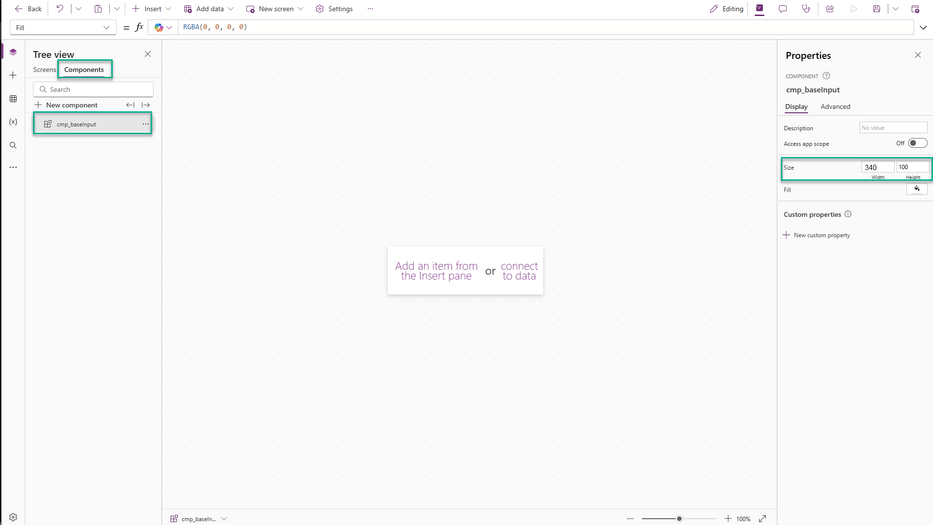
Navigate to the Components section of your Canvas App.
-
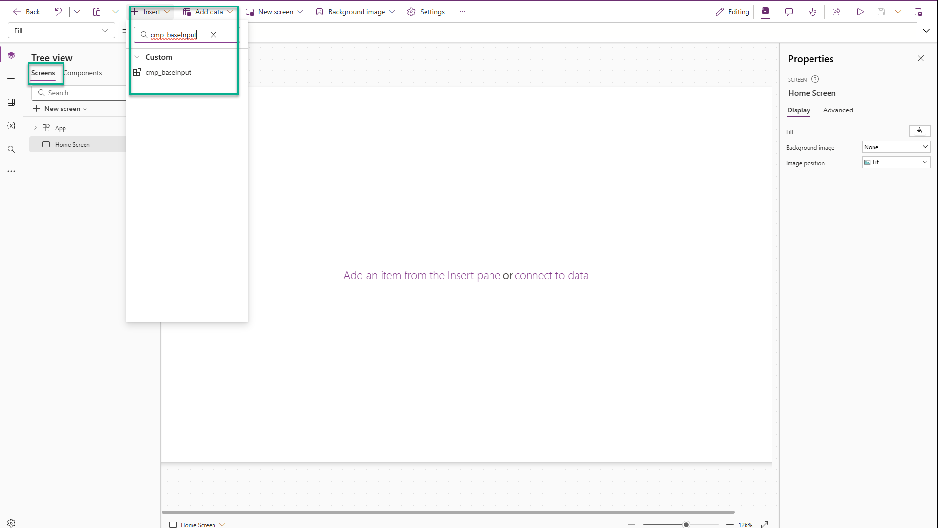
Add a new component and name it
cmp_baseInput. -
Resize it to 340 (w) x 100 (h).
Part 2: Add Controls
-
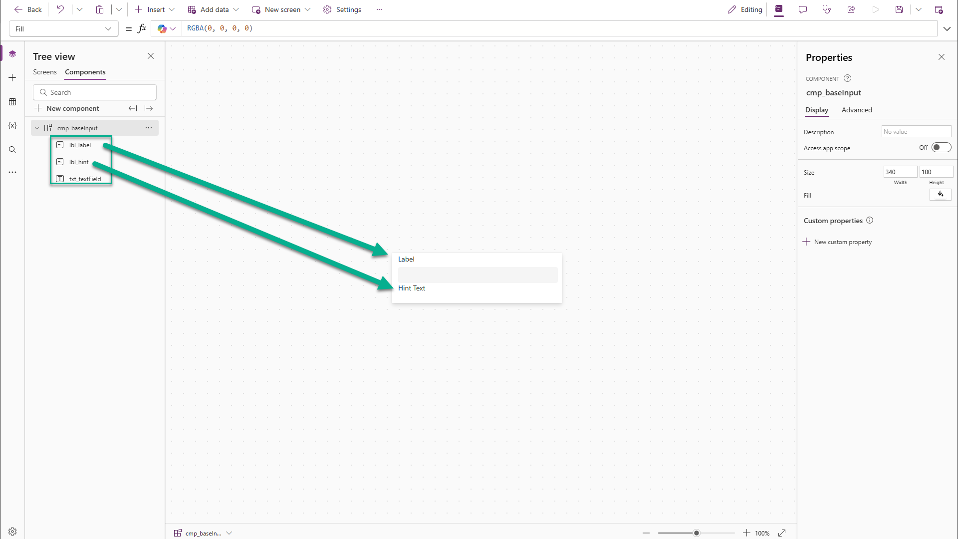
Add a Text Input control, centered.
-
Add two Labels—one above, one below the input.
-
Rename them:
-
lbl_label -
lbl_hint -
txt_textField
-
Part 3: Add Custom Properties
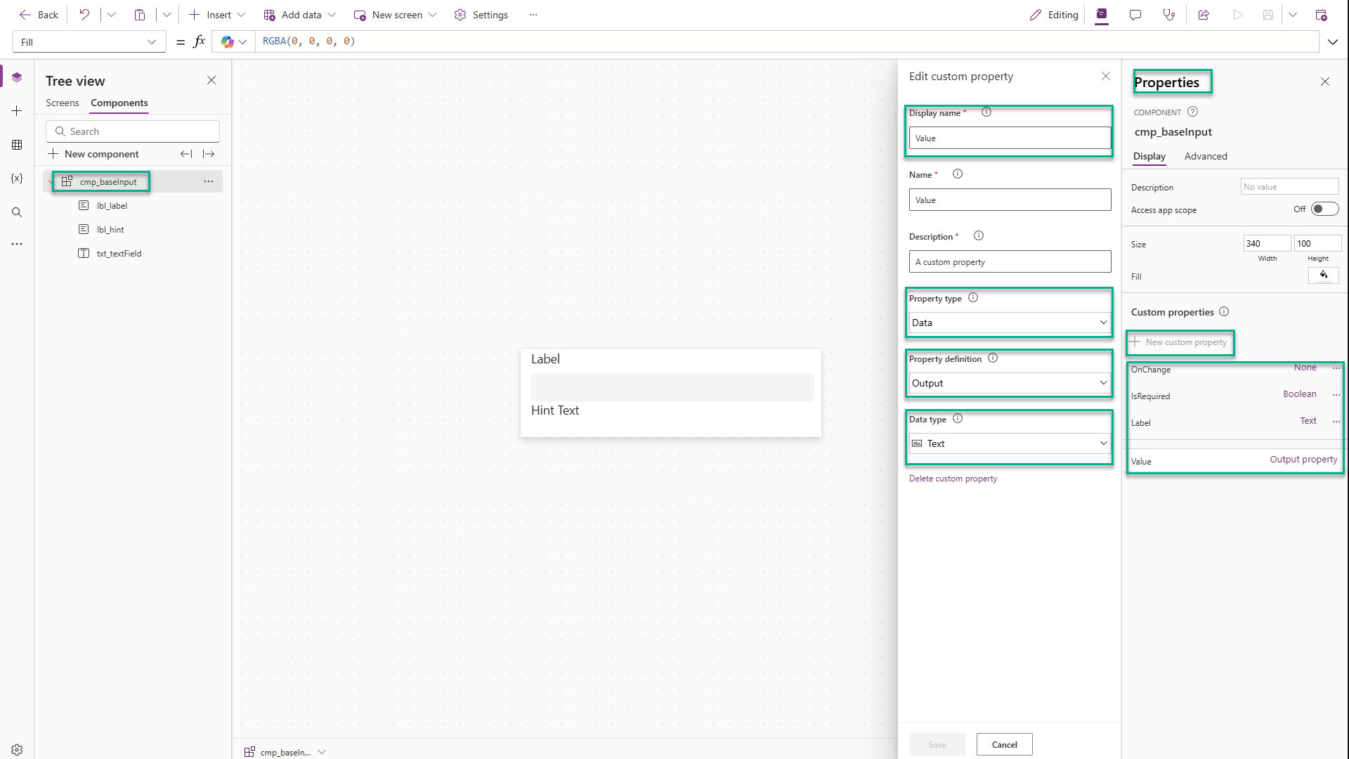
Add four properties to the component. We’re primarily concerned with the Property Type, Property Definition, and Data Type properties.
-
IsRequired(Data, Input, Boolean) -
Label(Data, Input, Text) -
Value(Data, Output, Text) -
OnChange(Event)
Part 4: Connect the Properties
Set the control’s properties as follows.
lbl_label.Text = cmp_baseInput.Label

lbl_hint.Text = "This field is required."
lbl_hint.Visible = cmp_baseInput.IsRequired And Len(txt_textField.Value) < 1

txt_textField.OnChange = cmp_baseInput.OnChange()

cmp_baseInput.Value = txt_textField.Value
cmp_baseInput.Label = "Placeholder Label"
Part 5: Style It
lbl_label.Size = 12
lbl_label.Height = 24
lbl_label.FontColor = RGBA(122, 138, 143, 1)

lbl_hint.Size = 10
lbl_hint.Height = 24
lbl_hint.FontColor = RGBA(215, 58, 60, 1)
lbl_hint.FontWeight = 'TextCanvas.Weight'.Semibold
Part 6: Add It to the App
-
Go back to the application screen.
-
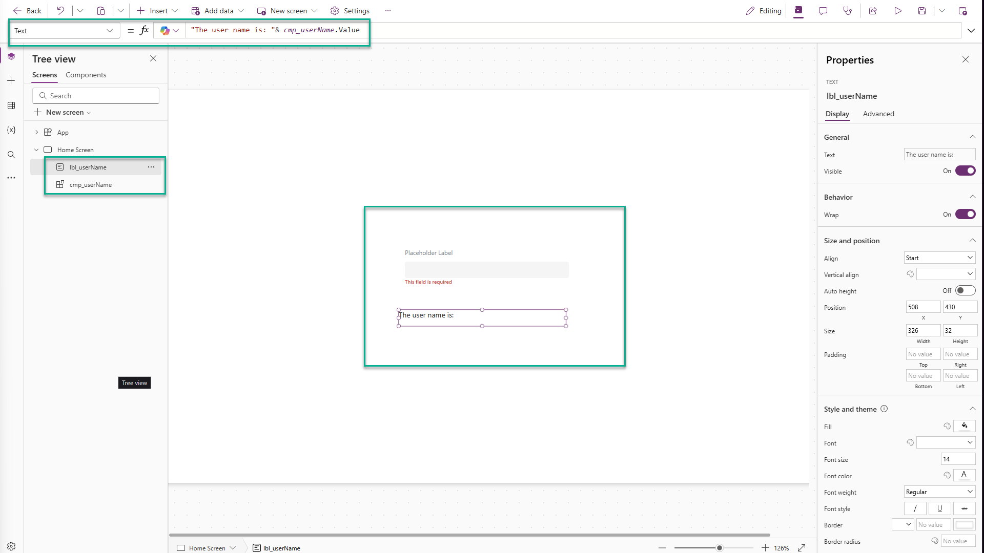
Insert the component and name it
cmp_userName. -
Add a label nearby and set its text to:
"The user name is: " & cmp_userName.Value
Part 7: Test It
-
Type in the component and click outside of it → label near the component updates and the hint disappears.
-
Clear the text → hint reappears
-
Set
IsRequiredto false → hint disappears -
Set
OnChangetoNotify("A change occurred!")and type in the input→ a toast message appears with you notification.
Wrapping Up
You’ve just created a functional, presentational component. It handles labels, validation, value output, and even events – all in one package.
This is the real power of components: abstraction, clarity, and reusability. Whether you’re in a traditional or low-code environment, thinking in components helps you break complexity into manageable parts.
As your apps grow, this mindset will pay off. You’ll spend less time rewriting logic and more time building value – one well-defined part at a time.
Enjoyed this article? I write regularly about low-code, development patterns, and practical tech topics at scriptedbytes.com
Stay curious and keep building.
Source: freeCodeCamp Programming Tutorials: Python, JavaScript, Git & MoreÂ

