


If you work with data or plan to in the future, at some point you’ll likely need to build a comprehensive analytics dashboard.
Sharing data through charts is a great way to provide others with a clearer understanding of this information. Pairing it with a pivot table is also a smart approach, allowing you to view your data from different perspectives. And what if you could also aggregate data and customize charts to suit your needs?
In this guide, I’ve consolidated my knowledge on creating an analytics dashboard in Next.js using Flexmonster and Highcharts. To make it engaging, we’ll explore some interesting survey results about passenger flying etiquette. I hope you find it helpful. Let’s roll!
Table of Contents
Prerequisites
-
Install Next.js (installation guide here)
-
In this project we’ll use the
flexmonster,react-flexmonster, andhighchartslibraries.
npm i react flexmonster react-flexmonster highcharts highcharts-react-official
npm i -g flexmonster-cli
These are paid tools for sharing analytics but offer more options for working with data and customization. You can also use free/open-source alternatives like:
Data/Analytics Libraries:
-
PivotTable.js — basic open-source pivot functionality
-
Orb — clean pivot UI with neat design
-
WebDataRocks — modern, free pivot table solution
Charts:
-
Nivo — awesome free charts with D3 power
-
Chart.js — simple yet powerful canvas charts
-
Recharts — React components for D3 charts
The Subject Area
Have you ever been curious about why people get so angry on planes with others’ behavior? Or maybe you’re that person who’s… misbehaving? Have you wondered if it’s okay to bother your neighbors onboard, whether it’s for stepping out of your seat or asking for something?
Imagine: you board a plane with your friends, and you are seated apart, not all together. You want to change places with someone to sit near each other. How likely is it that the person next to you will consider this to be rude or unacceptable?
We can explore these questions through a survey on passenger etiquette conducted by ABC News. Our goal is to examine passengers’ attitudes toward in-flight interactions and present our findings with charts and a pivot table. The complete survey data is sourced from here.
In this guide, I’ll highlight some intriguing correlations between different social groups and their perspectives on certain questions, such as:
-
The impact of age and income on overall dissatisfaction.
-
What behaviors do passengers consider the rudest?
-
How does traveling with children affect the flight experience?
-
Which social groups tend to leave the flight most satisfied or dissatisfied?
-
Who is more likely to break flight rules?
The Final Dashboard
In this tutorial, we’ll create an interactive dashboard using Next.js, featuring a pivot table and several charts on the final page.

Tools
I was looking for the tools that offer customizable and functional UI, wide range of chart types and pivot table features. So, I focused on Flexmonster for creating tables and Highcharts for the charts. These tools offer user-friendly interfaces, extensive customization options, handle large datasets, and integrate with each other.
Now, let’s delve into the process of integration.
How to Configure Highcharts and Flexmonster for Our Next.js App
In order to create the analytical dashboard, you’ll need to install the libraries and configure your project.
1. Define the Next.js project:
npx create-next-app flexmonster-project --ts --app
cd flexmonster-project
2. Get the Flexmonster wrapper for React:
flexmonster add react-flexmonster
Got it, libraries are now actually installed! Now, let’s move further, embedding them into the project.
3. Import Flexmonster styles to global.css:
@import "flexmonster/flexmonster.css";
4. Create the wrapper
Now you’ll create the wrapper for your future pivot table that integrates Flexmonster and Highcharts. First, let’s create a PivotWrapper.tsx file.
'use client'
import * as React from 'react';
import * as FlexmonsterReact from "react-flexmonster";
import Flexmonster from 'flexmonster';
import "flexmonster/lib/flexmonster.highcharts.js";


// take general Flexmonster parameters and some special for Next.js
type PivotProps = Flexmonster.Params & {
    pivotRef?: React.ForwardedRef<FlexmonsterReact.Pivot>;
  }

// pivotRef provides a reference to the Flexmonster instance for accessing the Flexmonster API.
const PivotWrapper: React.FC<PivotProps> = ({ pivotRef, ...params}) => {
    return (
        <FlexmonsterReact.Pivot
            {...params}
            ref={pivotRef}
        />
    )
}

export default PivotWrapper;
5. Import the wrapper
Now, import the wrapper in the analytical-dashboard/page.tsx file. You can change the route name analytical-dashboard to your liking:
"use client"
import * as React from "react";
import type { Pivot } from "react-flexmonster";
import dynamic from "next/dynamic";
import * as Highcharts from 'highcharts';
import HighchartsReact from 'highcharts-react-official';


// Load the wrapper dynamically
const PivotWrap = dynamic(() => import('@/app/PivotWrapper'), {
    ssr: false,
    loading: () => <h1>Loading Flexmonster...</h1>
});


const ForwardRefPivot = React.forwardRef<Pivot, Flexmonster.Params>((props, ref?: React.ForwardedRef<Pivot>) =>
    <PivotWrap {...props} pivotRef={ref} />

)

ForwardRefPivot.displayName = 'ForwardRefPivot';
By the way, Flexmonster supports dynamic loading for its tables, which provides a smooth experience when extracting large amounts of data.
6. Place your pivot wrapper and charts into the dashboard.
Let’s define a WithHighcharts() function to render our dashboard and work with its essential parts. First, we’ll initialize the ref object for the pivot table to access it and its events. The charts will be created in the createChart() function, which runs when pivot data loads (in the reportComplete event). Finally, we return the layout function.
Add the code below to the analytical-dashboard/page.tsx file:
export default function WithHighcharts() {
    const pivotRef: React.RefObject<Pivot> = React.useRef<Pivot>(null);

    const reportComplete = () => {
        pivotRef.current!.flexmonster.off("reportComplete", reportComplete);
        createChart();
    }

    // define and create charts on the page. Called when data loading is successfully completed
    const createChart = () => {
        // here we will place charts rendering later
    }

    return (
        <div className="App">
            <div id="pivot-container" className="">
              <ForwardRefPivot
                ref={pivotRef}
                toolbar={true}
                beforetoolbarcreated={toolbar => {
                  toolbar.showShareReportTab = true;
                }}
                shareReportConnection={{
                  url: "https://olap.flexmonster.com:9500"
                }}
                width="100%"
                height={600}
                report = {{
                  dataSource: {
                    type: "csv",
                    // connect to our dataset
                    filename: "https://query.data.world/s/vvjzn4x5anbdunavdn6lpu6tp2sq3m?dws=00000"
                  }
                }}
                reportcomplete={reportComplete}
                // your license key
                licenseKey="XXXX-XXXX-XXXX-XXXX-XXXX"
              />
          </div>

          // here we will place chart layouts
    )
}
7. Run the application:
npm run build
npm start
If you are interested in a detailed integration of Flexmonster with Next.js and Highcharts, you can check the complete documentation that I’ve linked here.
For now, we’ve set up a blank dashboard that’s ready to be populated with data. In the next section, I’ll walk you through the overall chart definition process and highlight some key considerations.
First, you’ll need to ensure that your charts update based on the filters applied to the grid. For that, you need to add the following snippet of code:
 React.useEffect(() => {
    if (pivotRef.current) {
        const pivot = pivotRef.current.flexmonster;

        // Trigger the chart update when data changes
        pivot.on('dataChanged', createChart);
        pivot.on('filterclose', createChart);


        return () => {
          pivot.off('dataChanged', createChart);
          pivot.off('filterclose', createChart);
        }
    }
}, [pivotRef]);
In this case, Next.js tracks the filterClose event and triggers the createChart() function, which updates the charts. Unfortunately, there is no event for filter changes, only for filter pop-up window opening/closing. So, I used the event that triggers on filter pop-up window closing, as I usually use it for applying filters. You can read more about Flexmonster events here.
How to Set Up the Dashboard
To get started, let’s get acquainted with our pivot table. The upcoming charts will draw information directly from it, so it’s a good idea to first understand how the dashboard works.
In the previous step, we already created a default grid. If you run it now, it will look like this:

It simply displays some default data from the dataset. Not bad, but we want to configure more representative data and explore the full potential of Flexmonster.
1. Configure the pivot table
The main buttons that allow you to configure what and how the data is displayed in the table are Format, Settings, and Fields. We’ll start with Fields.

By opening the Fields tab, you can select which columns from your dataset you want to display in the table. What shall we choose?
Hmm… It seems interesting to see the percentage distribution of respondents of different ages across various regions. Some polled regions likely have more older respondents, some younger, and others may have a balanced mix. This is more about analyzing the composition of the survey itself, but it’s a good start.
To achieve this, select the necessary fields in Rows and Columns. Next, choose the function to calculate the final values. There are quite a few options, but we’ll go with Percentage of column. As a result, you’ll get the percentage distribution of respondents of specific age groups in each region.
Here we go:

Alright, let’s tidy up this table a bit. We’ll keep just one decimal place, which you can do in the Format tab like this:

It’s quite simple: select the required field (in this case, there will only be one) in the Choose Value field and set Decimal Places to 1.
We’ll also remove the Grand Totals since they are unnecessary for our purposes. You can do this in the Settings tab:

Finally, we’ll want to remove blank responses. This is a feature of the selected dataset – some respondents chose not to answer certain questions, leaving the response field blank. For our analysis, this data is unnecessary, so we’ll filter it out.

And here’s how the table looks now. Quite neat!
2. Conditional Formatting
Now we want to set up conditional formatting to highlight standout data. The table is already configured, but adding visual cues will make the information easier to interpret. Fortunately, Flexmonster supports this feature, so let’s use it.
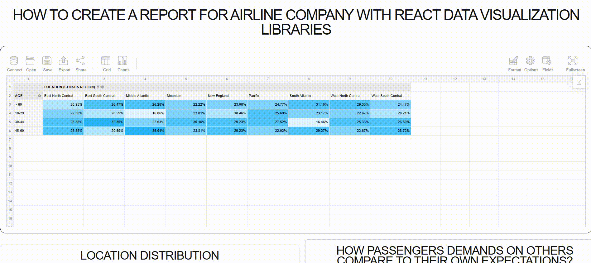
Here’s my idea: we want to identify areas where the distribution of respondents by age is uneven. We have four age ranges: youngsters (18-29), millennials (30-44), Gen X (45-59), and seniors (60+). In a balanced distribution, each age group should account for 100/4 = 25% (with a margin of ±2÷3%).
Here’s the plan:
-
22-27%: Average distribution (within range).
-
17-22% or 27-32%: slightly underrepresented or overrepresented.
-
<17% or >32%: strongly underrepresented or overrepresented.
In the Format tab, select Conditional Formatting and add conditions. Define the range with the value it applies to, and the highlight color. As a result, you’ll get a table that looks like this:

According to the table, most respondents are middle-aged. In some cases, they make up the majority of polled people of their region. The most unbalanced distribution is around the East South Central and Middle-Atlantic states. There are overrepresented in one age group, and underrepresented in others.
Awesome! We’ve explored the Flexmonster table. Beyond displaying data, it can also filter data for all our upcoming charts. Let’s move on to setting up the charts, and I’ll show you how the table can influence its data.
How to Set Up the Chart Configuration
In this section, we’ll create pie, bar, column, area, and line charts. It sounds like a lot, but Highcharts provides a wide range of chart types. You can also customize them to your liking.
First, we’ll create a pie chart showing location distribution of passengers. While a basic pie chart would typically be a circle, I’m opting for a donut chart instead. This example demonstrates the common chart configuration process. For other charts, simply modify the chart type, rows, and measures. You can also play with dataset fields and chart types to your liking.
1. Insert Highcharts into the page.
First, move down to the return() section. at the bottom, leave a free place for the chart layouts. So, here we’ll insert the first <div> block to store the future pie chart. As it’s about the etiquette of passengers onboard, let’s assign it an id of chart-location-distribution:
<div className="chart-item">
  <h2>Location Distribution</h2>
  <div id="chart-location-distribution"></div>
</div>
2. Define the chart options.
Let’s move on to the createChart() function. At the moment, it’s empty. To define the chart, paste pivotRef.current!.flexmonster.highcharts?.getData() into it. It gets three parameters inside: chart options, callbackHandler, and updateHandler.
pivotRef.current!.flexmonster.highcharts?.getData(
    // getting the current slice of data from the grid to apply filters to the chart
    const gridSlice = pivotRef.current!.flexmonster.getReport()?.slice as Flexmonster.Slice
        {
            type: 'pie',
            slice: {
                rows: [{ uniqueName: 'Location (Census Region)', }],
                measures: [
                    {
                        uniqueName: 'RespondentID',
                        aggregation: 'count',
                    },
                ],
                // apply current grid filters to the chart
                reportFilters: gridSlice.reportFilters
            },
        },
    // ...
    // in the next code section, I describe last two parameters
    // to be continued
)
Since we pass chart options as Flexmonster.Slice from getReport(), the data updates dynamically from the grid. The Slice object specifies which data sample to display on the chart by selecting from the dataset. You can read more about the properties of grid slices here.
You can customize the chart by changing data properties inside the callbackHandler parameter. Down below, we’ll create a custom donut chart by doing this:
pivotRef.current!.flexmonster.highcharts?.getData(
  // ...
  // continuing of configuring chart
  // chart options parameter defined in previous code section

  (data: any) => {
        // Define the chart configuration within the data object
        data.chart = {
            type: 'pie',
        };

        data.title = {
            text: 'Aggregated Survey Responses'
        };

        data.legend = {
            layout: 'horizontal',
            align: 'center',
            verticalAlign: 'bottom',
            x: 0,
            y: 10,
        }

        data.plotOptions = {
            pie: {
                innerSize: '50%',
                dataLabels: {
                    enabled: true,
                    format: '<b>{point.name}</b>: {point.percentage:.1f} %',
                },
            },
        };

        Highcharts.chart('chart-location-distribution', data);
    },
    (data: any) => {
        Highcharts.chart('chart-location-distribution', data);
    }
)
Note! You should change data before it passes to the Highcharts.chart() function as a parameter.
3. Completed Location Distribution Pie Chart
The chart shows that the most common passengers on this airline are locals from the Pacific, and the least common passengers are from the East South Central states. This is quite interesting. It might be because the Pacific region includes large cities such as San Francisco, Los Angeles, Seattle, and Portland, while the East South Central region includes states like Mississippi and Alabama, which have smaller populations and population density.

Filling Up the Dashboard with Other Charts
Now, let’s create the remaining charts following the same process – adjusting the chart type, slice options, and callbackHandler functions for each diagram. You can find the full chart configuration of each chart at the end of the guide on my GitHub.
1. Frequency of using airlines distributed by locations
Here we can see with a stacked column chart how often people from different regions fly.

The average passenger from regions across the board tend to fly infrequently, with most flying once a year. Overall, the trend suggests that flying habits are influenced by regional factors, with occasional travel being more common than frequent flying. An interesting fact is that many of the polled people here have never flown! (How did they get into this poll?!)
2. Who breaks the rules on board?

Tricky question, isn’t it? We all know that smoking and using electronics are prohibited on board. But not everyone follows these rules, and fewer will admit to breaking them.
Still, pollsters managed to gather some insights about rule violations. The bar chart above reveals a trend: frequent flyers tend to neglect the rules, while those who fly less often are more likely to follow them.
From my own experience, your first flights are stressful, and you typically try not to disrupt the delicate balance of the plane. Every rule feels crucial, almost sacred. But regular fliers don’t seem to think this way.
3. Ease of communication depending on age
The line chart below shows that age influences your ease of communication with strangers, with middle-aged people often feeling more comfortable initiating conversations.
Personally, I always enjoy befriending or communicating with strangers, as it brings a sense of connection. But for many people, especially on board a flight, approaching strangers can be difficult, with older passengers often feeling more hesitant to engage.

People aged 30-44 are most comfortable communicating with strangers during flights. In contrast, both younger passengers (under 30) and older passengers (60+) view excessive communication as rude and prefer to keep to themselves during the journey.
4. Do men consider bringing children onboard ruder than women?
I thought that men might be more affected by unruly children in different spaces, so I decided to check that. The question asked was, ‘Is it rude to bring unruly children on board?’ The options were ‘No, not at all,’ ‘Yes, somewhat rude,’ and ‘Yes, it’s rude.’ So, I built another pie chart to see the relationship.

Almost two-thirds of men chose the ‘Yes, rude’ option, while fewer women selected that answer.
5. People’s demands of others and themselves.
People often hold double standards, considering certain behaviors rude when done by others but not when they engage in those behaviors themselves. One of the most painful issues onboard is the mess created by reclining seats, which can affect the comfort of other passengers. This led me to research how people feel about reclining seats and how frequently they engage in the practice.

An interesting correlation emerged in two key points: the most outraged passengers are often those who do not recline their seats and are usually the ones who can’t tolerate when others do so. Also, there is always a small group of people who recline their seats regularly but are willing to argue with others about the same action.
6. Which age group tends to be outraged?
The area chart covers all the questions about what passengers consider rude, allowing us to observe how different age groups respond to various situations.

Interestingly, the most outraged responses are regarding babies onboard and people waking up to walk around the plane. Youngsters are most outraged by reclining seats, while passengers aged 30-44 tend to be more upset about people walking to the bathroom. Older passengers are also concerned about reclining seats.
The least outraged responses are about communicating with others and moving to unsold seats, indicating that gadgets haven’t completely stolen the value of live communication.
I attached links to the Highcharts documentation for each chart, but additional charts are available. You can inspect them here.
How to Sync Data Between Flexmonster and Highcharts
Let’s recall the earlier section on configuring chart options. Here, adding the reportFilters field to the slice object enables data synchronization across all dashboard elements, from pivot table to charts.
To filter dashboard data, add fields to Report Filters in the Fields tab and observe chart updates. For example, filtering Location values affects the pie chart and column chart since they use Location data.
You can try it out by adding other rows to Report Filters and directly influence the appearance of your charts.
Full Demo Link
You can check out the full Next.js demo app and the dashboard yourself here.
Wrapping up
In this tutorial, we built an interactive statistical dashboard, analyzed the subject matter, and processed the dataset. Along the way, we explored key configuration specifics for the libraries we used: Highcharts and Flexmonster. We then populated the dashboard with charts and demonstrated how to interact with it effectively.
I aimed to highlight a diverse and engaging dataset to make the process more interesting. I hope this guide serves as a helpful resource for building analytical dashboards in Next.js. Best of luck with your projects!
Source: freeCodeCamp Programming Tutorials: Python, JavaScript, Git & MoreÂ

