1. What is PrimeNG?
PrimeNG is an open-source library with prebuilt and customizable UI components that speed up the development process for Angular. It comes under the free-to-use MIT license.
2. Find your Angular version
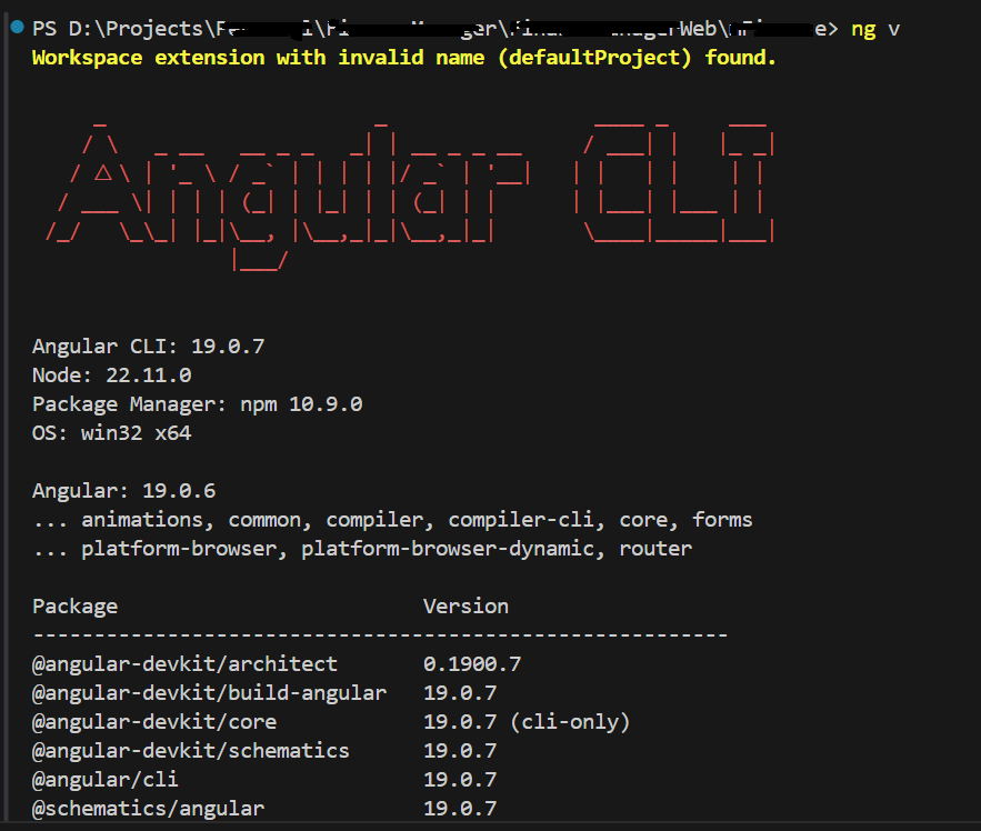
Run the command ‘ng v’ in your terminal to find the Angular version.

3. Install PrimeNG
3.1. Install PrimeNG and PrimeNG theme
Run the command ‘npm install primeng @primeng/themes’ in your terminal to install PrimeNG and its themes.
3.2. Possible encountering installation error
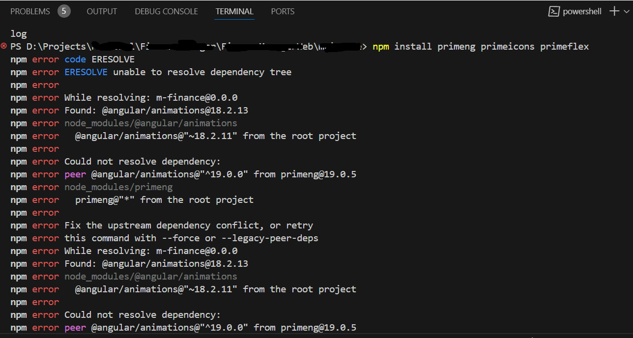
You may face an installation error while installing the PrimeNG npm packages.

3.4. Solution to installation failure
Fix the upstream dependency conflict or retry this command with –force
Retry the same command with ‘–force’,
‘npm install primeng @primeng/themes –save –force’ to install the PrimeNG packages.
4. Verify your installation
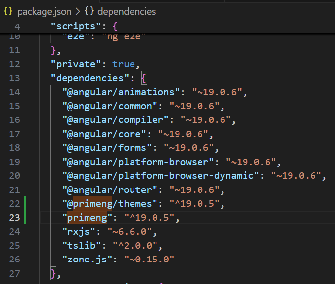
Verify the installation of PrimeNG by checking the package.json file.

5. Add reference to PrimeNG
5.1. Add reference to PrimeNG (app.config.ts approach)
Add a reference to PrimeNG animation, ProvidePrimeNG, and the theme (‘Aura’) in your app.config.ts to use the PrimeNG UI components across your Angular project. You may not have needed to manually add the CSS references in the angular.json or global styles.css file because it will be taken care of by the PrimeNG themes package in the newer PrimeNG version 19.
app.config.ts,

import { ApplicationConfig } from '@angular/core';
import { provideAnimationsAsync } from '@angular/platform-browser/animations/async';
import { providePrimeNG } from 'primeng/config';
import Aura from '@primeng/themes/aura';

export const appConfig: ApplicationConfig = {
    providers: [
        provideAnimationsAsync(),
        providePrimeNG({
            theme: {
                preset: Aura
            }
        })
    ]
};


ButtonDemo.Component.ts,

import { Component } from '@angular/core';
import { ButtonModule } from 'primeng/button';

@Component({
    selector: 'button-demo',
    templateUrl: './button-demo.html',
    standalone: true,
    imports: [ButtonModule]
})
export class ButtonDemo {}

ButtonDemo.Component.html
<div class="card flex justify-center">
    <p-button label="Check" />
</div>
5.2 Add reference to PrimeNG (app.module.ts approach)
app.module.ts,

import { provideAnimationsAsync } from '@angular/platform-browser/animations/async';
import { providePrimeNG } from 'primeng/config';
import Aura from '@primeng/themes/aura';

import { ButtonModule } from 'primeng/button';

@NgModule({
  declarations: [
    AppComponent
  ],
  imports: [
    BrowserModule,
    AppRoutingModule,
    FormsModule,
    HttpClientModule,
    ButtonModule
  ],
  providers: [provideAnimationsAsync(),
    providePrimeNG({
        theme: {
            preset: Aura
        }
    })],
  bootstrap: [AppComponent]
})
export class AppModule { }

ButtonDemo.Component.html
<div class="card flex justify-center">
    <p-button label="Check" />
</div>
5.3 Output (Button)

Source: Read More


