


While browsing through some of my old projects, I stumbled upon a portfolio I worked on a while back. The funny thing? I never used it. So, I decided to give it a fresh look and thought, why not share it with you?
As a developer, having a portfolio is important. It’s your personal space to showcase your skills, share projects, and impress potential employers. Whether you’re aiming to build an online presence, share your work with friends, or take your career to the next level, a portfolio is the perfect way to highlight what you can do.
In this article, I’ll guide you through building a simple portfolio website using just HTML and CSS. By the end, you’ll have a fully functional portfolio site ready to share with anyone.
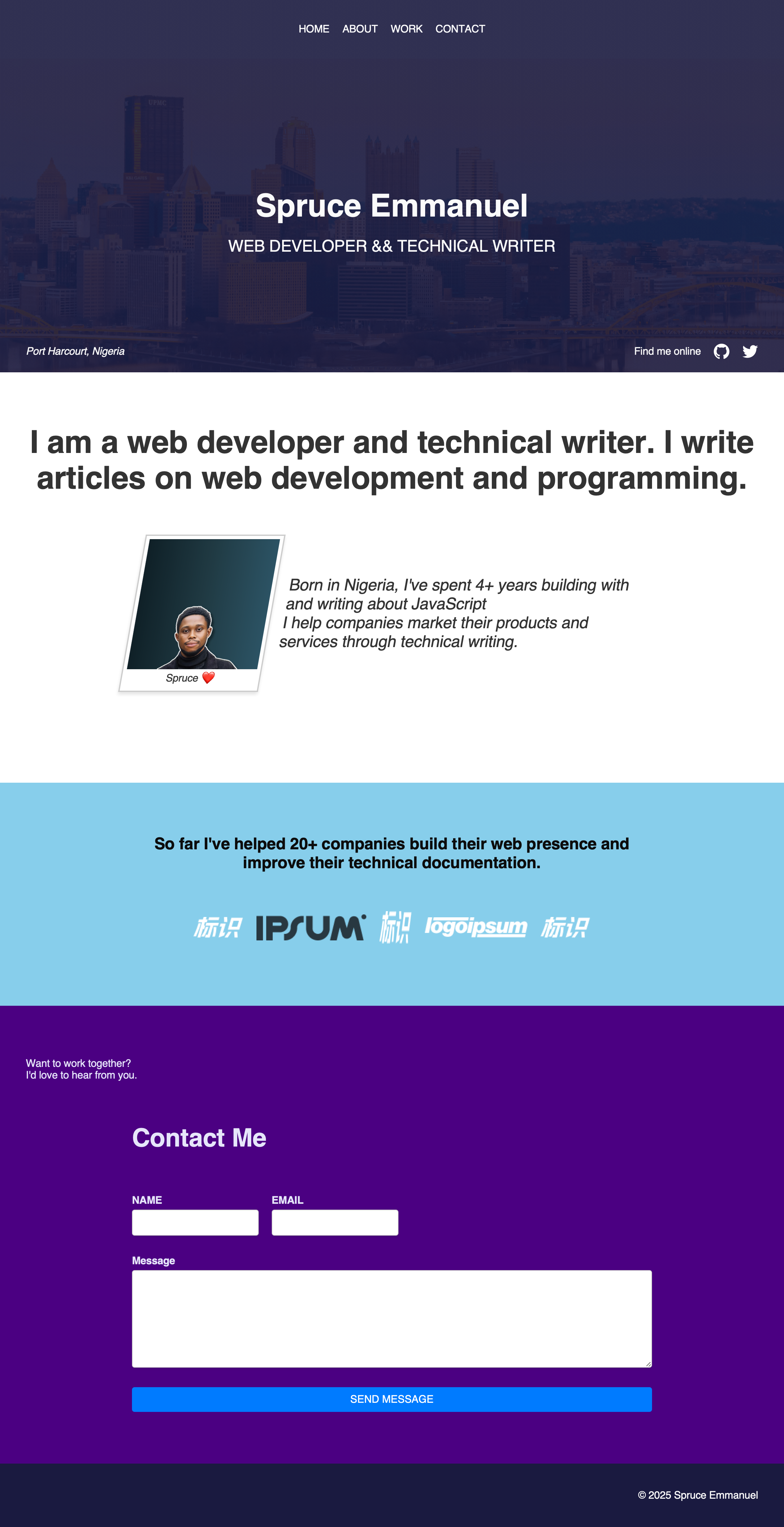
What the Finished Portfolio Looks Like:
Before we get started, here’s a preview of what your portfolio will look like once we’re done:
If you’d prefer to skip ahead, you can get the full code on GitHub.
Here’s what we’ll cover:
Project Overview and Setup
Before we start coding, let’s take a look at the basic structure of the project. Here’s how everything will be organized:
/assets
  - background_image.jpg
  - user.png
  - icon-github.svg
  - icon-twitter.svg
  - logo1.png
  - logo2.png
  - logo3.png
index.html
styles.css
This folder structure keeps things neat and organized. The /assets folder will hold all of your images and icons that will be used throughout the website, while the index.html file will contain the structure of your portfolio, and styles.css will control how everything looks.
Setting Up the HTML File
Let’s start with the basic HTML structure. Open your index.html file and add the following code:
<!DOCTYPE html>
<html lang="en">
  <head>
    <meta charset="UTF-8" />
    <meta name="viewport" content="width=device-width, initial-scale=1.0" />
    <link rel="stylesheet" href="styles.css" />
    <title>Spruce - Dev Portfolio</title>
  </head>
  <body>
    <!-- Content will go here -->
  </body>
</html>
Here’s a breakdown of what this code does:
-
DOCTYPE: This tells the browser that this is an HTML5 document.
-
meta charset: Defines the character encoding, which helps display text properly.
-
meta viewport: Ensures the website is responsive on different screen sizes.
-
link to styles.css: Links the
styles.cssfile for styling your website. -
title: This is the text that appears in the browser tab when you open the website.
Now that our HTML file is set up, we’ll move on to the CSS.
Setting Up the CSS File
Let’s now add some basic styling using a CSS reset. This helps eliminate browser inconsistencies by normalizing styles across different browsers.
Here’s the basic CSS reset you’ll need:
/**
 * CORE CONFIG
 * This powers everything from utility class generation to breakpoints
 * to enabling/disabling pre-built components/utilities.
 */
/* Box sizing rules */
*,
*::before,
*::after {
  box-sizing: border-box;
  font-family: sans-serif;
}

/* Remove default margin */
body,
h1,
h2,
h3,
h4,
p,
figure,
blockquote,
dl,
dd {
  margin: 0;
}

/* Remove list styles on ul, ol elements with a list role, which suggests default styling will be removed */
ul[role="list"],
ol[role="list"] {
  list-style: none;
  padding: 0;
}

/* Set core root defaults */
html:focus-within {
  scroll-behavior: smooth;
}

/* Set core body defaults */
body {
  min-height: 100vh;
  text-rendering: optimizeSpeed;
  letter-spacing: -0.01em;
}

/* All elements that don't have a class get default styles */
a:not([class]) {
  text-decoration-skip-ink: auto;
}

/* Make images easier to work with */
img,
picture {
  max-width: 100%;
  display: block;
}

/* Inherit fonts for inputs and buttons */
input,
button,
textarea,
select {
  font: inherit;
}

@media (prefers-reduced-motion: reduce) {
  html:focus-within {
    scroll-behavior: auto;
  }
}

:focus {
  outline: 2px dashed #00ff19;
  outline-offset: 0.25rem;
}

main:focus {
  outline: none;
}
This reset clears any default margins and paddings, ensuring that your layout remains consistent across browsers. You can find more info about what the code does in the comments.
Sizing and Spacing with Utopia
For spacing and typography, we’ll use a flexible system from Utopia, a tool designed to make responsive typography easier to implement. Here’s the CSS that will give us scalable, adjustable spacing and font sizes:
/* @link https://utopia.fyi/type/calculator?c=320,18,1.2,1240,20,1.25,5,2,&s=0.75|0.5|0.25,1.5|2|3|4|6,s-l&g=s,l,xl,12 */

:root {
  --step--2: clamp(0.7813rem, 0.7747rem + 0.0326vw, 0.8rem);
  --step--1: clamp(0.9375rem, 0.9158rem + 0.1087vw, 1rem);
  --step-0: clamp(1.125rem, 1.0815rem + 0.2174vw, 1.25rem);
  --step-1: clamp(1.35rem, 1.2761rem + 0.3696vw, 1.5625rem);
  --step-2: clamp(1.62rem, 1.5041rem + 0.5793vw, 1.9531rem);
  --step-3: clamp(1.944rem, 1.771rem + 0.8651vw, 2.4414rem);
  --step-4: clamp(2.3328rem, 2.0827rem + 1.2504vw, 3.0518rem);
  --step-5: clamp(2.7994rem, 2.4462rem + 1.7658vw, 3.8147rem);
}

/* @link https://utopia.fyi/space/calculator?c=320,18,1.2,1240,20,1.25,5,2,&s=0.75|0.5|0.25,1.5|2|3|4|6,s-l&g=s,l,xl,12 */

:root {
  --space-3xs: clamp(0.3125rem, 0.3125rem + 0vw, 0.3125rem);
  --space-2xs: clamp(0.5625rem, 0.5408rem + 0.1087vw, 0.625rem);
  --space-xs: clamp(0.875rem, 0.8533rem + 0.1087vw, 0.9375rem);
  --space-s: clamp(1.125rem, 1.0815rem + 0.2174vw, 1.25rem);
  --space-m: clamp(1.6875rem, 1.6223rem + 0.3261vw, 1.875rem);
  --space-l: clamp(2.25rem, 2.163rem + 0.4348vw, 2.5rem);
  --space-xl: clamp(3.375rem, 3.2446rem + 0.6522vw, 3.75rem);
  --space-2xl: clamp(4.5rem, 4.3261rem + 0.8696vw, 5rem);
  --space-3xl: clamp(6.75rem, 6.4891rem + 1.3043vw, 7.5rem);
}
These CSS variables give you flexible, responsive font sizes and spacing, based on the viewport size. For instance, --step-5 corresponds to the largest font size, which you will use for main headings (h1), and smaller sizes like --step-1 for text that’s less prominent.
How Typography and Spacing Work Together
To apply these scalable values, we’ll use the following for headings:
h1,
.h1 {
  font-size: var(--step-5);
}

h2,
.h2 {
  font-size: var(--step-4);
}

h3,
.h3 {
  font-size: var(--step-3);
}

h4,
.h4 {
  font-size: var(--step-2);
}

h5,
.h5 {
  font-size: var(--step-1);
}
Here, the h1 will be the largest size (using --step-5), and h2 will be a little smaller (--step-4), continuing down to h5. These variables ensure the text adjusts to different screen sizes and maintains consistent visual hierarchy.
Defining Constants for Layouts and Spacing
We can also define some utility classes and wrappers for more consistent layouts across the website. Here’s how we can define some constants for layout styling:
/* define some constants */
.flex {
  display: flex;
  align-items: center;
  gap: var(--space-s);
}
@media (max-width: 468px) {
  .flex {
    flex-wrap: wrap;
  }
}
.flex_center {
  justify-content: center;
}
.flex_around {
  justify-content: space-around;
}
.flex_between {
  justify-content: space-between;
}
@media (max-width: 468px) {
  .flex_around {
    justify-content: center;
  }
  .flex_between {
    justify-content: center;
  }
}
.text_center {
  text-align: center;
}
.text_right {
  text-align: right;
}

/* define spacing */
.padding-top-3xs {
  padding: var(--space-3xs);
}
These classes allow you to quickly apply flexible layouts and spacing throughout your design. The .flex class will apply Flexbox, while .flex_center centers the content. There are also responsive adjustments for smaller screens like wrapping flex items when necessary.
Creating the Wrappers
To help structure your layout neatly and consistently, we’ll use wrappers. Wrappers ensure that content is centered and doesn’t stretch too far on wide screens:
/* create the wrappers */
.wrapper {
  width: 100%;
  max-width: 1240px;
  margin: 0 auto;
}
.wrapper_inner {
  width: 100%;
  max-width: 800px;
  margin: 0 auto;
}
The .wrapper class ensures that the content doesn’t get too wide, while .wrapper_inner adds another layer of control for inner sections like a main content area or smaller containers.
How to Build the Header and Hero Section
Now that our project structure is ready, let’s get into building the first major sections: the Header and Hero. These sections are your site’s first impression, giving visitors a sense of who you are while offering easy navigation.
HTML for the Header and Hero
Here’s the HTML structure for both sections:
<!DOCTYPE html>
<html lang="en">
  <head>
    <meta charset="UTF-8" />
    <meta name="viewport" content="width=device-width, initial-scale=1.0" />
    <link rel="stylesheet" href="styles.css" />
    <title>Spruce - Dev Portfolio</title>
  </head>
  <body>
    <header class="site_header">
      <div class="wrapper_inner">
        <nav class="site_header_nav">
          <ul role="list" class="flex flex_center">
            <li><a href="#0">HOME</a></li>
            <li><a href="#about">ABOUT</a></li>
            <li><a href="#work">WORK</a></li>
            <li><a href="#contact">CONTACT</a></li>
          </ul>
        </nav>
      </div>
    </header>
    <main>
      <section id="hero">
        <div class="wrapper">
          <div class="wrapper_inner">
            <div class="text_center hero_content">
              <h1 class="h2">Spruce Emmanuel</h1>
              <p class="h5">WEB DEVELOPER && TECHNICAL WRITER</p>
            </div>
          </div>
          <ul role="list" class="flex flex_between hero_social">
            <address>Port Harcourt, Nigeria</address>
            <ul role="list" class="flex">
              <li>Find me online</li>
              <li>
                <a href="https://github.com/iamspruce" target="_blank">
                  <img src="/assets/icon-github.svg" alt="GitHub" width="24" height="24" />
                </a>
              </li>
              <li>
                <a href="https://x.com/sprucekhalifa" target="_blank">
                  <img src="/assets/icon-twitter.svg" alt="Twitter" width="24" height="24" />
                </a>
              </li>
            </ul>
          </ul>
        </div>
      </section>
    </main>
  </body>
</html>
Header breakdown:
-
Navigation: The navbar lets users quickly jump to key sections like Home, About, Work, and Contact. It’s centered using the
.flexand.flex_centerclasses, making it clean and accessible. -
Flex layout: Links are laid out horizontally using
.flexfor a smooth, modern look.
Hero breakdown:
-
Hero content: This is where you introduce yourself. Your name and title are centered with padding to give it space and clarity.
-
Hero social: Below your bio, we’ve added your location and social links. These are aligned with
.flexto keep everything neat and easy to navigate.
CSS for Header and Hero
Here’s the CSS to style these sections:
Header styling:
/* Style the header */
.site_header {
  padding: var(--space-s) 0;
  background: linear-gradient(rgba(26, 26, 64, 0.9), rgba(26, 26, 64, 0.9));
}

.site_header_nav ul li a {
  text-decoration: none;
  color: #fff;
}
-
.site_header: Adds padding and a dark gradient for a sleek background. -
.site_header_nav ul li a: Removes link underlines and makes the text white for a modern, bold look.
Hero styling:
/* Hero section styling */
.hero_content {
  padding: var(--space-3xl) 0;
}

.hero_content h1 {
  margin-bottom: var(--space-s);
}

.hero_social {
  padding-top: var(--space-3xl);
}

/* General styling for the hero section */
section {
  padding: var(--space-2xl) var(--space-l);
}

section#hero {
  background: linear-gradient(rgba(26, 26, 64, 0.9), rgba(26, 26, 64, 0.9)),
    url("/assets/background_image.jpg");
  padding-bottom: 4px;
  background-size: cover;
  background-position: top;
  background-attachment: scroll;
  color: #fafafa;
  --color-accent: #8a2be2;
}
-
.hero_content: Adds padding to keep the content spacious. -
.hero_social: Makes room for the social media links to stand out. -
section#hero: Sets a stylish gradient background with an image, ensuring the hero section feels engaging and visually striking.
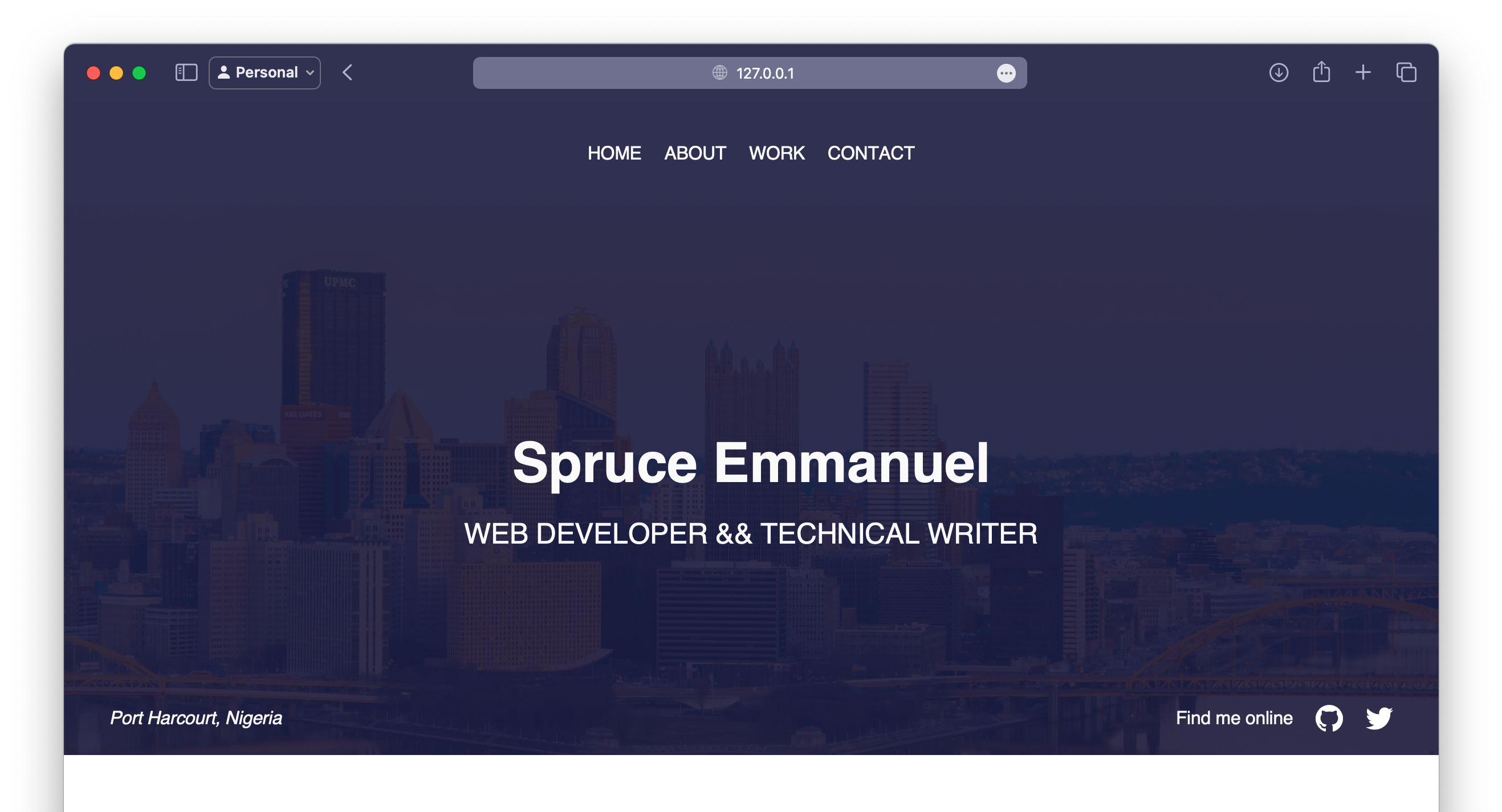
Here’s what it looks like at this point:
How to Build the About Section
The About Section lets you introduce yourself and share your professional journey, giving visitors a glimpse of who you are and what you do.
HTML for the About Section
Here’s the HTML structure for the About Section:
<section id="about">
  <div class="wrapper">
    <div class="text_center">
      <h2>
        I am a web developer and technical writer. I write articles on web development and programming.
      </h2>
    </div>
    <div class="wrapper_inner">
      <div class="about_content flex flex_around">
        <figure class="about_figure text_center">
          <img width="200px" height="200px" src="/assets/user.png" alt="Developer" class="about_img" />
          <figcaption class="about_caption">Spruce ❤️</figcaption>
        </figure>
        <p class="h5">
          Born in Nigeria, I've spent 4+ years building with and writing about JavaScript. I help companies market their products and services through technical writing.
        </p>
      </div>
    </div>
  </div>
</section>
Breakdown of the About section:
-
Introduction: A short and clear statement about your role as a developer.
-
About content: The profile image and bio are positioned side by side with a flex container for balance.
-
Figure and image: The profile image is displayed within a
<figure>tag, with a caption below it. -
Text: A brief bio explaining your background and expertise.
CSS for the About Section
Here’s the CSS styling for the About section:
About section styling:
/* About section */
.about_content {
  padding: var(--space-xl) 0;
  transform: skewX(-10deg);
}

@media (max-width: 468px) {
  .about_content {
    transform: skewX(0deg);
  }
}

.about_figure {
  padding: var(--space-xl) 0;
  box-shadow: 0 4px 6px rgba(0, 0, 0, 0.1);
  border: 2px solid #ccc;
  display: inline-block;
  padding: 5px;
}

.about_img {
  width: 300px;
  height: 200px;
  object-fit: cover;
}

.about_caption {
  padding: var(--space-3xs) 0;
}

section#about {
  background-color: #ffffff;
  color: #333;
  --color-accent: #ffd700;
}
Breakdown of the CSS:
-
Skew effect: The
.about_contentclass gives the section a dynamic look with a slight skew, which is removed on small screens. -
Figure styling: The profile image gets padding and a subtle box shadow to help it stand out.
-
Image styling: The image fills the space proportionally, ensuring it doesn’t distort.
-
Caption styling: Padding around the caption provides better spacing.
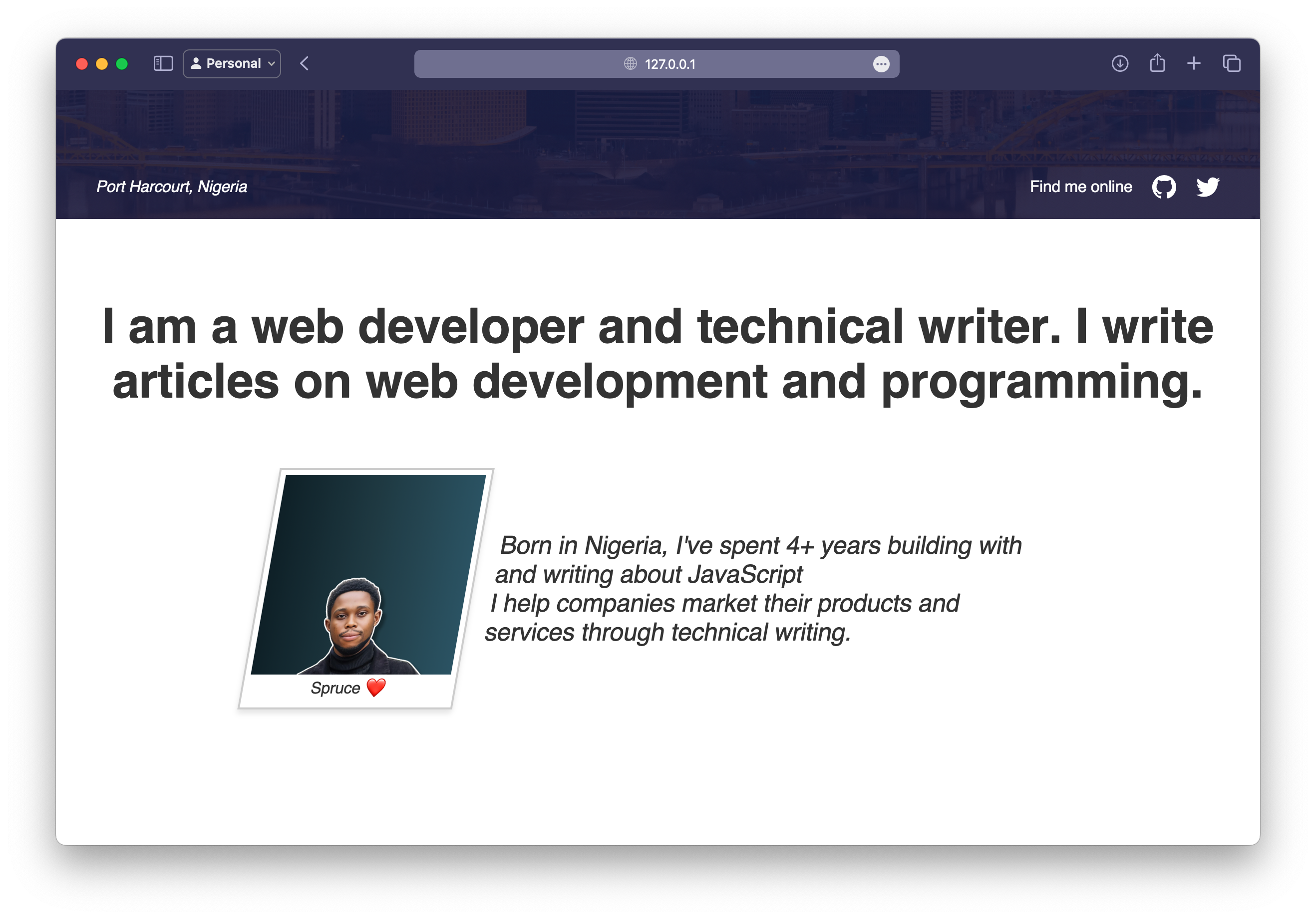
About section preview:
This is what your About Section will look like after applying these styles:
How to Build the Work Section
The Work Section is where you can showcase the companies or projects you’ve worked with or contributed to. This section helps to demonstrate your experience and the impact you’ve made, while providing visitors with visual examples of your professional background.
HTML for the Work Section
Here’s the HTML structure for the Work Section:
<section id="work">
  <div class="wrapper_inner">
    <div class="text_center">
      <h4 class="h5">
        So far I've helped 20+ companies build their web presence and
        improve their technical documentation.
      </h4>
      <ul role="list" class="work_logos flex flex_center">
        <li>
          <img src="/assets/logo1.png" alt="Acme Corp" />
        </li>
        <li>
          <img src="/assets/logo2.png" alt="Acme Innovations" />
        </li>
        <li>
          <img
            src="/assets/logo1.png"
            alt="Acme Solutions"
            width="50"
            height="50"
          />
        </li>
        <li>
          <img src="/assets/logo3.png" alt="Acme Technologies" />
        </li>
        <li>
          <img src="/assets/logo1.png" alt="Acme Enterprises" />
        </li>
      </ul>
    </div>
  </div>
</section>
Breakdown of the Work section:
-
Introduction: The
<h4>element introduces the work experience with a statement highlighting how you’ve helped companies with their web presence and technical documentation. -
Logos: The logos of the companies you’ve worked with are placed inside an unordered list (
<ul>). Each logo is wrapped in a list item (<li>) for better structure and layout. -
Flexbox layout: The logos are positioned in a flexible layout using the
flexandflex_centerclasses. This ensures that the logos are evenly spaced and centered horizontally within the section.
CSS Styling for the Work Section
Now let’s add some style to the Work section to make it visually appealing and responsive.
Work section styling:
/* work section */
.work_logos {
  margin-top: var(--space-xl);
}

section#work {
  background-color: #87ceeb;
  color: #0c0c0c;
  --color-accent: #2e8b57;
}
How to Build the Contact Section and Footer
The Contact Section and Footer provide a space for visitors to reach out to you and a final touch for the webpage. It’s essential to have an easy-to-use form for inquiries, along with a footer that includes your copyright information.
HTML for the Contact Section and Footer
Here’s the HTML structure for the Contact Section and Footer:
<section id="contact">
<div class="wrapper">
<div class="text_left">
<p>
Want to work together? <br />
I'd love to hear from you.
</p>
</div>
<div class="wrapper_inner">
<h5 class="h3">Contact Me</h5>
<form action="" method="post" class="contact_form">
<div class="flex">
<div class="form_group">
<label for="name">NAME</label>
<input type="text" id="name" name="name" />
</div>
<div class="form_group">
<label for="email">EMAIL</label>
<input type="email" id="email" name="email" />
</div>
</div>
<div class="form_group">
<label for="message">Message</label>
<textarea id="message" name="message"></textarea>
</div>
<button type="submit">SEND MESSAGE</button>
</form>
</div>
</div>
</section>
<footer>
<section id="footer">
<div class="wrapper">
<div class="text_right">
<p>© 2025 Spruce Emmanuel</p>
</div>
</div>
</section>
</footer>
Breakdown of the HTML:
-
Contact section: This section includes a welcoming text that invites users to reach out, followed by a contact form with fields for the user’s name, email, and a message.
-
Footer: The footer includes copyright information, ensuring that visitors know who owns the content. It’s placed at the bottom of the page and gives a professional touch to the site.
CSS for the Contact Section and Footer
Now let’s style the Contact Section and Footer to make them both user-friendly and visually appealing.
Contact section styling:
/* contact section */
.contact_form {
  display: flex;
  flex-direction: column;
  gap: 20px;
}

.form_group {
  display: flex;
  flex-direction: column;
}

label {
  margin-bottom: 5px;
  font-weight: bold;
}

input[type="text"],
input[type="email"],
textarea {
  width: 100%;
  padding: 10px;
  border: 1px solid #ccc;
  border-radius: 4px;
  box-shadow: 0 2px 4px rgba(0, 0, 0, 0.1);
  margin-bottom: 10px;
}

textarea {
  resize: vertical;
  height: 150px;
}

button[type="submit"] {
  padding: 10px 20px;
  border: none;
  border-radius: 4px;
  background-color: #007bff;
  color: white;
  cursor: pointer;
}

button[type="submit"]:hover {
  background-color: #0056b3;
}
Footer section styling:
/* footer section */
section#footer {
  padding: var(--space-l) var(--space-l);
}
Wrapping Up
And there you have it! You’ve just built a simple portfolio website using only HTML and CSS. You’ve learned how to structure your project, apply a CSS reset, and create responsive typography and layout systems that scale beautifully across different screen sizes.
By following this guide, you now have a portfolio that you can be proud of and share with friends, family, or potential employers. The beauty of this project is that you can continue to expand and personalize it by adding new sections, showcasing more of your work, or experimenting with JavaScript to add interactive elements.
If you’re interested in exploring more advanced features or learning how to host your portfolio online, check out my tutorial on How to Host Your Project on GitHub – Explained With Examples.
If you have any questions, feel free to find me on Twitter at @sprucekhalifa, and don’t forget to follow me for more tips and updates. Happy coding!
Source: freeCodeCamp Programming Tutorials: Python, JavaScript, Git & MoreÂ
 Exposes Systems to Remote Code Execution Risks")
