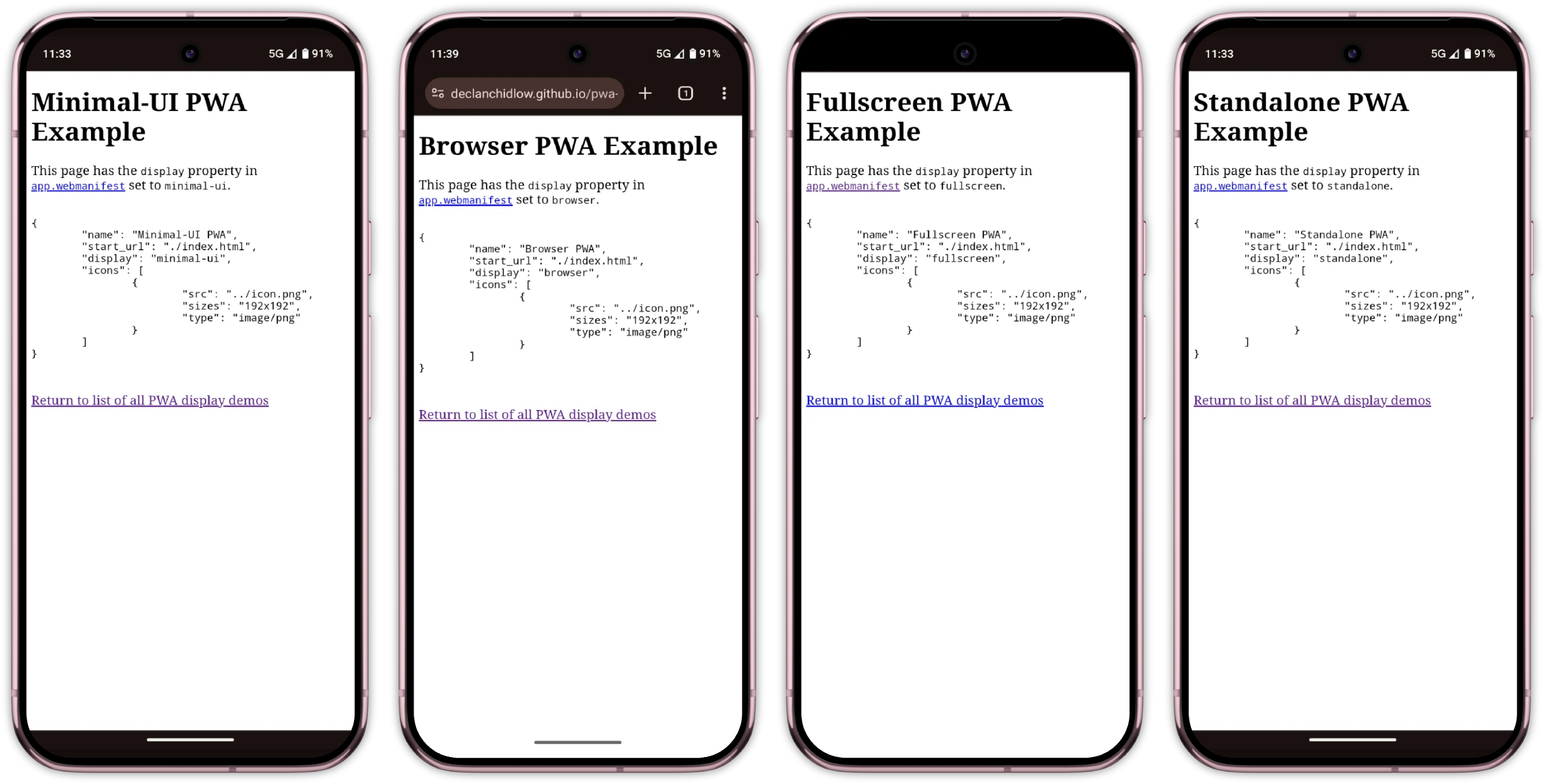
Progressive web apps (PWA) are a fantastic way to turn web applications into native-like, standalone experiences. They bridge the gap between websites and native apps, but this transformation can be prone to introducing design challenges that require thoughtful consideration.
We define our PWAs with a manifest file. In our PWA’s manifest, we can select from a collection of display modes, each offering different levels of browser interface visibility:
fullscreen: Hides all browser UI, using the entire display.standalone: Looks like a native app, hiding browser controls but keeping system UI.minimal-ui: Shows minimal browser UI elements.browser: Standard web browser experience with full browser interface.
Oftentimes, we want our PWAs to feel like apps rather than a website in a browser, so we set the display manifest member to one of the options that hides the browser’s interface, such as fullscreen or standalone. This is fantastic for helping make our applications feel more at home, but it can introduce some issues we wouldn’t usually consider when building for the web.
It’s easy to forget just how much functionality the browser provides to us. Things like forward/back buttons, the ability to refresh a page, search within pages, or even manipulate, share, or copy a page’s URL are all browser-provided features that users can lose access to when the browser’s UI is hidden. There is also the case of things that we display on websites that don’t necessarily translate to app experiences.

Imagine a user deep into a form with no back button, trying to share a product page without the ability to copy a URL, or hitting a bug with no refresh button to bail them out!
Much like how we make different considerations when designing for the web versus designing for print, we need to make considerations when designing for independent experiences rather than browser-based experiences by tailoring the content and user experience to the medium.
Thankfully, we’re provided with plenty of ways to customise the web.
Using Media Queries To Target Display Modes
We use media queries all the time when writing CSS. Whether it’s switching up styles for print or setting breakpoints for responsive design, they’re commonplace in the web developer’s toolkit. Each of the display modes discussed previously can be used as a media query to alter the appearance of documents depending.
Media queries such as @media (min-width: 1000px) tend to get the most use for setting breakpoints based on the viewport size, but they’re capable of so much more. They can handle print styles, device orientation, contrast preferences, and a whole ton more. In our case, we’re interested in the display-mode media feature.
Display mode media queries correspond to the current display mode.
Note: While we may set display modes in our manifest, the actual display mode may differ depending on browser support.
These media queries directly reference the current mode:
@media (display-mode: standalone)will only apply to pages set to standalone mode.@media (display-mode: fullscreen)applies to fullscreen mode. It is worth noting that this also applies when using the Fullscreen API.@media (display-mode: minimal-ui)applies to minimal UI mode.@media (display-mode: browser)applies to standard browser mode.
It is also worth keeping an eye out for the window-controls-overlay and tabbed display modes. At the time of writing, these two display modes are experimental and can be used with display_override. display-override is a member of our PWA’s manifest, like display, but provides some extra options and power.
display has a predetermined fallback chain (fullscreen -> standalone -> minimal-ui -> browser) that we can’t change, but display-override allows setting a fallback order of our choosing, like the following:
"display_override": ["fullscreen", "minimal-ui"]
window-controls-overlay can only apply to PWAs running on a desktop operating system. It makes the PWA take up the entire window, with window control buttons appearing as an overlay. Meanwhile, tabbed is relevant when there are multiple applications within a single window.
In addition to these, there is also the picture-in-picture display mode that applies to (you guessed it) picture-in-picture modes.
We use these media queries exactly as we would any other media query. To show an element with the class .pwa-only when the display mode is standalone, we could do this:
.pwa-only {
    display: none;
}

@media (display-mode: standalone) {
    .pwa-only {
        display: block;
    }
}
If we wanted to show the element when the display mode is standalone or minimal-ui, we could do this:
@media (display-mode: standalone), (display-mode: minimal-ui) {
    .pwa-only {
        display: block;
    }
}
As great as it is, sometimes CSS isn’t enough. In those cases, we can also reference the display mode and make necessary adjustments with JavaScript:
const isStandalone = window.matchMedia("(display-mode: standalone)").matches;
// Listen for display mode changes
window.matchMedia("(display-mode: standalone)").addEventListener("change", (e) => {
  if (e.matches) {
    // App is now in standalone mode
    console.log("Running as PWA");
  }
});
Practical Applications
Now that we know how to make display modifications depending on whether users are using our web app as a PWA or in a browser, we can have a look at how we might put these newly learnt skills to use.
Tailoring Content For PWA Users
Users who have an app installed as a PWA are already converted, so you can tweak your app to tone down the marketing speak and focus on the user experience. Since these users have demonstrated commitment by installing your app, they likely don’t need promotional content or installation prompts.
Display More Options And Features
You might need to directly expose more things in PWA mode, as people won’t be able to access the browser’s settings as easily when the browser UI is hidden. Features like changing font sizing, switching between light and dark mode, bookmarks, sharing, tabs, etc., might need an in-app alternative.
Platform-Appropriate Features
There are features you might not want on your web app because they feel out of place, but that you might want on your PWA. A good example is the bottom navigation bar, which is common in native mobile apps thanks to the easier reachability it provides, but uncommon on websites.
People sometimes print websites, but they very rarely print apps. Consider whether features like print buttons should be hidden in PWA mode.
Install Prompts
A common annoyance is a prompt to install a site as a PWA appearing when the user has already installed the site. Ideally, the browser will provide an install prompt of its own if our PWA is configured correctly, but not all browsers do, and it can be finicky. MDN has a fantastic guide on creating a custom button to trigger the installation of a PWA, but it might not fit our needs.
We can improve things by hiding install prompts with our media query or detecting the current display mode with JavaScript and forgoing triggering popups in the first place.
We could even set this up as a reusable utility class so that anything we don’t want to be displayed when the app is installed as a PWA can be hidden with ease.
/* Utility class to hide elements in PWA mode */
.hide-in-pwa {
  display: block;
}

@media (display-mode: standalone), (display-mode: minimal-ui) {
  .hide-in-pwa {
    display: none !important;
  }
}
Then in your HTML:
<div class="install-prompt hide-in-pwa">
  <button>Install Our App</button>
</div>

<div class="browser-notice hide-in-pwa">
  <p>For the best experience, install this as an app!</p>
</div>
We could also do the opposite and create a utility class to make elements only show when in a PWA, as we discussed earlier.
Strategic Use Of Scope And Start URL
Another way to hide content from your site is to set the scope and start_url properties. These aren’t using media queries as we’ve discussed, but should be considered as ways to present different content depending on whether a site is installed as a PWA.
Here is an example of a manifest using these properties:
{ "name": "Example PWA","scope": "/dashboard/","start_url": "/dashboard/index.html","display": "standalone", "icons": [ { "src": "icon.png", "sizes": "192x192", "type": "image/png" } ] }
scope here defines the top level of the PWA. When users leave the scope of your PWA, they’ll still have an app-like interface but gain access to browser UI elements. This can be useful if you’ve got certain parts of your app that you still want to be part of the PWA but which aren’t necessarily optimised or making the necessary considerations.
start_url defines the URL a user will be presented with when they open the application. This is useful if, for example, your app has marketing content at example.com and a dashboard at example.com/dashboard/index.html. It is likely that people who have installed the app as a PWA don’t need the marketing content, so you can set the start_url to /dashboard/index.html so the app starts on that page when they open the PWA.
Enhanced Transitions
View transitions can feel unfamiliar, out of place, and a tad gaudy on the web, but are a common feature of native applications. We can set up PWA-only view transitions by wrapping the relevant CSS appropriately:
@media (display-mode: standalone) {
  @view-transition {
    navigation: auto;
  }
}
If you’re really ambitious, you could also tweak the design of a site entirely to fit more closely with native design systems when running as a PWA by pairing a check for the display mode with a check for the device and/or browser in use as needed.
Browser Support And Testing
Browser support for display mode media queries is good and extensive. However, it’s worth noting that Firefox doesn’t have PWA support, and Firefox for Android only displays PWAs in browser mode, so you should make the necessary considerations. Thankfully, progressive enhancement is on our side. If we’re dealing with a browser lacking support for PWAs or these media queries, we’ll be treated to graceful degradation.
Testing PWAs can be challenging because every device and browser handles them differently. Each display mode behaves slightly differently in every browser and OS combination.
Unfortunately, I don’t have a silver bullet to offer you with regard to this. Browsers don’t have a convenient way to simulate display modes for testing, so you’ll have to test out your PWA on different devices, browsers, and operating systems to be sure everything works everywhere it should, as it should.
Recap
Using a PWA is a fundamentally different experience from using a web app in the browser, so considerations should be made. display-mode media queries provide a powerful way to create truly adaptive Progressive Web Apps that respond intelligently to their installation and display context. By leveraging these queries, we can do the following:
- Hide redundant installation prompts for users who have already installed the app,
- Provide appropriate navigation aids when making browser controls unavailable,
- Tailor content and functionality to match user expectations in different contexts,
- Create more native-feeling experiences that respect platform conventions, and
- Progressively enhance the experience for committed users.
The key is remembering that PWA users in standalone mode have different needs and expectations than standard website visitors. By detecting and responding to display modes, we can create experiences that feel more polished, purposeful, and genuinely app-like.
As PWAs continue to mature, thoughtful implementations and tailoring will become increasingly important for creating truly compelling app experiences on the web. If you’re itching for even more information and PWA tips and tricks, check out Ankita Masand’s “Extensive Guide To Progressive Web Applications”.
Further Reading On SmashingMag
- “Creating A Magento PWA: Customizing Themes vs. Coding From Scratch”, Alex Husar
- “How To Optimize Progressive Web Apps: Going Beyond The Basics”, Gert Svaiko
- “How To Decide Which PWA Elements Should Stick”, Suzanne Scacca
- “Uniting Web And Native Apps With 4 Unknown JavaScript APIs”, Juan Diego Rodríguez
Source: Read MoreÂ


