When you picture placing images in long-form content — like articles, case studies, or reports — the standard approach is inline rectangles, breaking up blocks of text. Functional? Sure. Inspiring? Hardly.
Why do so many long-form articles feel visually flat? Why do images so often seem bolted on, rather than part of the story? And how does that affect engagement, comprehension, or tone?
Images in long-form content can (and often should) do more than illustrate. They can shape how people navigate, engage with, and interpret what they’re reading. They help set the pace, influence how readers feel, and add character that words alone can’t always convey.
So, how do you use images to add personality, rhythm, and even surprise someone along the way? Here’s how I do it.

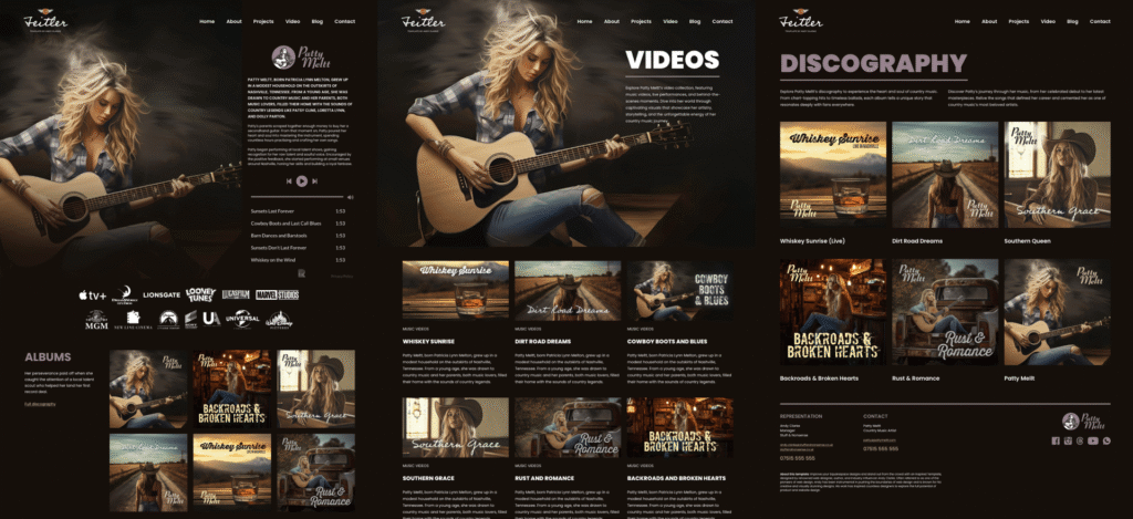
My brief: Patty Meltt is an up-and-coming country music sensation, and she needed a website to launch her new album and tour. She wanted it to be distinctive-looking and memorable, so she called Stuff & Nonsense. Patty’s not real, but the challenges of designing and developing sites like hers are.
First, a not-so-long-form recap.
You probably already know that grids make designs feel predictable, rhythmic, and structured, which helps readers feel comfortable when consuming long-form content. Grids bring balance. They help keep things aligned, organized, and easy to follow, which makes complex information feel less overwhelming.

But once I’ve established a grid, breaking it occasionally can be a powerful way to draw attention to key content, add personality, and prevent layouts from feeling formulaic or flat.

For example, in long-form content, I might pull images into the margins or nudge them out of alignment to create a more casual, energetic feel. I could expand an image’s inline size out of its column using negative margin values:
figure {
  inline-size: 120%;
  margin-inline-start: -10%;
  margin-inline-end: -10%;
}
Used sparingly, these breaks serve as punctuation, guiding the reader’s eye and adding moments of visual interest to the text’s flow.
Text width or full-bleed
Once we start thinking creatively about images in long-form content, one question usually comes to mind: how wide should those images be?

Should they sit flush with the edges of the text column?
img {
  inline-size: 100%;
  max-inline-size: 100%;
}
Or expand to fill the entire width of the page?
figure {
  inline-size: 100vw;
  margin-inline-start: 50%;
  transform: translateX(-50%);
}
Both approaches are valid, but it’s important to understand how they serve different purposes.
Book and newspaper layouts traditionally keep images confined to the text column, reinforcing the flow of words. Magazines, on the other hand, regularly break the grid with full-bleed imagery for dramatic effect.
In articles, news stories, and reports, images set inside the column flow with the copy, giving a sense of order and rhythm. This works especially well for charts, diagrams, and infographics, where it’s important to keep things clear and easy to read. But in the wrong context, this approach can feel predictable and lacking in energy
Stretching images beyond the content column to fill the full width of the viewport creates instant impact. These moments act like dramatic pauses — they purposefully break the reading rhythm, reset attention, and shift focus from words to visuals. That said, these images should always serve a purpose. They lose their impact quickly if they’re overused or feel like filler.
Using a modular grid for multiple images
So far, I’ve focused on single images in the flow of text. But what if I want to present a collection? How can I arrange a sequence of images that belong together?

Instead of stacking images vertically, I can use a modular grid to create a cohesive arrangement with precise control over placement and scale. What’s a modular grid? It’s a structure built from repeated units — typically squares or rectangles — arranged horizontally and vertically to bring order to varied content. I can place individual images within single modules, or span multiple modules to create larger, more impactful zones.
figure {
  display: grid;
  grid-template-columns: repeat(4, 1fr);
  gap: 15px;
}

figure > *:nth-child(1) {
  grid-column: 1 / -1;
}
Modular grids also help us break free from conventional, column-based layouts, adding variety and keeping things visually interesting without relying on full-bleed images every time. They give me the flexibility to mix landscape and portrait images within the same space. I can vary scale, making some images larger for emphasis and others smaller in support. It’s a layout technique that groups related visuals, reinforcing the relationship between them.
CSS Shapes and expressive possibilities
Whatever shape the subject takes, every image sits inside a box. By default, text flows above or below that box. If I float an image left or right, the adjacent text wraps around the rectangle, regardless of what’s inside. When a subject fills its box edge to edge, this wrapping feels natural.

But when the subject is cut out or has an irregular outline, that rectangular wrap can feel awkward.

CSS Shapes solves that problem by allowing text to wrap around any custom shape I define. Letting text flow around a shape isn’t just decorative — it adds energy and keeps the page feeling lively. Using shape-outside affects the reading experience. It slows people down slightly, creates visual rhythm, and adds contrast to the steady march of regular text blocks. It also brings text and image into a closer relationship, making them feel part of a shared composition rather than isolated elements.

Most shape-outside explanations start with circles or ellipses, but I think they should begin with something more expressive: wrapping text around an image’s alpha channel.
img {
  float: left;
  width: 300px;
  height: auto;
  shape-outside: url('patty.webp');
  shape-image-threshold: .5;
  shape-margin: 1rem;
}
No clipping paths. No polygons. Just letting the natural silhouette of the image shape the text. It’s a small detail that makes a design feel more considered, more crafted, and more human.
Integrating captions into a design
Captions don’t have to sit quietly beneath an image. They can play a far more expressive role in shaping how an image is perceived and understood. Most captions look like afterthoughts to me — small, grey text, tucked beneath a picture.

But when I think more deliberately about their positioning and styling, captions become an active part of the design. They can help guide attention, highlight important points, and bring a bit more personality to the page.
No rule says captions must sit below an image. Why not treat them as design elements in their own right? I might position a caption to the left or right of an image.
figure {
  display: grid;
  grid-template-columns: repeat(6, 1fr);
  gap: 1rem;
}

figure img {
  grid-column: 1 / 6;
}

figcaption {
  grid-column: 6;
}
Or let it overlap part of the picture itself:
figure {
  display: grid;
  grid-template-columns: repeat(6, 1fr);
  gap: 1rem;
}

figure img {
  grid-column: 1 / 6;
  grid-row: 1;
}

figcaption {
  grid-column: 5 / -1;
  grid-row: 1;
}
Captions connect images and text. Done well, they can elevate as well as explain. They don’t have to look conventional either; you can style them to look like pull quotes or side notes.

I might design a caption to echo a pull quote, or combine it with graphic elements to make it feel less like a label and more like part of the story it’s helping to tell.
The power of whitespace
Until now, I’ve concentrated on the images themselves — how they’re captioned, positioned, and sized. But there’s something else that’s just as important: the space around them.
Whitespace isn’t empty space; it’s active. It shapes how content feels, how it flows, and how it’s read. The margins, padding, and negative space around an image influence how much attention it attracts and how comfortably it sits within a page.

Tighter spacing is useful when grouping images, but it also creates tension. In contrast, generous margins give an image more breathing room.
figure {
  margin-block: 3rem;
}
Like a line break in a poem or a pause in conversation, whitespace slows things down and gives people natural moments to pause while reading.
Conclusion
Images in long-form content aren’t just illustrations. They shape how people experience what they’re reading — how they move through it, how it feels, and what they remember. By thinking beyond the default rectangle, we can use images to create rhythm, personality, and even moments of surprise.
Whether it’s by breaking the grid, choosing full-bleed over inline, wrapping text, or designing playful captions, it’s about being deliberate. So next time you’re laying out a long article, don’t wonder, “Where can I put an image?” Ask, “How can this image help shape someone’s experience?”
Getting Creative With Images in Long-Form Content originally published on CSS-Tricks, which is part of the DigitalOcean family. You should get the newsletter.
Source: Read MoreÂ

