


Many products — digital and physical — are focused on “average” users — a statistical representation of the user base, which often overlooks or dismisses anything that deviates from that average, or happens to be an edge case. But people are never edge cases, and “average” users don’t really exist. We must be deliberate and intentional to ensure that our products reflect that.
Today, roughly 10% of people are left-handed. Yet most products — digital and physical — aren’t designed with them in mind. And there is rarely a conversation about how a particular digital experience would work better for their needs. So how would it adapt, and what are the issues we should keep in mind? Well, let’s explore what it means for us.
This article is part of our ongoing series on UX. You can find more details on design patterns and UX strategy in Smart Interface Design Patterns 🍣 — with live UX training coming up soon. Jump to table of contents.
Left-Handedness ≠ “Left-Only”
It’s easy to assume that left-handed people are usually left-handed users. However, that’s not necessarily the case. Because most products are designed with right-handed use in mind, many left-handed people have to use their right hand to navigate the physical world.
From very early childhood, left-handed people have to rely on their right hand to use tools and appliances like scissors, openers, fridges, and so on. That’s why left-handed people tend to be ambidextrous, sometimes using different hands for different tasks, and sometimes using different hands for the same tasks interchangeably. However, only 1% of people use both hands equally well (ambidextrous).

In the same way, right-handed people aren’t necessarily right-handed users. It’s common to be using a mobile device in both left and right hands, or both, perhaps with a preference for one. But when it comes to writing, a preference is stronger.
Challenges For Left-Handed Users
Because left-handed users are in the minority, there is less demand for left-handed products, and so typically they are more expensive, and also more difficult to find. Troubles often emerge with seemingly simple tools — scissors, can openers, musical instruments, rulers, microwaves and bank pens.
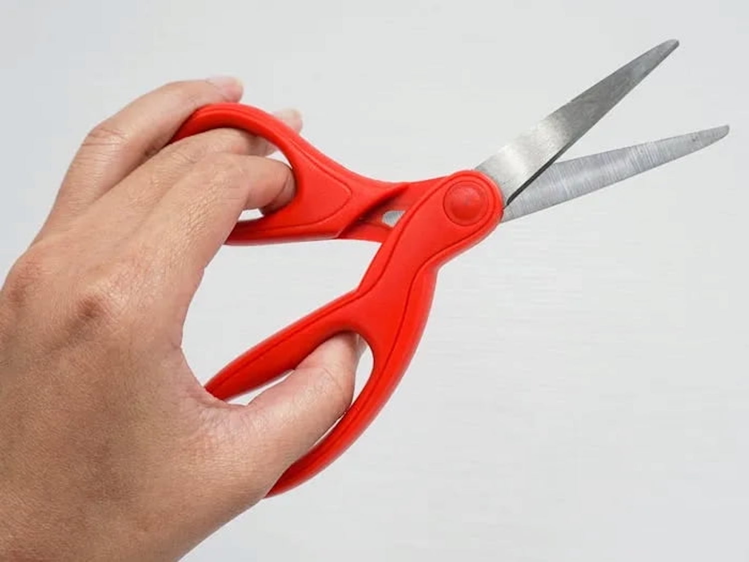
For example, most scissors are designed with the top blade positioned for right-handed use, which makes cutting difficult and less precise. And in microwaves, buttons and interfaces are nearly always on the right, making left-handed use more difficult.
Now, with digital products, most left-handed people tend to adapt to right-handed tools, which they use daily. Unsurprisingly, many use their right hand to navigate the mouse. However, it’s often quite different on mobile where the left hand is often preferred.
- Don’t make design decisions based on left/right-handedness.
- Allow customizations based on the user’s personal preferences.
- Allow users to re-order columns (incl. the Actions column).
- In forms, place action buttons next to the last user’s interaction.
- Keyboard accessibility helps everyone move faster (Esc).
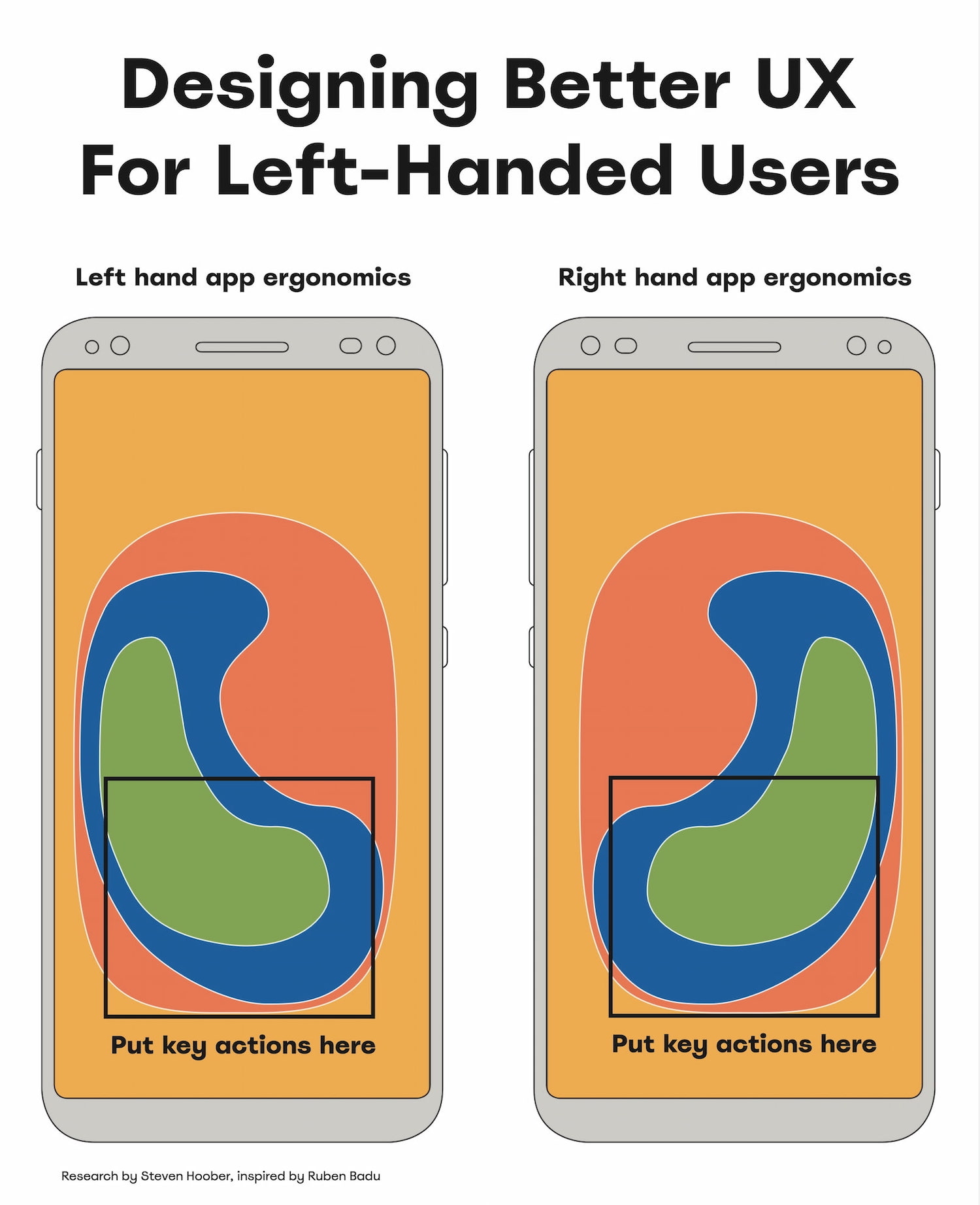
Usability Guidelines To Support Both Hands
As Ruben Babu writes, we shouldn’t design a fire extinguisher that can’t be used by both hands. Think pull up and pull down, rather than swipe left or right. Minimize the distance to travel with the mouse. And when in doubt, align to the center.
- Bottom left → better for lefties, bottom right → for righties.
- With magnifiers, users can’t spot right-aligned buttons.
- On desktop, align buttons to the left/middle, not right.
- On mobile, most people switch both hands when tapping.
- Key actions → put in middle half to two-thirds of the screen.

A simple way to test the mobile UI is by trying to use the opposite-handed UX test. For key flows, we try to complete them with your non-dominant hand and use the opposite hand to discover UX shortcomings.
For physical products, you might try the oil test. It might be more effective than you might think.
Good UX Works For Both
Our aim isn’t to degrade the UX of right-handed users by meeting the needs of left-handed users. The aim is to create an accessible experience for everyone. Providing a better experience for left-handed people also benefits right-handed people who have a temporary arm disability.
And that’s an often-repeated but also often-overlooked universal principle of usability: better accessibility is better for everyone, even if it might feel that it doesn’t benefit you directly at the moment.
Useful Resources
- “Discover Hidden UX Flaws With the Opposite-Handed UX Test,” by Jeff Huang
- “Right-Aligned Buttons Aren’t More Efficient For Right-Handed People,” by Julia Y.
- “Mobile Accessibility Target Sizes Cheatsheet,” by Vitaly Friedman
- “Why The World Is Not Designed For Left-Handed People,” by Elvis Hsiao
- “Usability For Left Handedness 101”, by Ruben Babu
- Touch Design For Mobile Interfaces, by Steven Hoober
Meet “Smart Interface Design Patterns”
You can find more details on design patterns and UX in Smart Interface Design Patterns, our 15h-video course with 100s of practical examples from real-life projects — with a live UX training later this year. Everything from mega-dropdowns to complex enterprise tables — with 5 new segments added every year. Jump to a free preview. Use code BIRDIE to save 15% off.
 Meet Smart Interface Design Patterns, our video course on interface design & UX.
Video + UX Training
$ 495.00 $ 699.00
Get Video + UX Training
25 video lessons (15h) + Live UX Training.
100 days money-back-guarantee.
Video only
40 video lessons (15h). Updated yearly.
Also available as a UX Bundle with 2 video courses.
Source: Read MoreÂ