What is old is new again, and that appears to be the case with Apple’s Liquid Glass Design, which has another feature that reminds me of Windows 10, particularly the Fluent Design System’s Reveal effect.
This year’s Apple design refresh includes “Liquid Glass.” It looks a bit like Windows Vista’s Aero Glass because it adds a translucent effect everywhere. I’ve explained why macOS’s Liquid Glass is somewhat similar to Aero Glass in my previous story. I wasn’t alone in calling out Apple’s “innovation” as a throwback from the past.
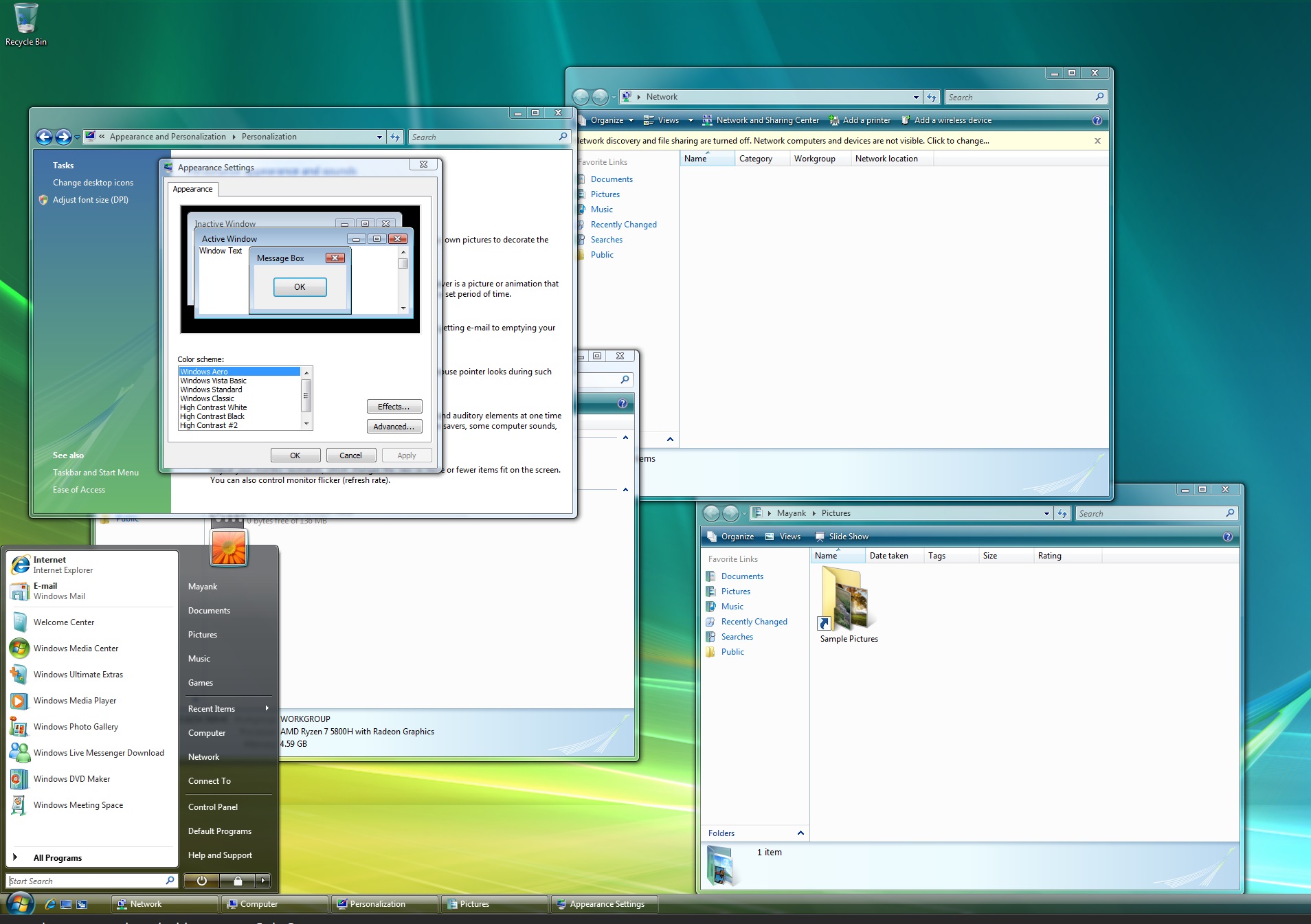
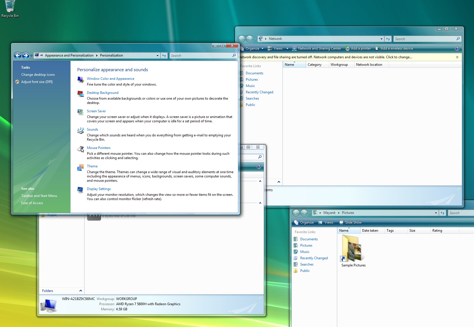
Microsoft also mocked Apple with a short video on Windows Aero and Vista. While we’re not saying Apple copied Microsoft’s Windows Aero, it’s a fact that the idea is certainly not new, and it was explored by Microsoft in 2006. It turns out that Liquid Glass’s translucent effect isn’t the only feature we found similar to Windows.
iOS 26’s little light-up when you touch or play with menus reminds me of Windows 10
On iOS 26 and iPadOS 26, the Liquid Glass design lights up the background of the menu when you move your finger (and I assume the cursor in the case of macOS). This is similar to how Microsoft Fluent Design works when you hover over the live tiles in the Windows 10 Start menu.
As you can see in the above video posted on X, when you tap on something in iOS 26, a soft light appears under your finger. It looks fresh, but if you’ve used Windows 10, you’ve seen something like this before.
Fluent Design, which is still relevant in Windows 11 but not as much as Windows 10, includes Acrylic. This creates a translucent texture behind the background of the app. The idea is to add depth, so you can see through the background, but the text remains clearly visible.
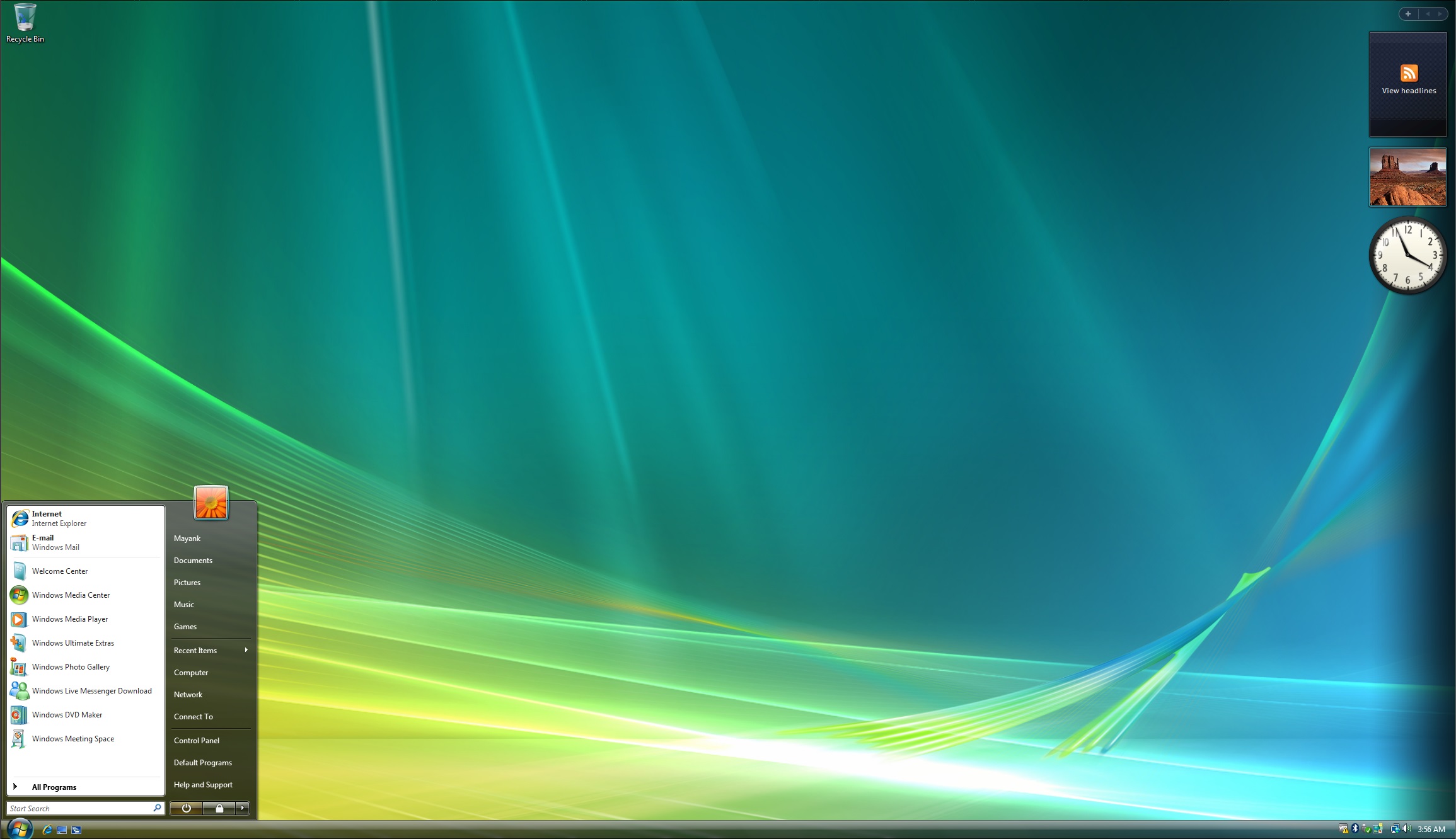
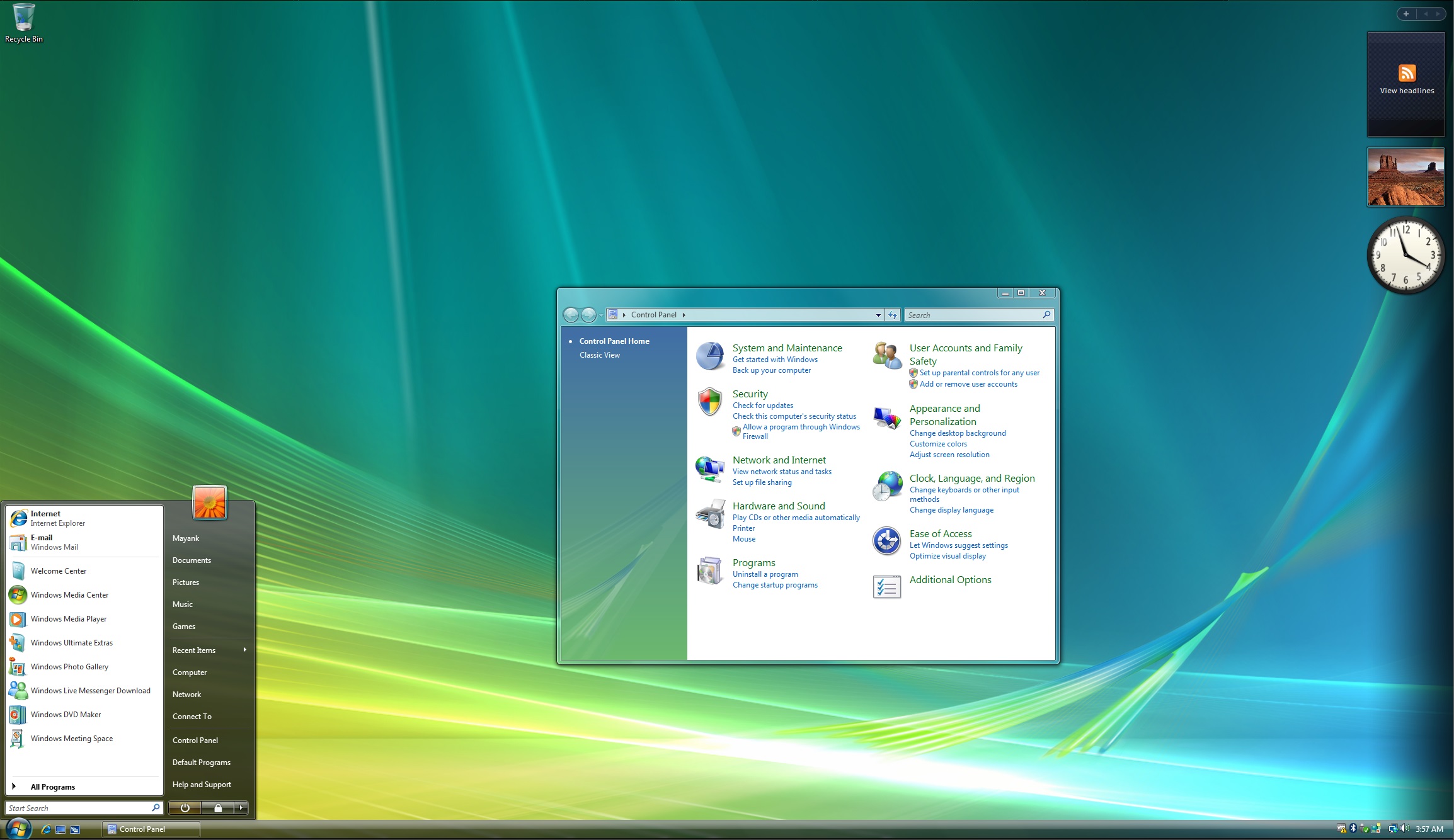
It’s not as powerful as Windows Vista’s Aero Glass, which added a translucent or glass-like effect to the title bar. Unlike Aero Glass, Acrylic applies to the background only. But that’s a different story.
Fluent Design’s most noticeable feature is Reveal, which adds a subtle light-like reflection effect to elements where it’s applied, such as the live tiles on Windows 10. This is similar to the subtle effect we’ve seen on iOS 26 or iPadOS 26 as part of the Liquid Glass revamp.
Microsoft coined the idea of Reveal in 2017 and experimented with internal builds even earlier. Fluent Design’s Reveal effect follows your cursor or touch movement and lights up the background. It’s a subtle effect compared to Apple’s Liquid Design, and the colours are also flat.
On the other hand, Liquid Design is more vibrant, features rounded corners, and the entire menu moves/shakes when you touch or move around with your fingertips.
Again, I’m not saying Apple copied Microsoft. Designers always follow the trend, and sometimes, the old trend is the new one.
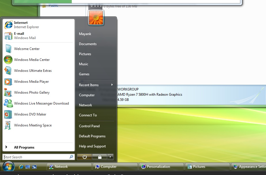
Apple has revived two Windows features that worked well years ago. One is Aero Glass from Windows Vista, and another is Fluent Design Reveal from Windows 10. Perhaps, Microsoft was ahead of time with its design approach, if only it could stick to the plans and focus on consistency. Another example is Windows Phone. What do you think?
The post iOS 26’s Liquid Glass finger-light reflect looks like Windows 10 Fluent Design appeared first on Windows Latest
Source: Read MoreÂ
