In this article, I try to summarize the best practices mentioned by various accessibility experts and their work (like this, this, and this) into a single article that’s easy to read, understand, and apply.
Let’s begin.
What are tooltips?
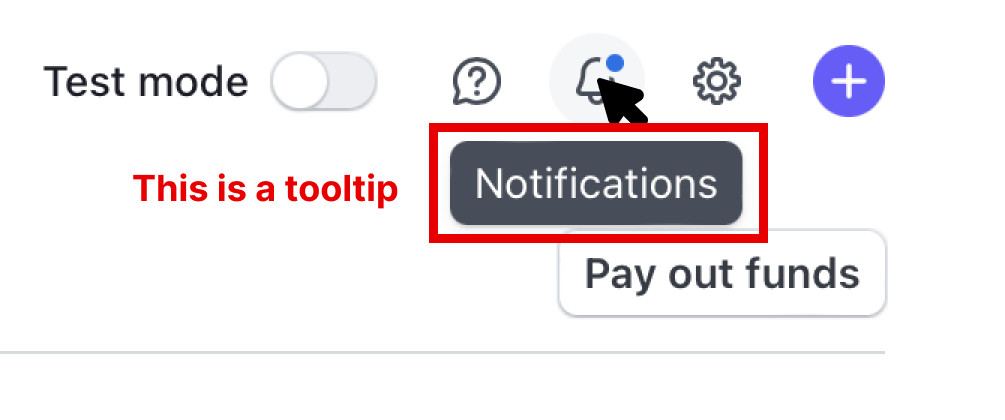
Tooltips are used to provide simple text hints for UI controls. Think of them as tips for tools. They’re basically little bubbles of text content that pop up when you hover over an unnamed control (like the bell icon in Stripe).
The “Notifications†text that pops up when you hover over Stripe’s bell icon is a tooltip.
If you prefer more of a formal definition, Sarah Highley provides us with a pretty good one:
A “tooltip†is a non-modal (or non-blocking) overlay containing text-only content that provides supplemental information about an existing UI control. It is hidden by default, and becomes available on hover or focus of the control it describes.
She further goes on to say:
That definition could even be narrowed down even further by saying tooltips must provide only descriptive text.
This narrowed definition is basically (in my experience) how every accessibility expert defines tooltips:
Tooltips must not contain interactive content.
Heydon Pickering takes things even further, saying: If you’re thinking of adding interactive content (even an ok button), you should be using dialog instead.
In his words:
You’re thinking of dialogs. Use a dialog.
Two kinds of tooltips
Tooltips are basically only used for two things:
Labeling an icon
Providing a contextual description of an icon
Heydon separates these cleanly into two categories, “Primary Label†and “Auxiliary description†in his Inclusive Components article on tooltips and toggletips).
Labeling
If your tooltip is used to label an icon — using only one or two words — you should use the aria-labelledby attribute to properly label it since it is attached to nothing else on the page that would help identify it.
<button aria-labelledby=”notifications”> … </button>
<div role=”tooltip” id=”notifications”>Notifications</div>
You could provide contextual information, like stating the number of notifications, by giving a space-separated list of ids to aria-labelledby.
<button aria-labelledby=”notifications-count notifications-label”>
<!– bell icon here –>
<span id=”notifications-count”>3</span>
</button>
<div role=”tooltip” id=”notifications-label”>Notifications</div>
Providing contextual description
If your tooltip provides a contextual description of the icon, you should use aria-describedby. But, when you do this, you also need to provide an accessible name for the icon.
In this case, Heydon recommends including the label as the text content of the button. This label would be hidden visually from sighted users but read for screen readers.
Then, you can add aria-describedby to include the auxiliary description.
<button class=”notifications” aria-describedby=”notifications-desc”>
<!– icon for bell here –>
<span id=”notifications-count”>3</span>
<span class=”visually-hidden”>Notifications</span>
</button>
<div role=”tooltip” id=”notifications-desc”>View and manage notifications settings</div>
Here, screen readers would say “3 notifications†first, followed by “view and manage notifications settings†after a brief pause.
Additional tooltip dos and don’ts
Here are a couple of additional points you should be aware of:
Do:
Use aria-labellebdy or aria-describedby attributes depending on the type of tooltip you’re building.
Use the tooltip role even if it doesn’t do much in screen readers today, because it may extend accessibility support for some software.
Open tooltips on mouseover or focus, and close them on mouseout or blur.
Allow a mouse user to move their mouse over the tooltip content without dismissing the tooltip.
Allow a keyboard user to close the tooltip on the Escape button, per WCAG Success Criterion 1.4.13.
Don’t:
Don’t use the title attribute. Much has been said about this so I shall not repeat them.
Don’t use the aria-haspopup attribute with the tooltip role because aria-haspopup signifies interactive content while tooltip should contain non-interactive content.
Don’t include essential content inside tooltips because some screen readers may ignore aria-labelledby or aria-describedby. (It’s rare, but possible.)
Tooltip limitations and alternatives
Tooltips are inaccessible to most touch devices because:
users cannot hover over a button on a touch device, and
users cannot focus on a button on a touch device.
The best alternative is not to use tooltips, and instead, find a way to include the label or descriptive text in the design.
If the “tooltip†contains a lot of content — including interactive content — you may want to display that information with a Toggletip (or just use a <dialog> element).
Heydon explains toggletips nicely and concisely:
Toggletips exist to reveal information balloons. Often they take the form of little “i†icons.
These informational icons should be wrapped within a <button> element. When opened, screen readers can announce the text contained in it through a live region with the status role.
<span class=”tooltip-container”>
<button type=”button” aria-label=”more info”>i</button>
<span role=”status”>This clarifies whatever needs clarifying</span>
</span>
Speaking anymore about toggletips detracts this article from tooltips so I’ll point you to Heydon’s “Tooltips and Toggletips†article if you’re interested in chasing this short rabbit hole.
That’s all you need to know about tooltips and their current best practices!
Further reading
Clarifying the Relationship Between Popovers and Dialogs (Zell Liew)
Tooltips and Toggletips (Inclusive Components)
Tooltips in the time of WCAG 2.1 (Sarah Higley)
Short note on aria-label, aria-labelledby, and aria-describedby (Léonie Watson)
Some Hands-On with the HTML Dialog Element (Chris Coyier)
Tooltip Best Practices originally published on CSS-Tricks, which is part of the DigitalOcean family. You should get the newsletter.
Source: Read MoreÂ

