A dual list box is a commonly used UI component in Vue.js that allows users to select items from one list (the source) and move them to another (the destination). This component is ideal for scenarios where users need to select multiple items from a large list, offering functionality to filter, search, and select items easily.
In this blog, we’ll learn how to build a dual list box component in Vue.js using TypeScript, highlighting features such as searching, filtering, and moving items between the lists.
Features of the Dual List Box
- Search functionality for refining list items.
- Move single or multiple items between lists.
- Filter items based on their status (e.g., active or inactive).
- Support for keyboard interactions like
Ctrl + Clickto select multiple items.
Step 1: Setting Up the Project
Before diving into building the component, let’s first set up the project. We’ll begin by installing the necessary dependencies to get started.
Step 1.1: Install Vue and Vue-Property-Decorator
To start, open your terminal and run the following command to install Vue and the vue-property-decorator package, which we’ll use to leverage TypeScript decorators:
![]()
Step 1.2: Create the DualListBox.vue File
Next, navigate to the components directory of your Vue project and create a new file called DualListBox.vue. This file will serve as the foundation for our component. We’ll define the structure for two key sections: one for available items and one for selected items, with buttons in between to move items back and forth.
Explore more on setting up Vue projects in this detailed guide from Vue Mastery
Step 2: Create the Layout for Available Items
With the project setup complete, let’s move on to creating the layout for the available items section. This part will include the search functionality, item counts, and filtering options.
Step 2.1:Â Search Box for Available Items
To help users refine the available items, add a search input field. This input will be bound to the searchSource data property, allowing users to filter items dynamically.

Step 2.2: Display Available Items Count
After adding the search input, it’s useful to show users the number of items matching the search criteria. We can display the count of filtered items alongside the total number of available items.

Step 2.3: Add Checkbox for Active Items
In some cases, users may want to filter items based on their status (e.g., active or inactive). To provide this option, include a checkbox that filters active items, controlled by the activeItems property.

Step 2.4: List of Available Items
Now, we’ll display the available items in a list. Each item will be clickable, allowing users to select it and move it to the selected items list.

Step 3: Add Buttons to Move Items
Between the available and selected items lists, we need buttons to facilitate the movement of items. These buttons allow users to move items between the two lists, either one at a time or all at once.

Step 4: Create the Layout for Selected Items
Next, we’ll create the layout for the selected items section. This part mirrors the available items section, with search, filtering, and item display functionalities.
Step 4.1: Search Box for Selected Items
To allow users to search through the selected items, add a search input bound to searchDestination.

Step 4.2: Display Selected Items Count
Just like the available items section, show the count of filtered and total items in the selected list.

Step 4.3: List of Selected Items
Finally, we’ll display the selected items, allowing users to click on them to remove them from the list.

Step 5: Defining Properties and Data
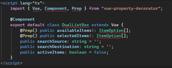
Now that the template is in place, let’s move to the script section. We’ll define the properties and data needed to manage the lists and interactions. Use @Prop to accept availableItems and selectedItems from the parent component.

Step 6: Implementing Filtered Lists
To ensure the search and filter functionalities work as intended, create computed properties that return the filtered lists based on search terms and item status.

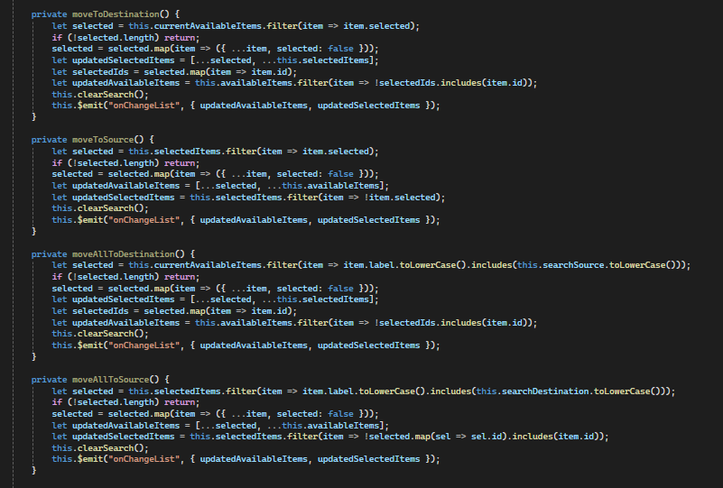
Step 7: Implementing the Move Logic
Next, implement the methods that handle moving items between the available and selected lists. These include:
moveToDestinationfor moving selected items from available to selected.moveToSourcefor moving items back to available.moveAllToDestinationto move all available items.moveAllToSourceto move all selected items back.

Step 8: Emitting Events to the Parent Component
When items are moved between lists, we’ll emit an event to notify the parent component to update its state. Here’s an example of emitting the onChangeList event:
![]()
In the parent component, listen for this event to update the selected and available items accordingly.

For further reading on event handling in Vue.js, check out the official Vue documentation on event handling.
Step 9: Styling the Component
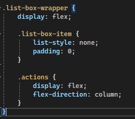
Finally, add CSS styles to make the dual list box visually appealing. You can customize the list boxes, buttons, and search inputs to match your design requirements.

Conclusion
In this tutorial, you’ve built a dual list box component using Vue.js with TypeScript. This component allows users to move items between two lists, search within the lists, and filter items by status. You can extend this component further by adding features like drag-and-drop or keyboard navigation.
Source: Read MoreÂ


