Caleb Porzio, creator of Alpine.js, just released a resize plugin that allows you to react easily when an element changes. This plugin is a wrapper around the Resize Observer API, and the impressive part, in my opinion, is how this plugin went from idea to publish in just over an hour!
[The resize plugin] is useful for: custom size-based animations, intelligent sticky positioning, conditionally adding attributes based on the element’s size, etc.
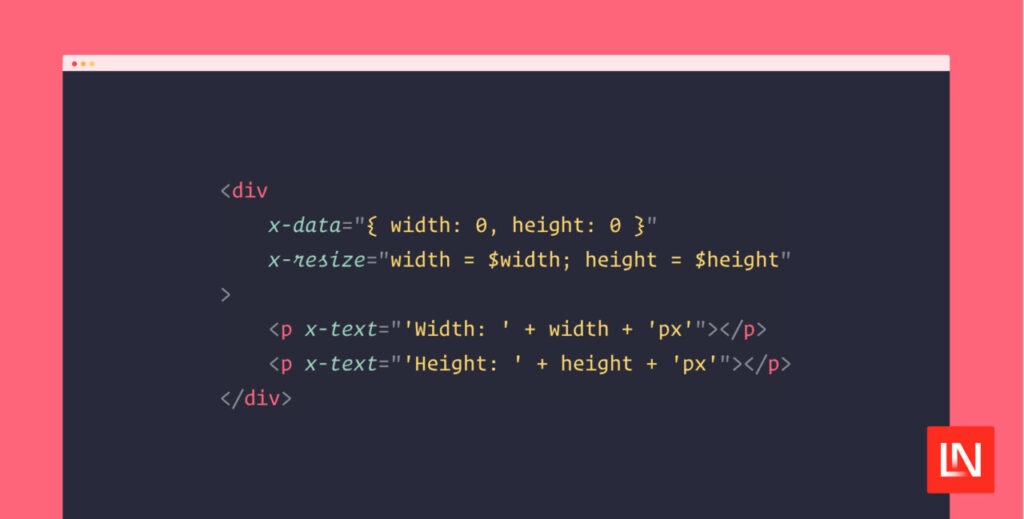
Here’s an example of using the x-resize attribute to handle size changes:
<div
x-data=”{ width: 0, height: 0 }”
x-resize=”width = $width; height = $height”
>
<p x-text=”‘Width: ‘ + width + ‘px'”></p>
<p x-text=”‘Height: ‘ + height + ‘px'”></p>
</div>
If you want to know the width and height of the entire document instead of a specific element, you can use the .document modifier:
<div
x-data=”{ width: 0, height: 0 }”
x-resize=”width = $width; height = $height”
>…</div>
Note that the height is the scroll height, not the viewport’s height. You’ll see a larger height as you change the size of the window and the content is pushed down on smaller screens.
You can learn more about this plugin in the Alpine.js documentation!
The post A Resize Plugin for Alpine.js appeared first on Laravel News.
Join the Laravel Newsletter to get all the latest Laravel articles like this directly in your inbox.
Source: Read MoreÂ


